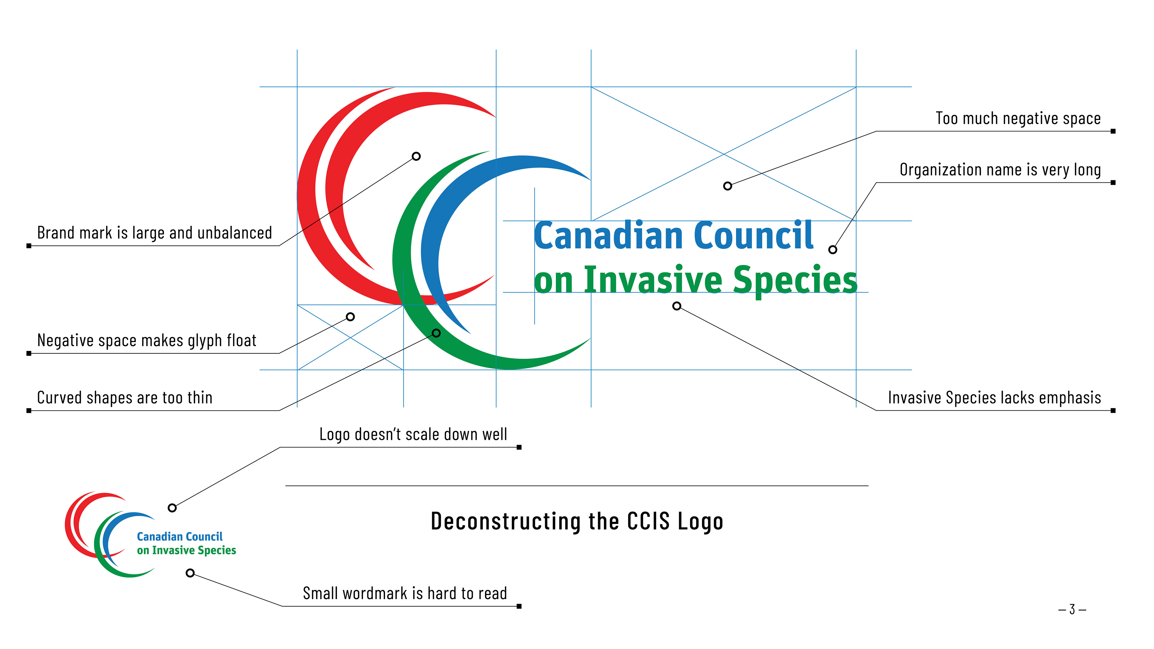
Deconstructing the Original Logo
The first logo concepts addressed key issues with the original CCIS glyph: poor legibility at smaller sizes, limited storytelling, and awkward negative space.
Concept Development
Each new glyph was given a unique name to help decision-makers connect with its meaning, sparking productive discussions and speeding up approvals.
The first concept reimagined the original glyph’s shapes into a circular, bulb-like form, symbolizing elements coming together in support and teamwork. Subsequent concepts drew inspiration from the new vision statement: “Healthy lands, waters, communities, and economies, resilient to invasive species.”
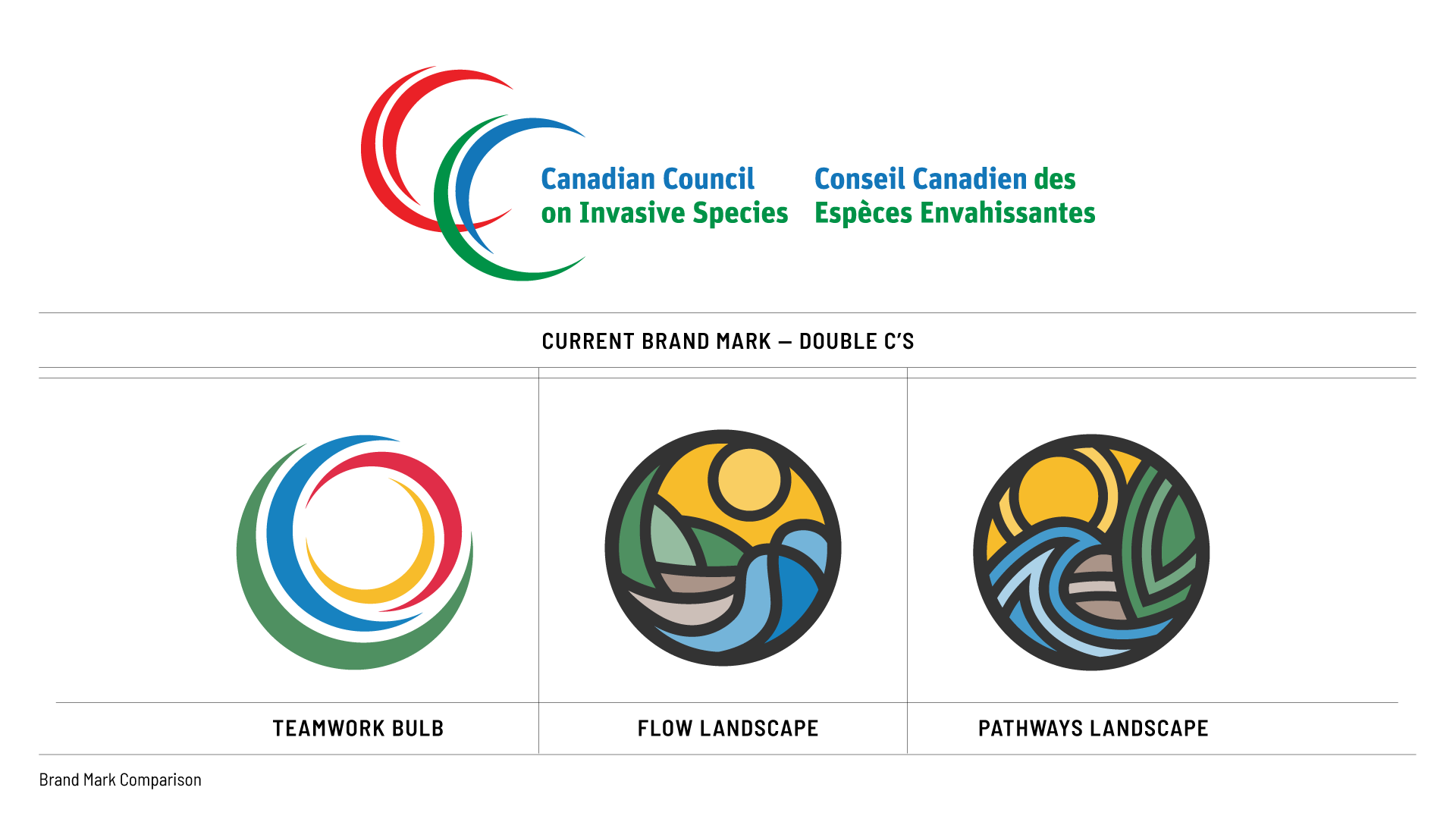
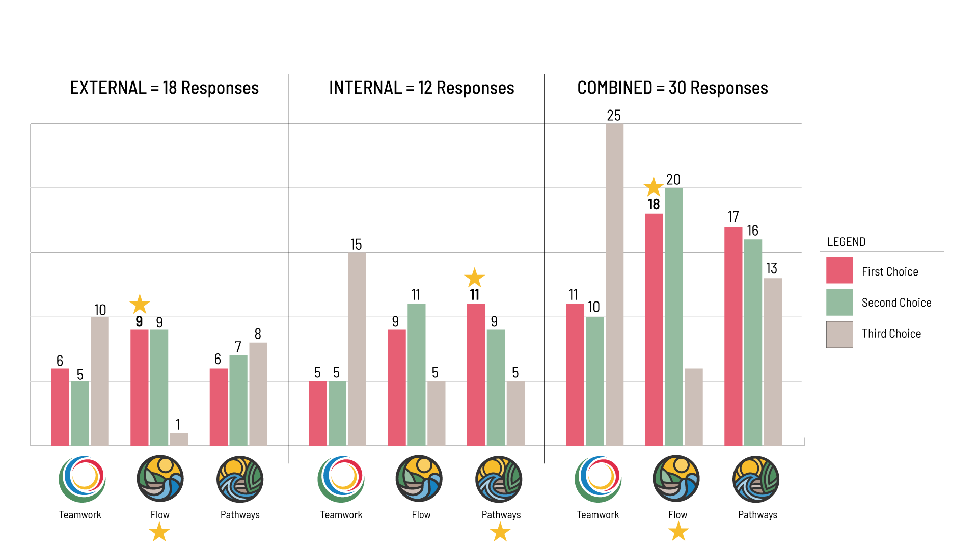
Teamwork Bulb: A new twist on the current CCIS brand mark to form a shape that reflects a team effort to address invasive species.
Flow Landscape: The space between each of the forms in this graphic represents pathways, and the shapes themselves depict movement. This flow follows the work Invasvies Canada puts into each of our programs to bring awareness and stop the spread.
Pathways Landscape: This version of the landscape is bolder and more striking with dark outlines for the pathways. Reverberating tints in the colourways give each element a pulse.
Graphic Standards Production
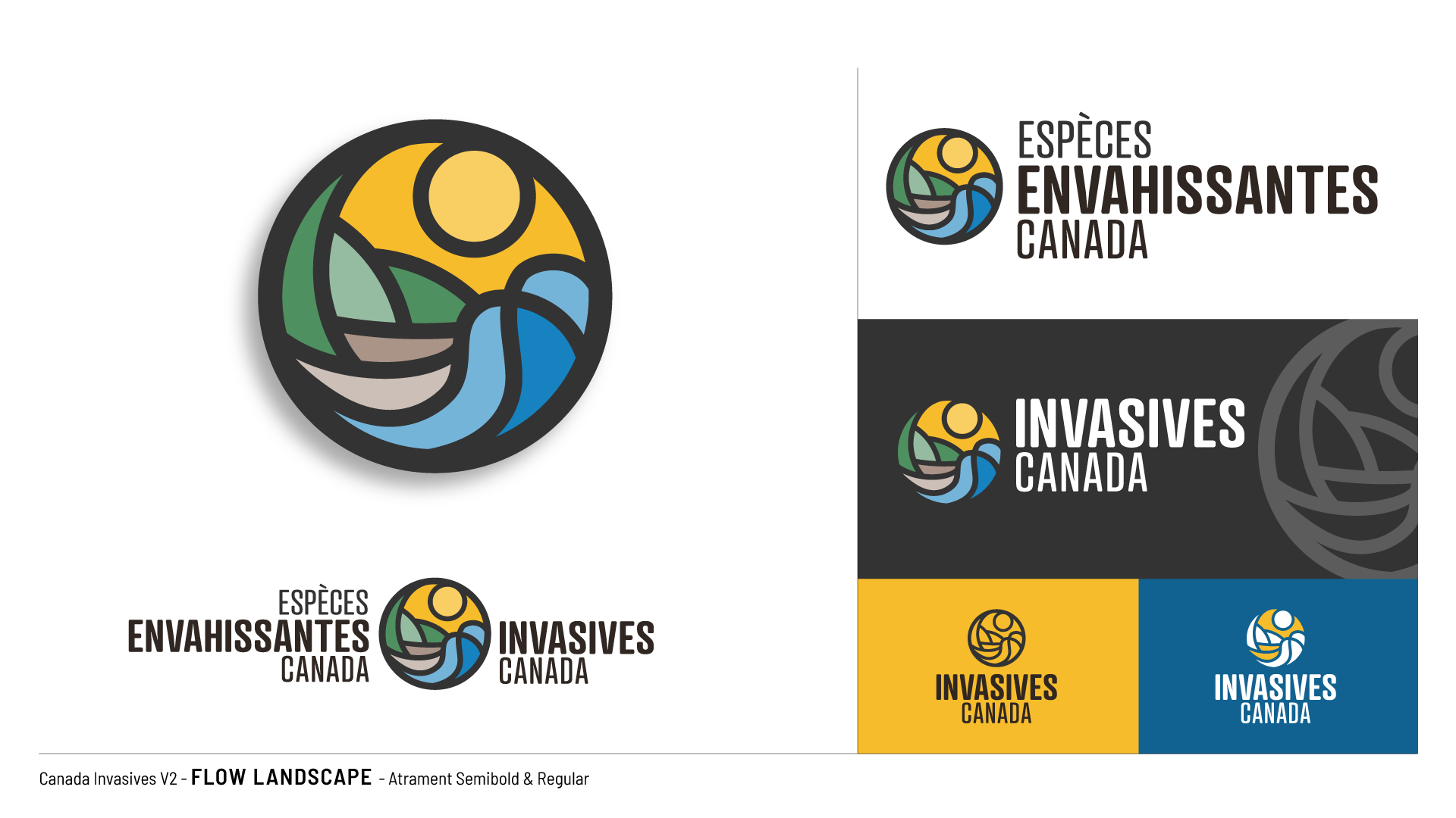
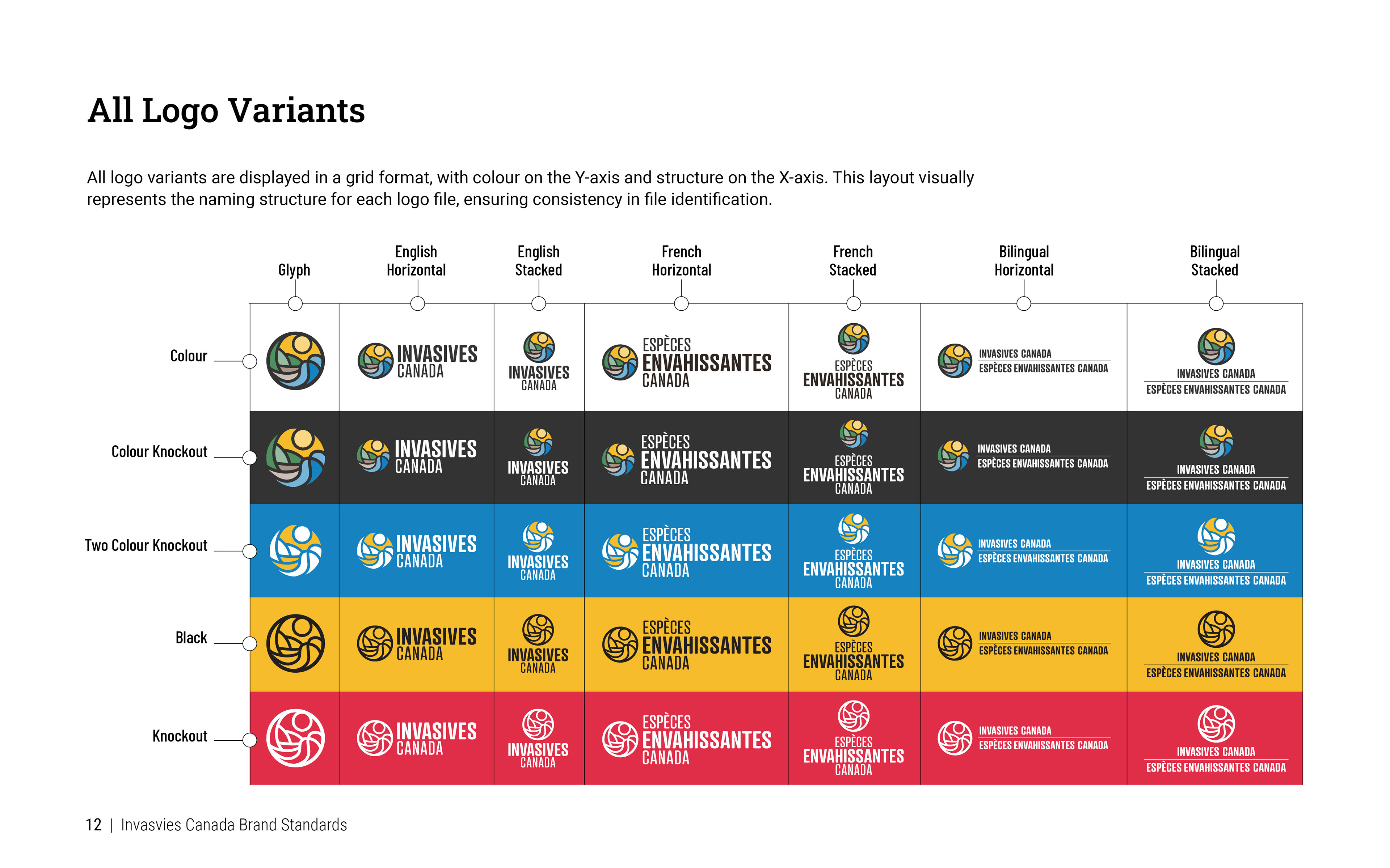
The Invasives Canada graphic standards evolved alongside the logo design. From the earliest concept presentations, I included key elements—logo variations in 4‑colour, 1‑colour, knock‑out, French, bilingual, stacked, and horizontal formats—so decision-makers could see the brand in practical use. These foundational standards guided the logo’s development and shaped the final identity system.
Focus Group Surveys
The CCIS Communications Committee and operating chapters narrowed the logo concepts to three finalists. These were tested in a small focus group survey with both internal and external audiences, providing clear feedback that guided the final logo selection.
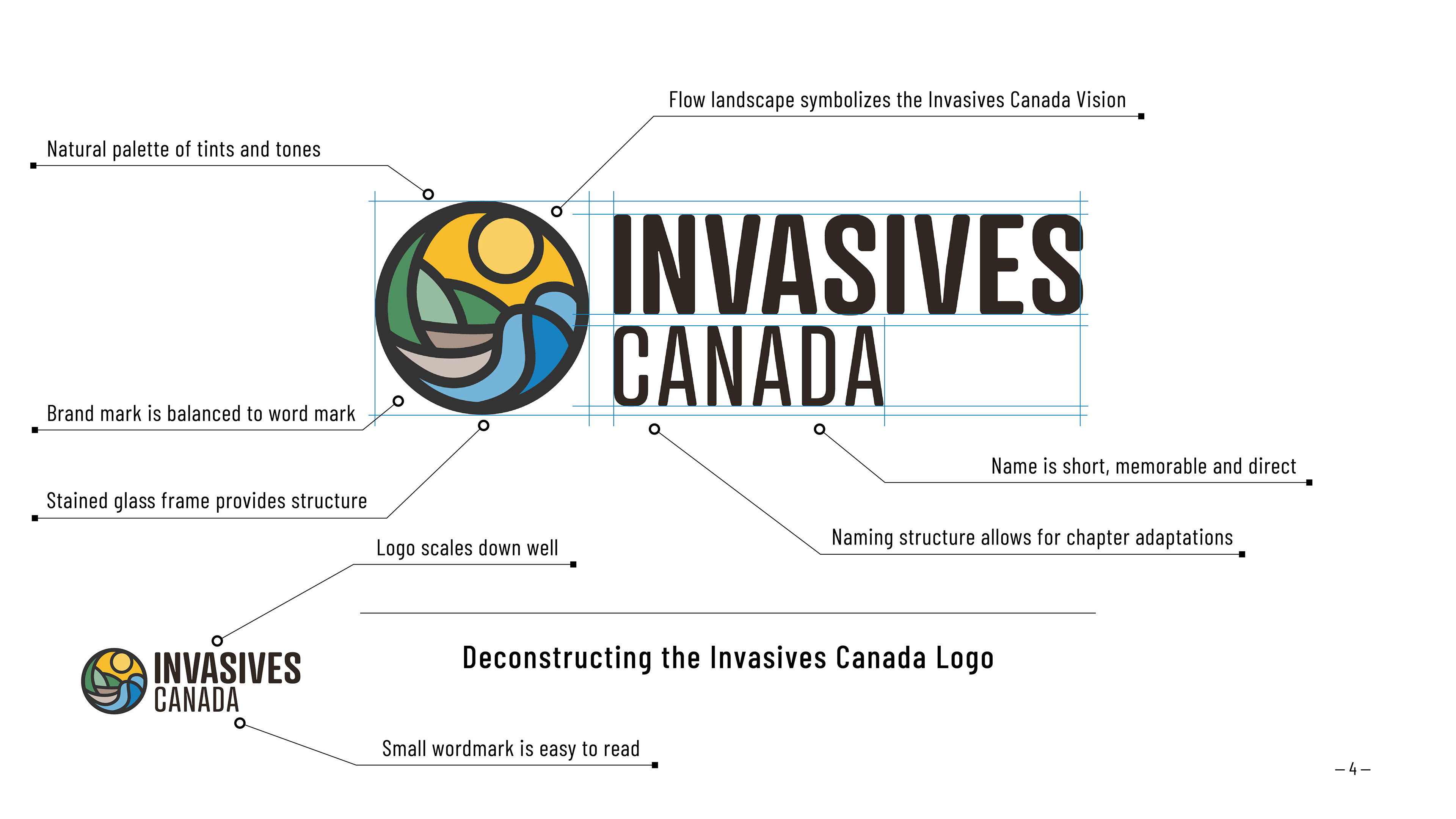
Deconstructing the New Logo