
The Problem
A brand audit in late 2025 found a gap between what PlayCleanGo communicated and how it made people feel. The materials were accurate. They weren’t activating.
The visual tone read as educational — appropriate for an organization rooted in conservation science, but not designed to move the people who needed to be moved. Photography showed landscapes more often than people. Headlines instructed rather than invited. Partner execution across the network was inconsistent, diluting local recognition. The overall impression was compliance. Not community.

The Work
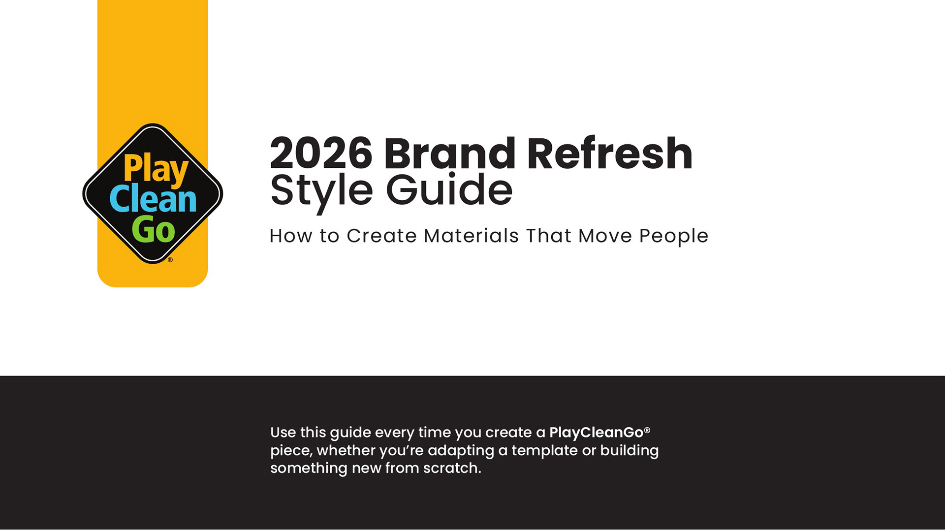
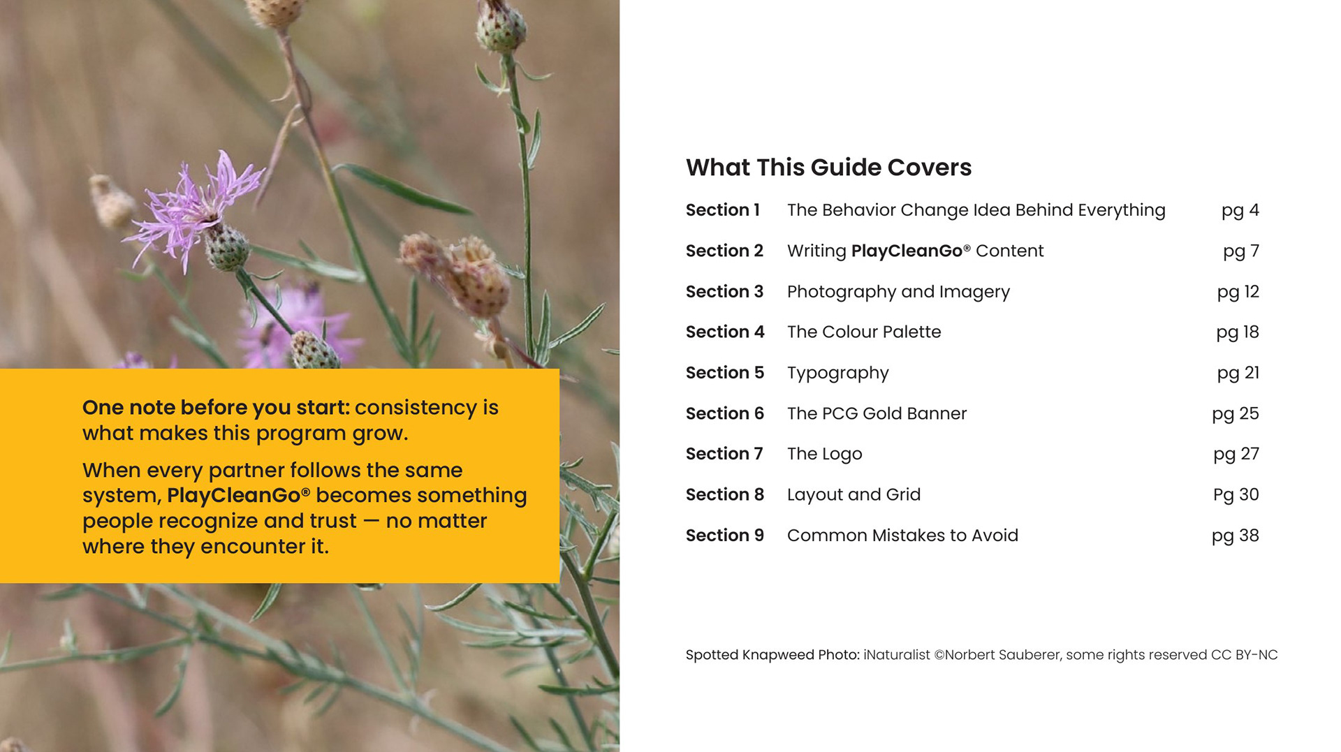
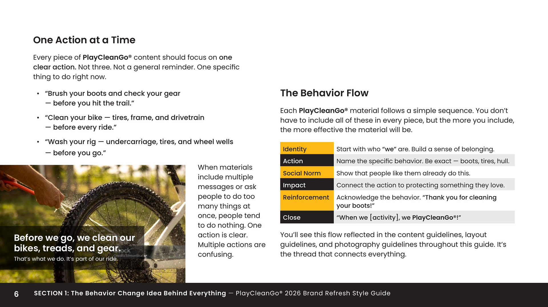
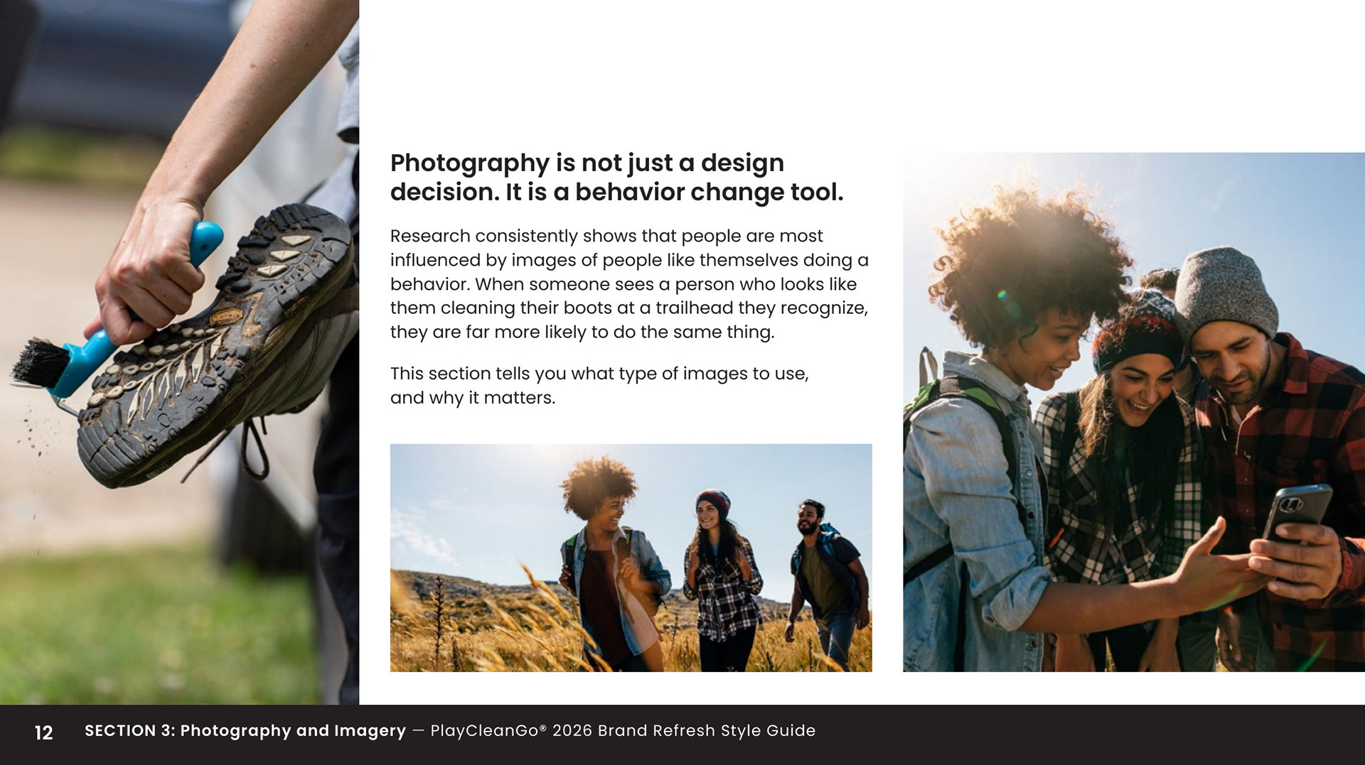
Brand Refresh Style Guide
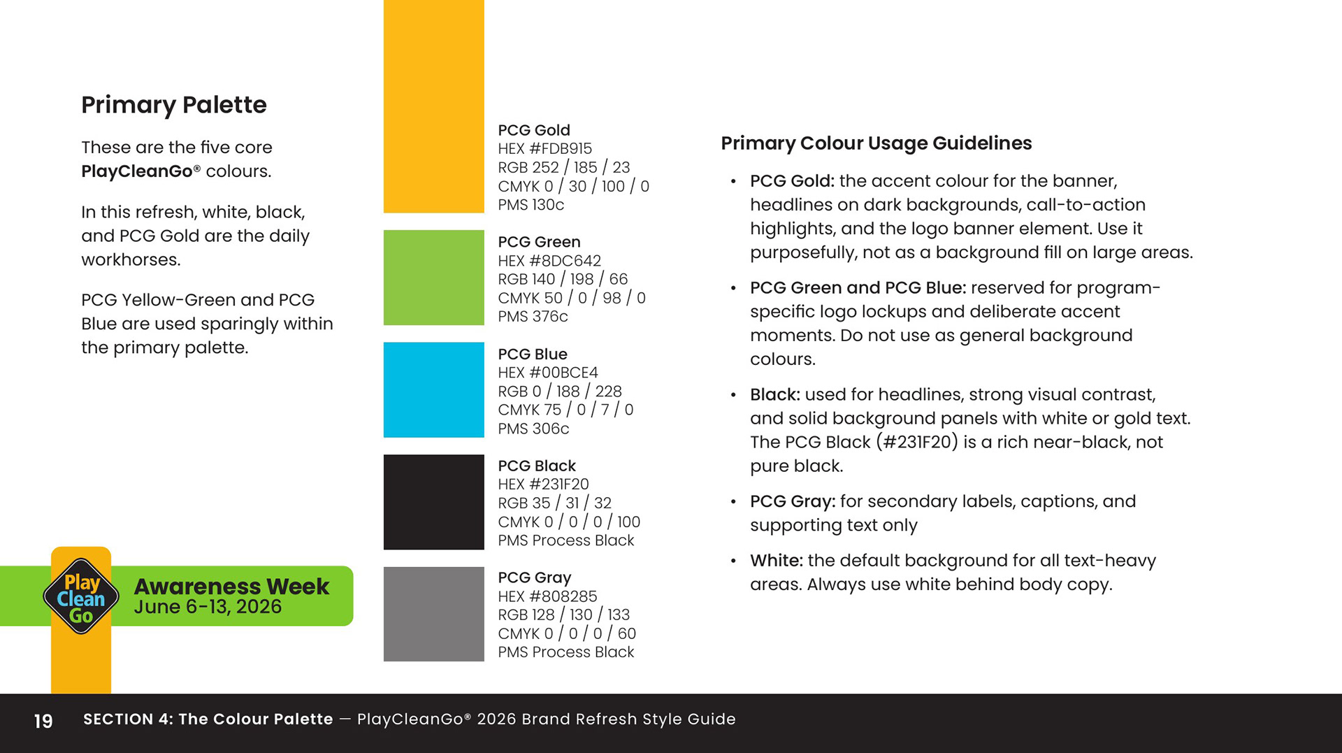
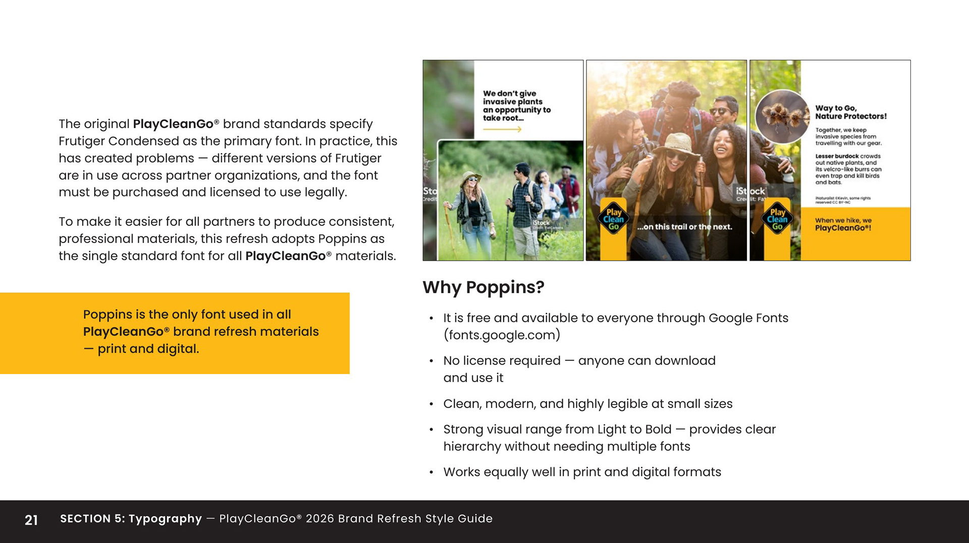
A how-to for partners covering writing principles, photography direction, color application, and layout guidance — all built around the behaviour-change framework. Designed so any partner organization could execute on-brand without needing a briefing.
A how-to for partners covering writing principles, photography direction, color application, and layout guidance — all built around the behaviour-change framework. Designed so any partner organization could execute on-brand without needing a briefing.
Print Materials
Posters, rack cards, and roll-up banners sized for trailheads, visitor centres, and partner locations across North America. Each piece carries a specific call to action and a social norm cue.
Posters, rack cards, and roll-up banners sized for trailheads, visitor centres, and partner locations across North America. Each piece carries a specific call to action and a social norm cue.
Social Content
Posts, stories, and carousels segmented by audience — hikers, seniors, campers, hunters, cyclists — and adapted for seasonal campaign windows. Each format follows the same behaviour-first visual logic.
Posts, stories, and carousels segmented by audience — hikers, seniors, campers, hunters, cyclists — and adapted for seasonal campaign windows. Each format follows the same behaviour-first visual logic.
Figma + Canva Template Systems
A partner-ready template system built in two environments: Figma for design-familiar partners, Canva for organizations without dedicated design resources. Both systems use the same visual logic and brand rules, so execution stays consistent no matter which tool a partner uses.
A partner-ready template system built in two environments: Figma for design-familiar partners, Canva for organizations without dedicated design resources. Both systems use the same visual logic and brand rules, so execution stays consistent no matter which tool a partner uses.