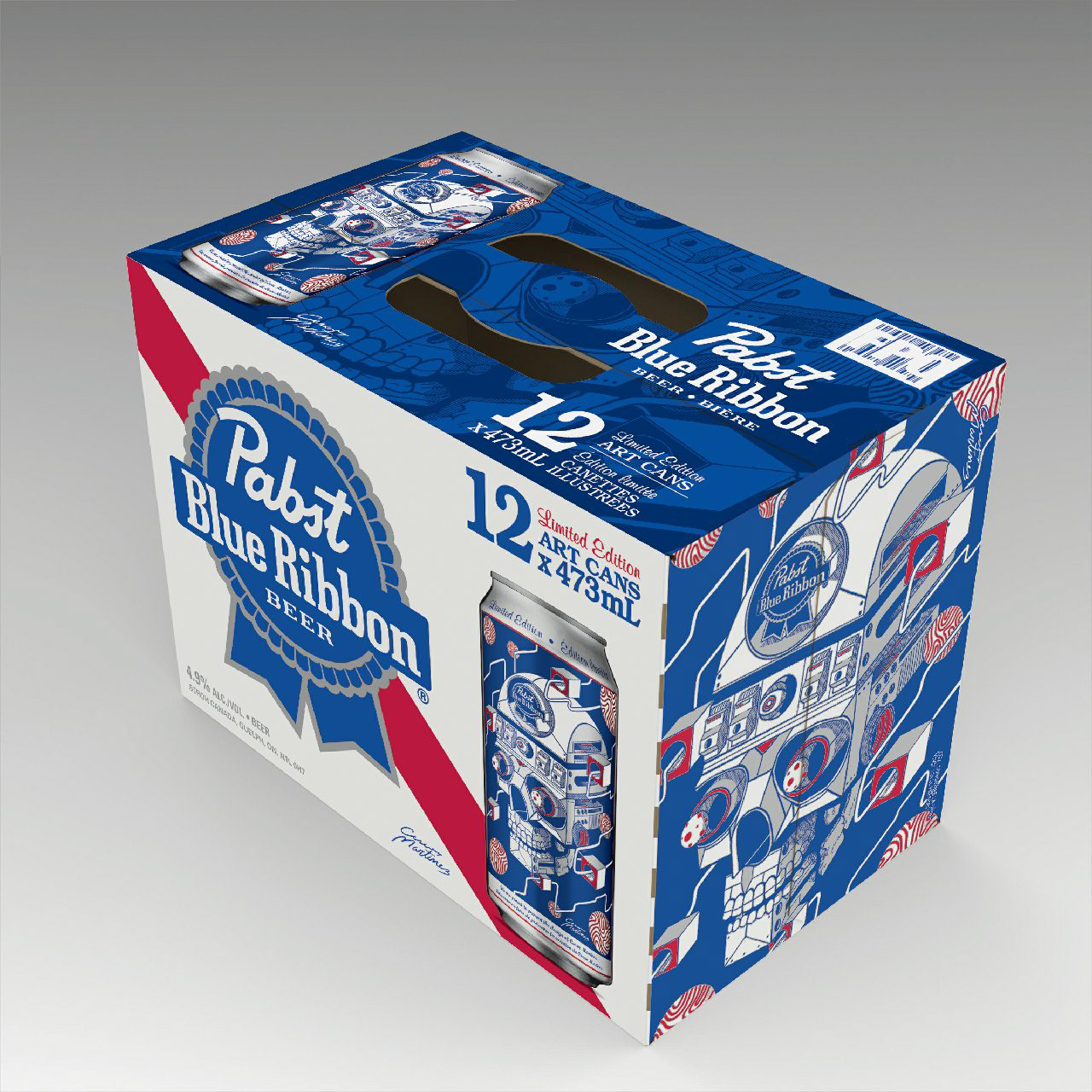
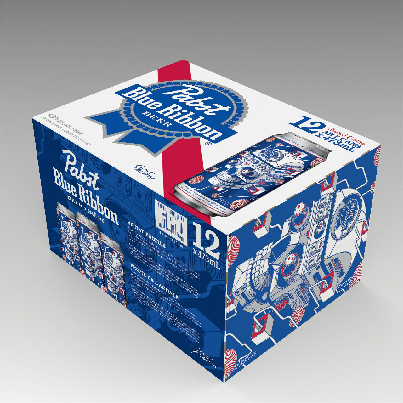
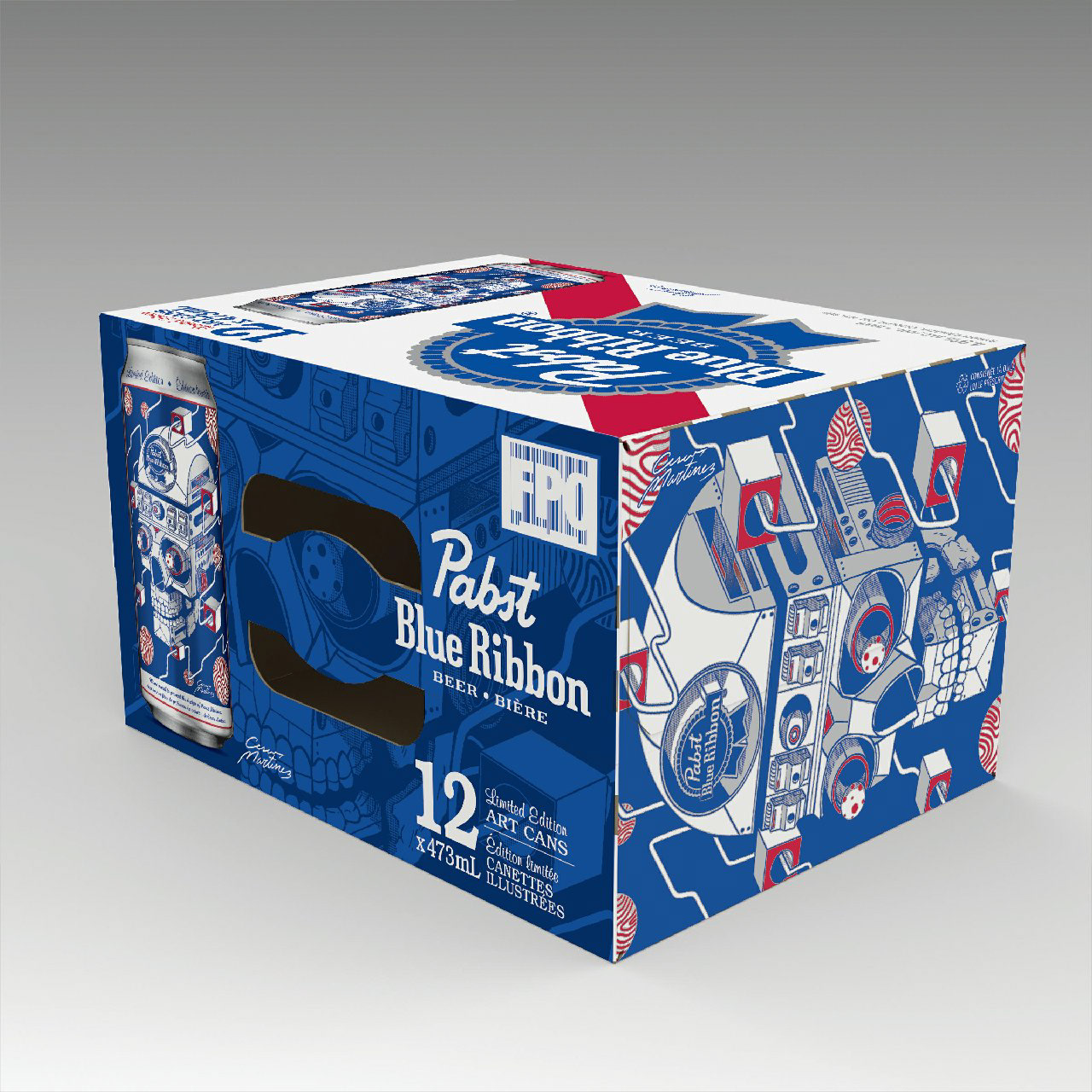
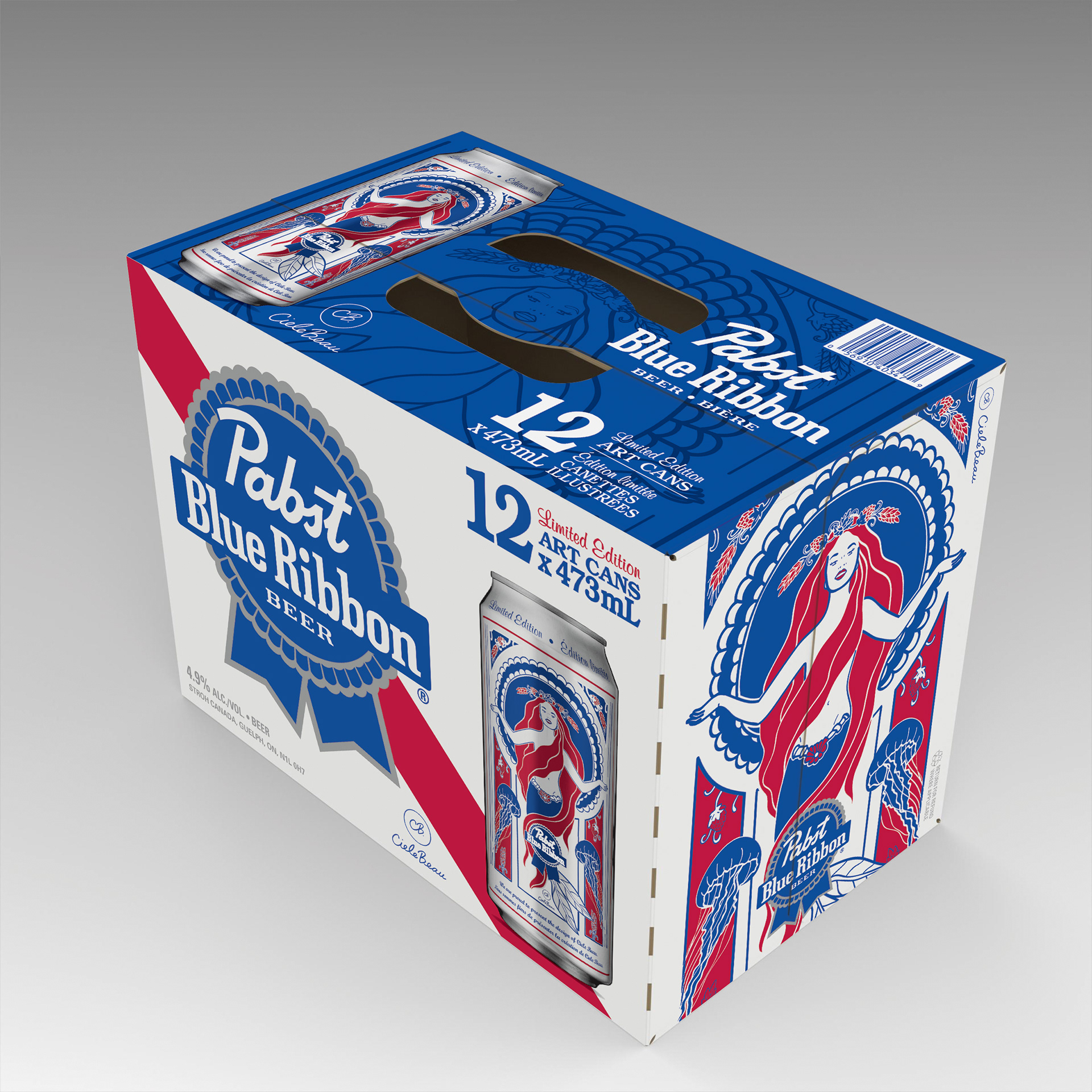
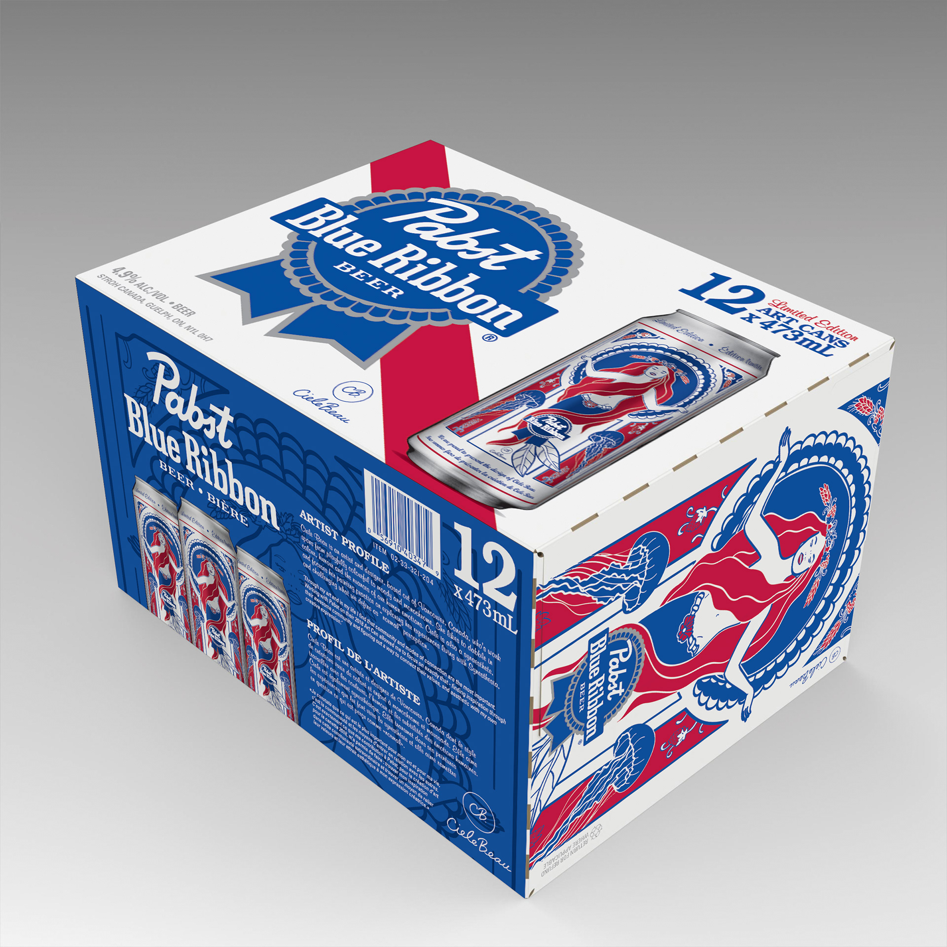
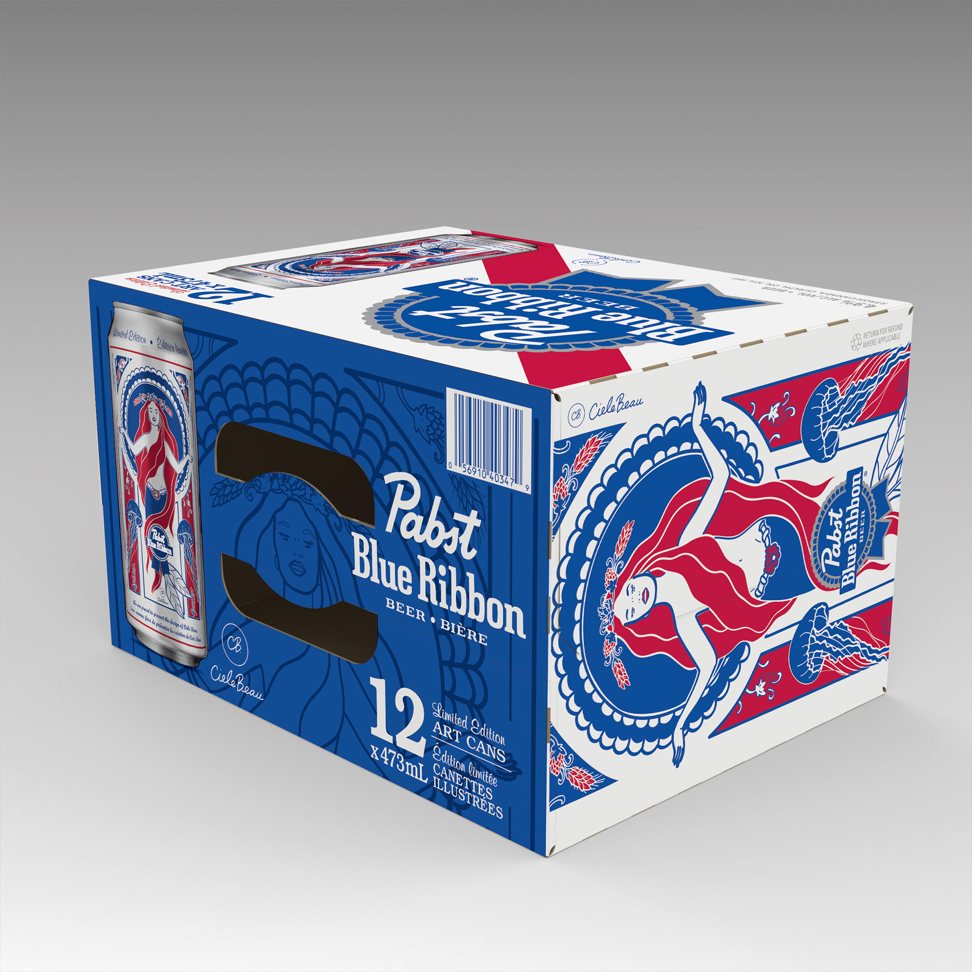
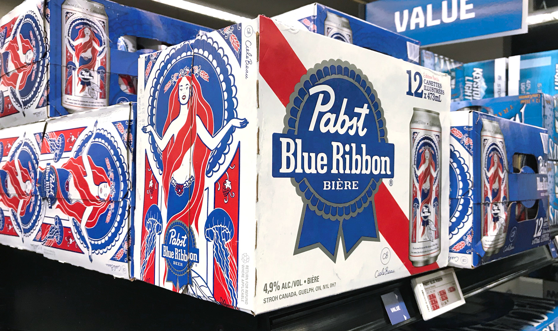
PBR Sponsored Artist Packs
Pabst Blue Ribbon commissioned artists to create illustrations for a series of limited edition 473mL cans. My role was to creatively integrate these unique artworks into the packaging design. To give the illustrations prominence and attract attention on the shelf, I featured them prominently on the end panels. I also transformed the artwork into duo-tones for the handle and bottom panels, ensuring cohesive branding throughout the packaging.
The face panel layout was inspired by the 1950s revival concept I had developed the year prior. This minimalist design provided the perfect canvas to showcase the exceptional artwork while maintaining a strong connection to the brand's heritage.
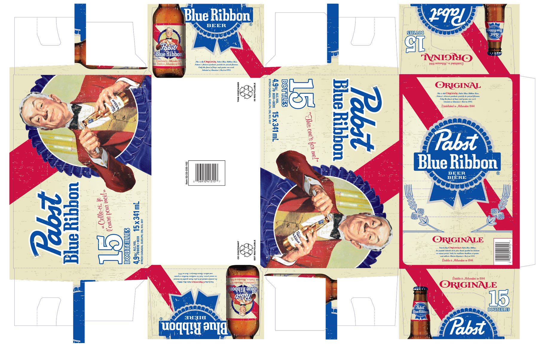
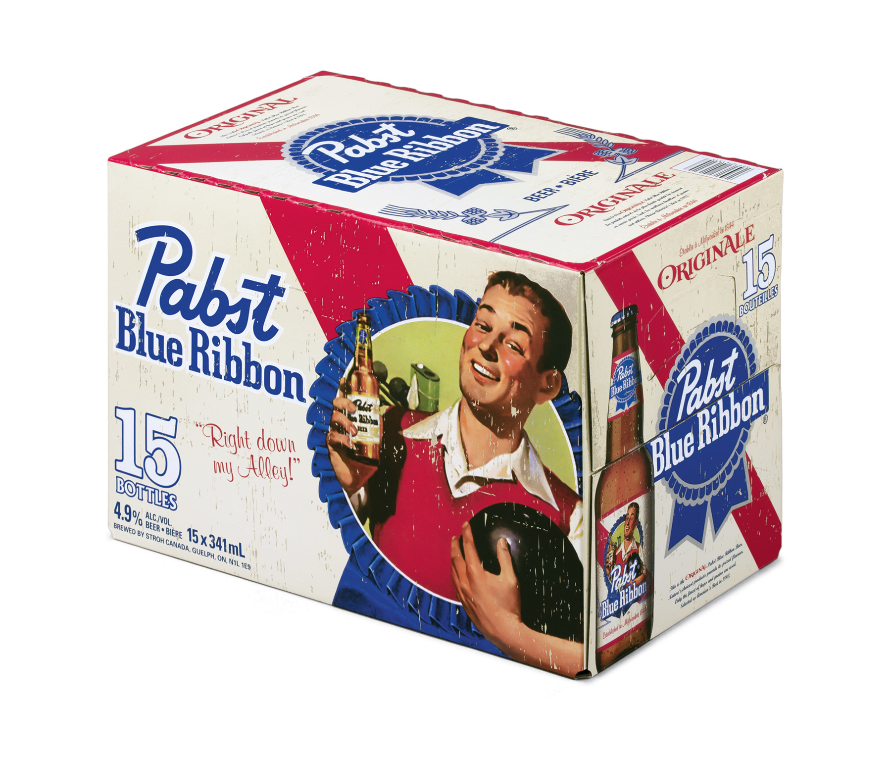
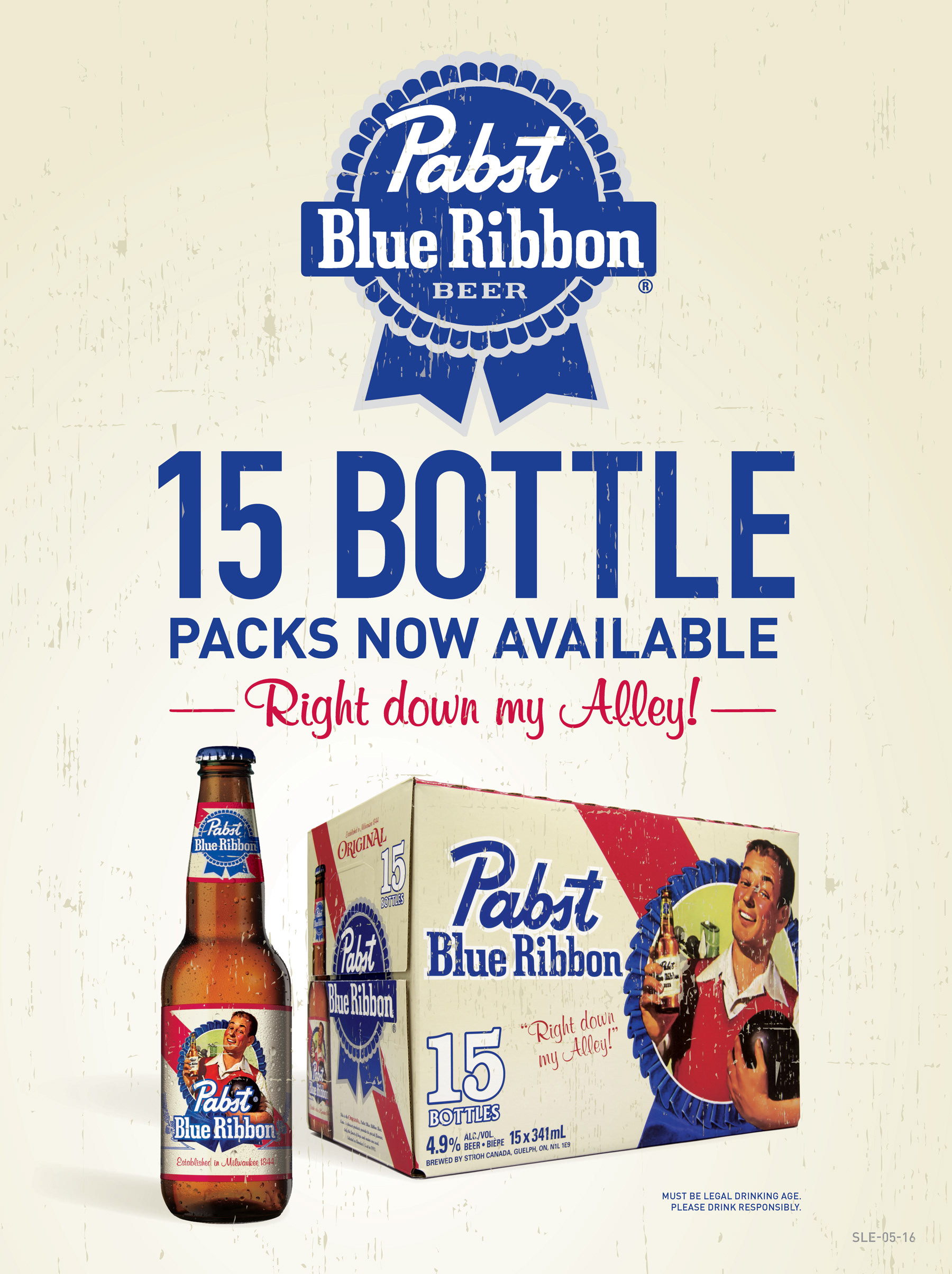
PBR Vintage Packs
These vintage packs drew inspiration from Pabst Blue Ribbon's original 1947 LIFE Magazine print ads. Since the artwork had long been lost from the PBR archives, we sourced the ads from eBay resellers, scanned them, and meticulously color-corrected them, making a few tweaks to achieve the perfect look. The top of the pack was designed to mimic the iconic PBR can label, reinforcing the brand's strong visual identity. These packs resonated particularly well with Boomers and Gen X, driving strong sales.
This project also marked the first time PBR Canada allowed us to feature a product photo of the PBR bottle on secondary packaging. Beyond the concept development, I managed the bottle mock-up in Photoshop, creatively blending two blank bottles from separate shoots to achieve a unique look for PBR. From concept to completion, these PBR projects were an absolute blast, and I was thrilled to be involved from start to finish, including putting my signature on the press approval.