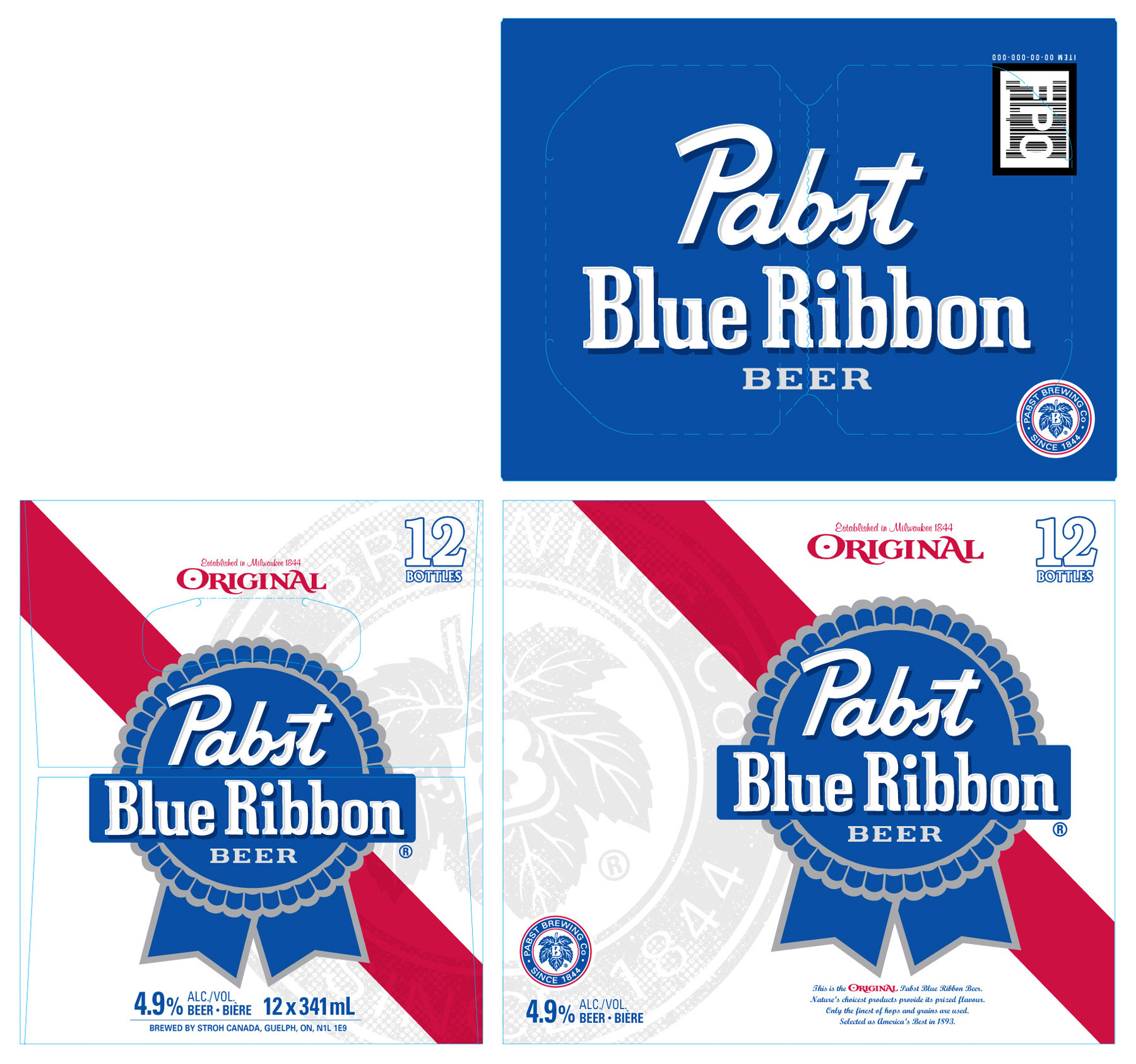
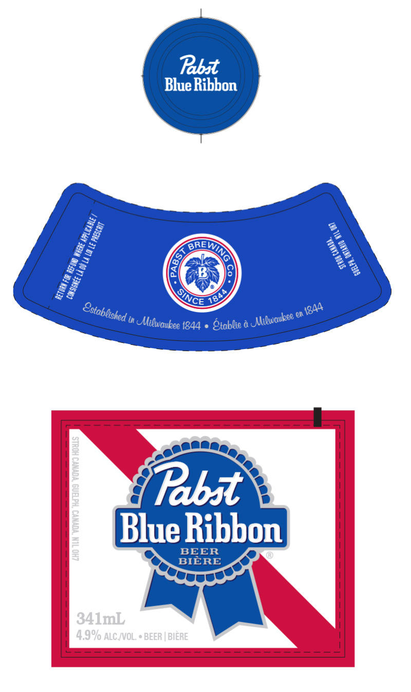
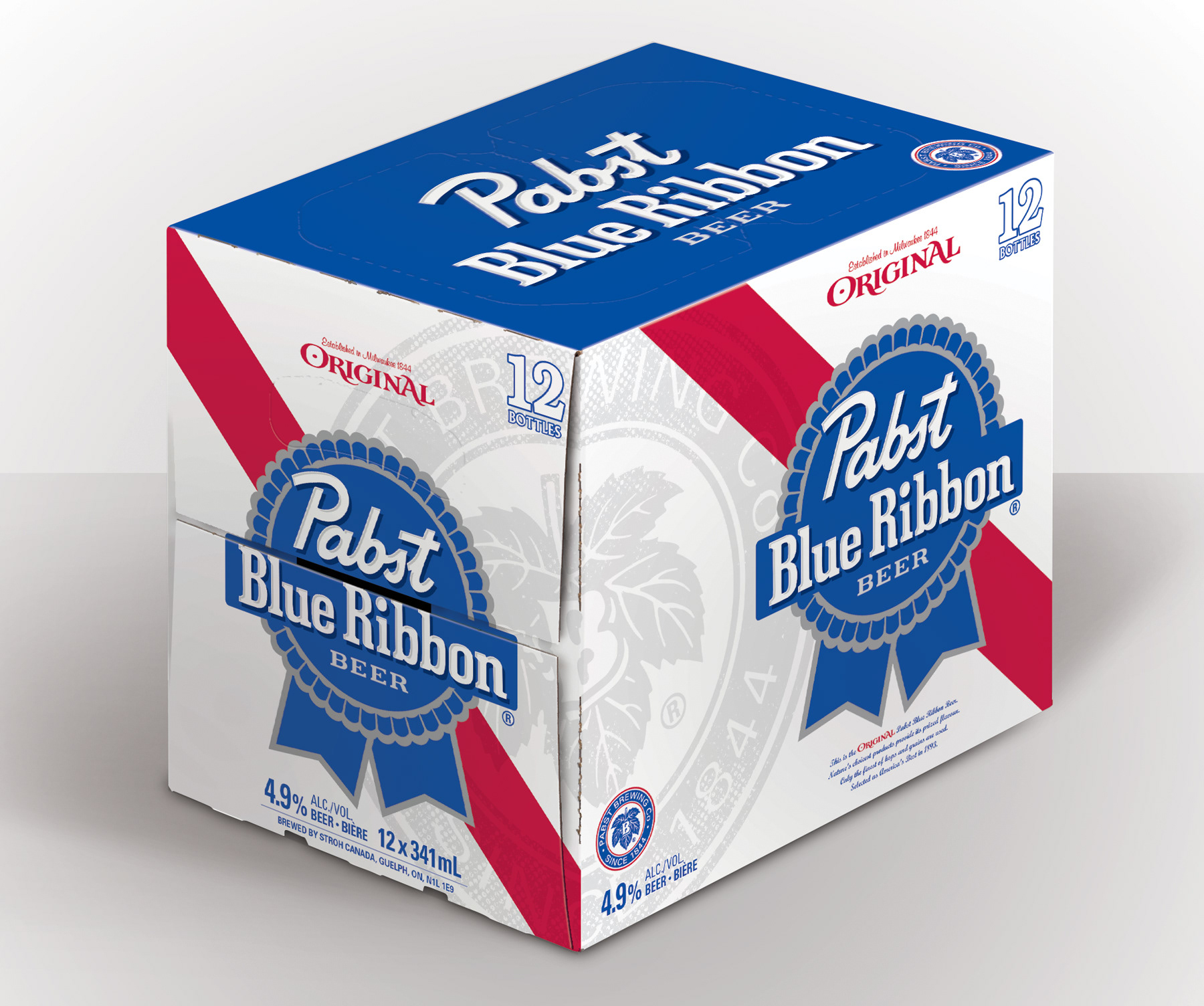
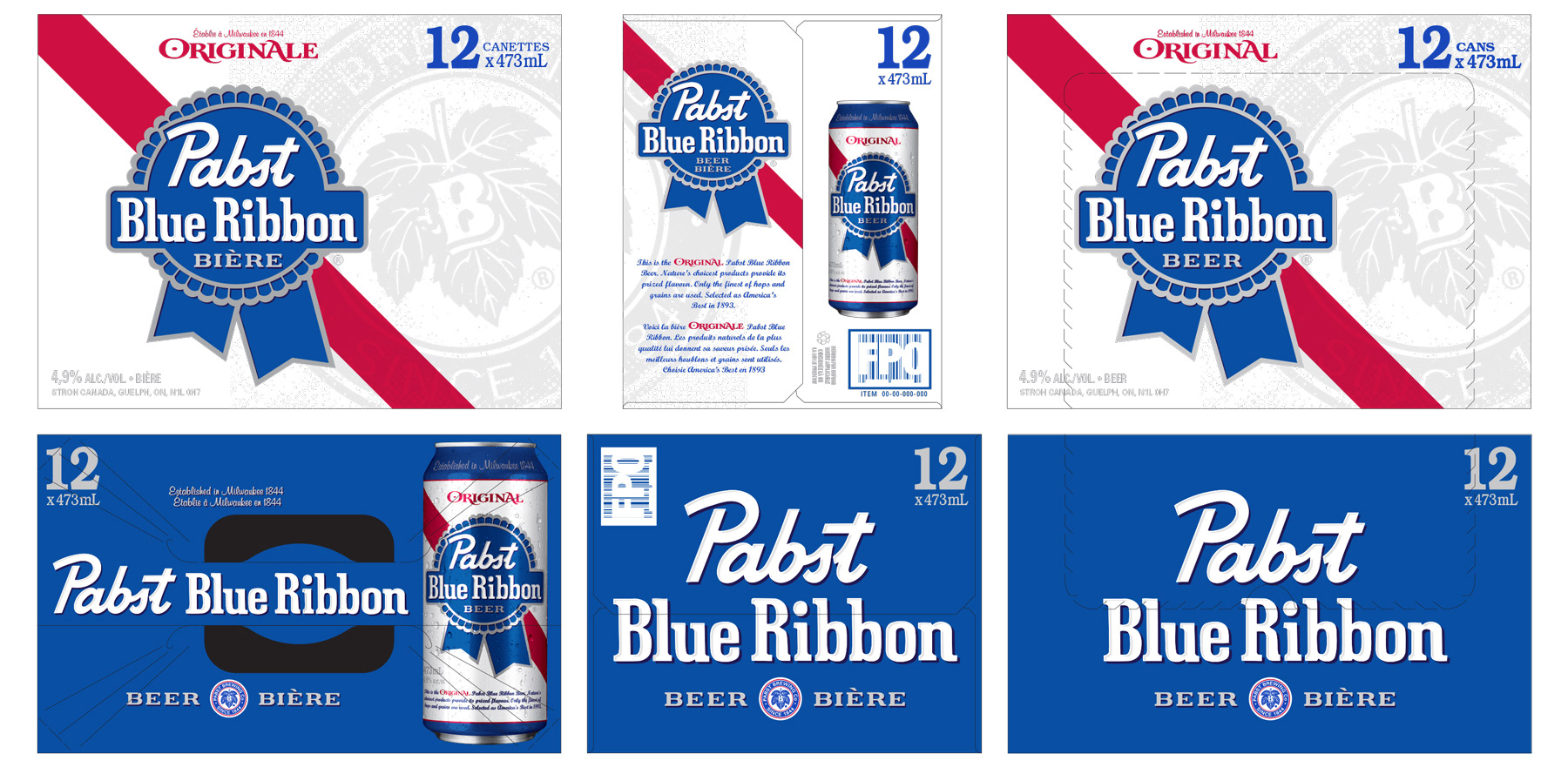
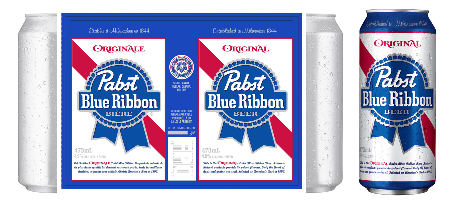
In my research on Pabst Blue Ribbon, I was consistently drawn to the simplicity and cleanliness of their 1950s packaging, which I mostly encountered in vintage magazine ads. Inspired by this classic era, I developed packaging concepts that introduced a dimensional treatment to the PBR wordmark, combined with a vintage emblem overlaid with a distressed screen to add texture to the background. These elements were carried across both primary and secondary packaging, creating a cohesive and nostalgic look. As with all packaging design in my portfolio, I approached this project with the end in mind, carefully considering the die-line (handles, flaps, type safety) to ensure every element was positioned perfectly. I also adhered to liquor board requirements for type size, placement, and the use of descriptive text, balancing creative expression with regulatory compliance.treatment to the PBT wordmark and leveraged the vintage emblem with a distressed screen to provide texture to the background. I carried these elements across both primary and secondary packaging. As with all packaging design in my portfolio, I was work with the end in mind — considering the die-line (handles, flaps, type safety) when positioning each element. Same goes for the liquor board requirements for type size, placement and use of descriptive text.