Brand Goal
The goal of the Youth Nature Keepers logo was to establish a strong and recognizable identity that reflects the organization’s mission and values. The logo needed to attract volunteers, raise awareness, and foster a sense of unity among participants. The design cleverly integrates alphabetic characters and eco-friendly elements, symbolizing the dedication and energy of young volunteers committed to environmental stewardship.
A Symbol of Unity with the Environment
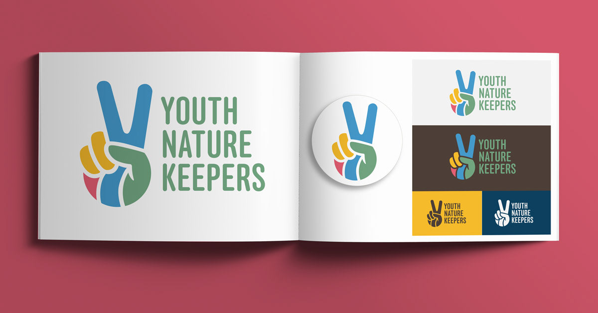
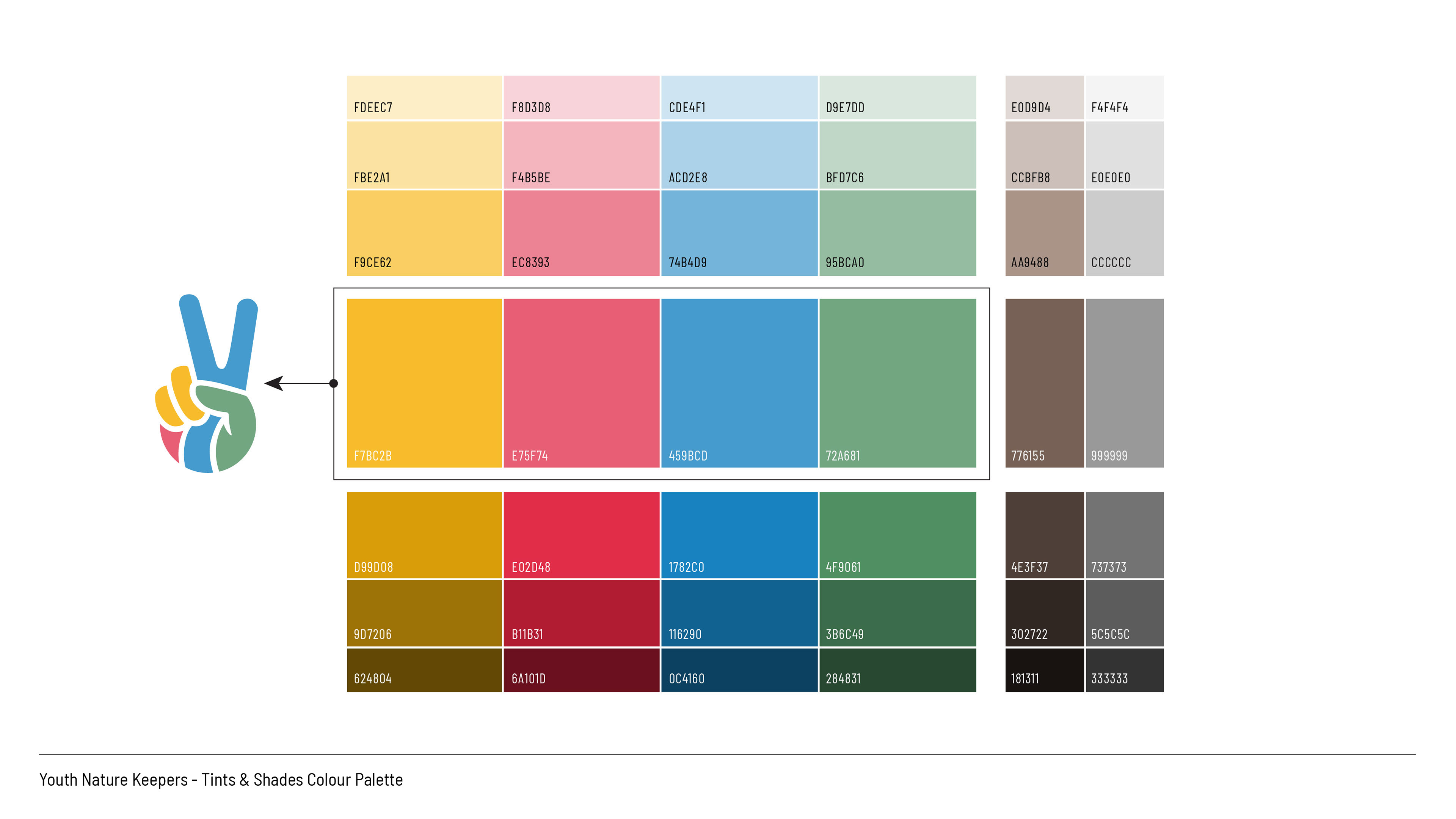
The logo design features a peace symbol shaped like a hand, forming the letter "Y" for youth, radiating harmony and unity with the environment. The incorporation of the green thumb represents the organization’s commitment to safeguarding the natural world. The thoughtfully selected colour palette conveys a rich and meaningful message: green for life and growth, yellow and red for caution and the threat of invasive species, and blue for aquatic ecosystems, emphasizing the protection of waterways and aquatic life.
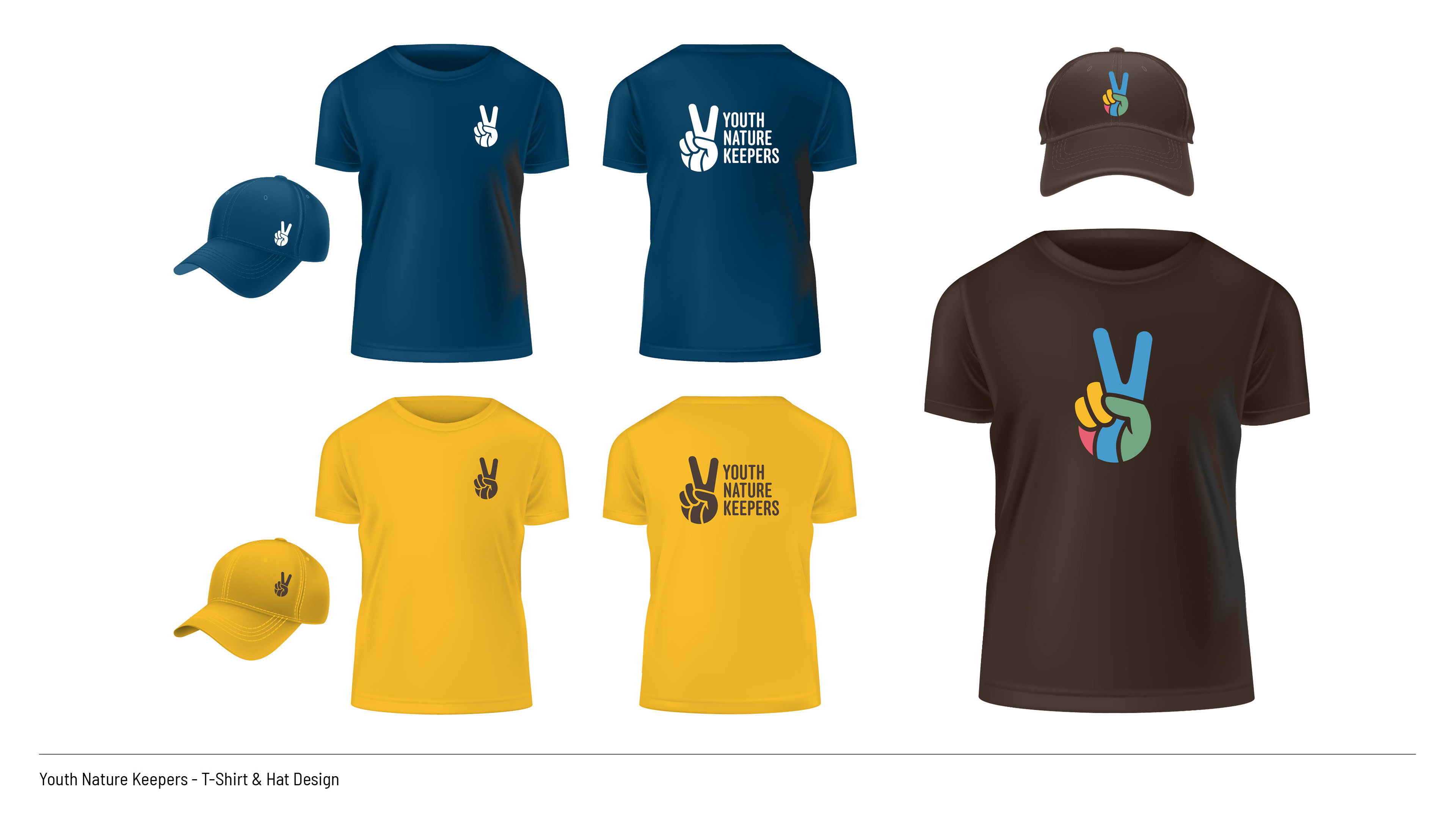
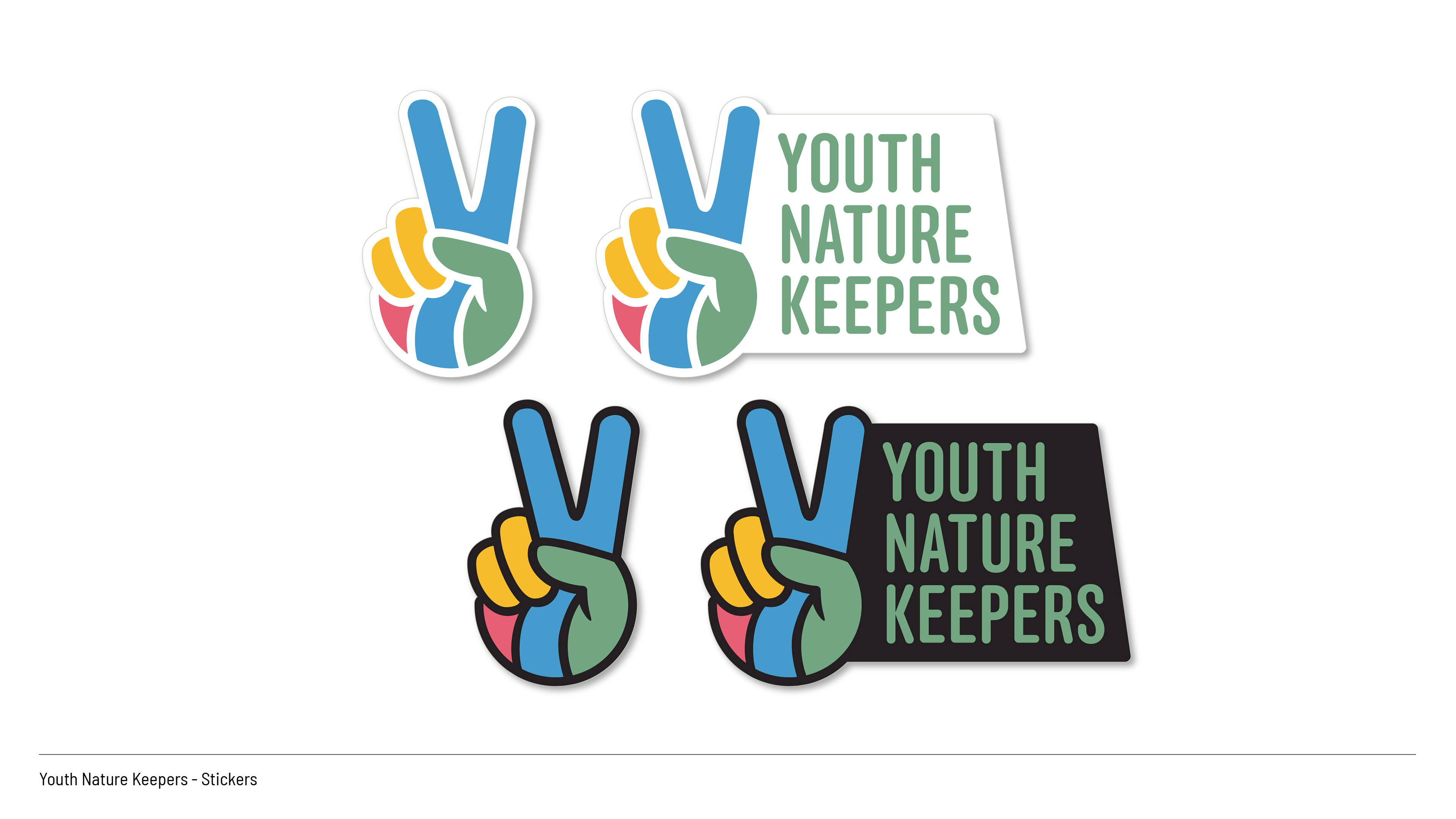
To ensure versatility and cost-effectiveness, mono-tone versions of the logo were created for use on branded clothing and merchandise. The color scheme was carefully chosen to maintain the logo’s visual impact across various applications, ensuring that the brand identity remains strong and consistent on both light and dark backgrounds.