Role: Marketing & Communications Consultant • March 2004 to Present
Scope: Naming, identity systems, graphic standards, web design, campaigns, print, video and photography
Collaborators: Program staff, regional coordinators, an in-house illustrator, web developers, print and production vendors
Scope: Naming, identity systems, graphic standards, web design, campaigns, print, video and photography
Collaborators: Program staff, regional coordinators, an in-house illustrator, web developers, print and production vendors

Rebrand and Rename — Invasives Canada
CCIS had operated under a name and visual identity that made sense internally but didn't land with the public audiences the organization needed to reach. The rebrand to Invasives Canada gave the organization a name that worked as a destination, a movement, and a URL.
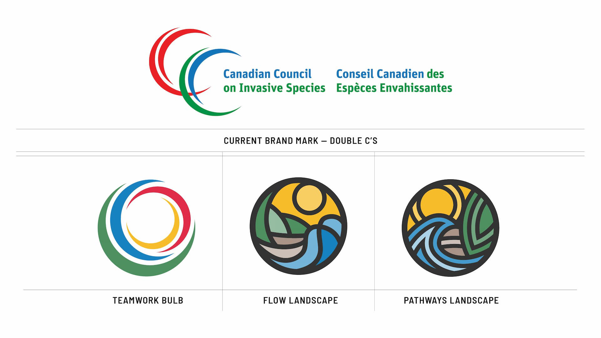
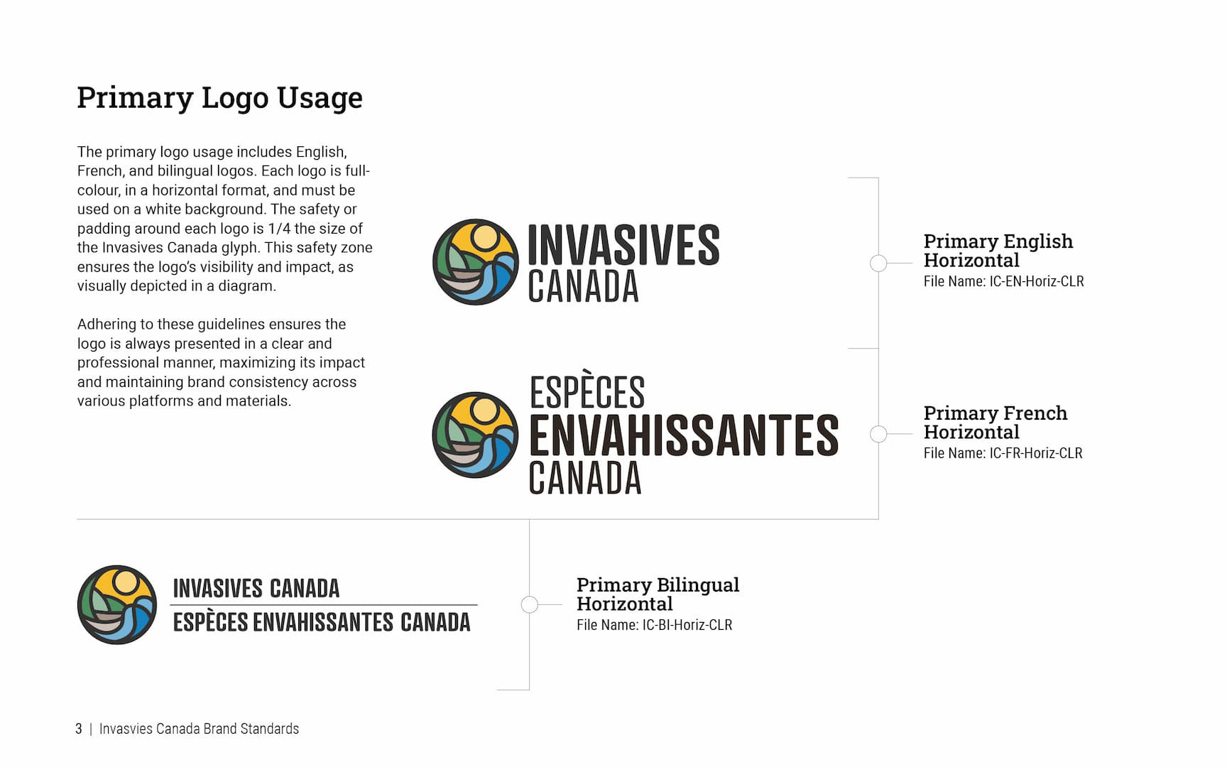
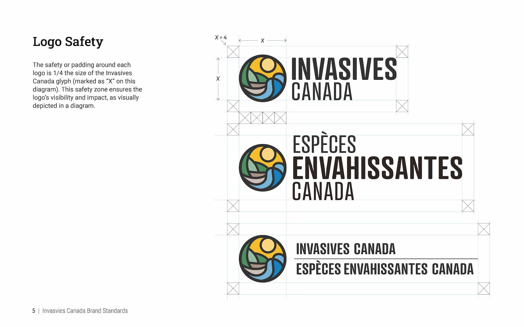
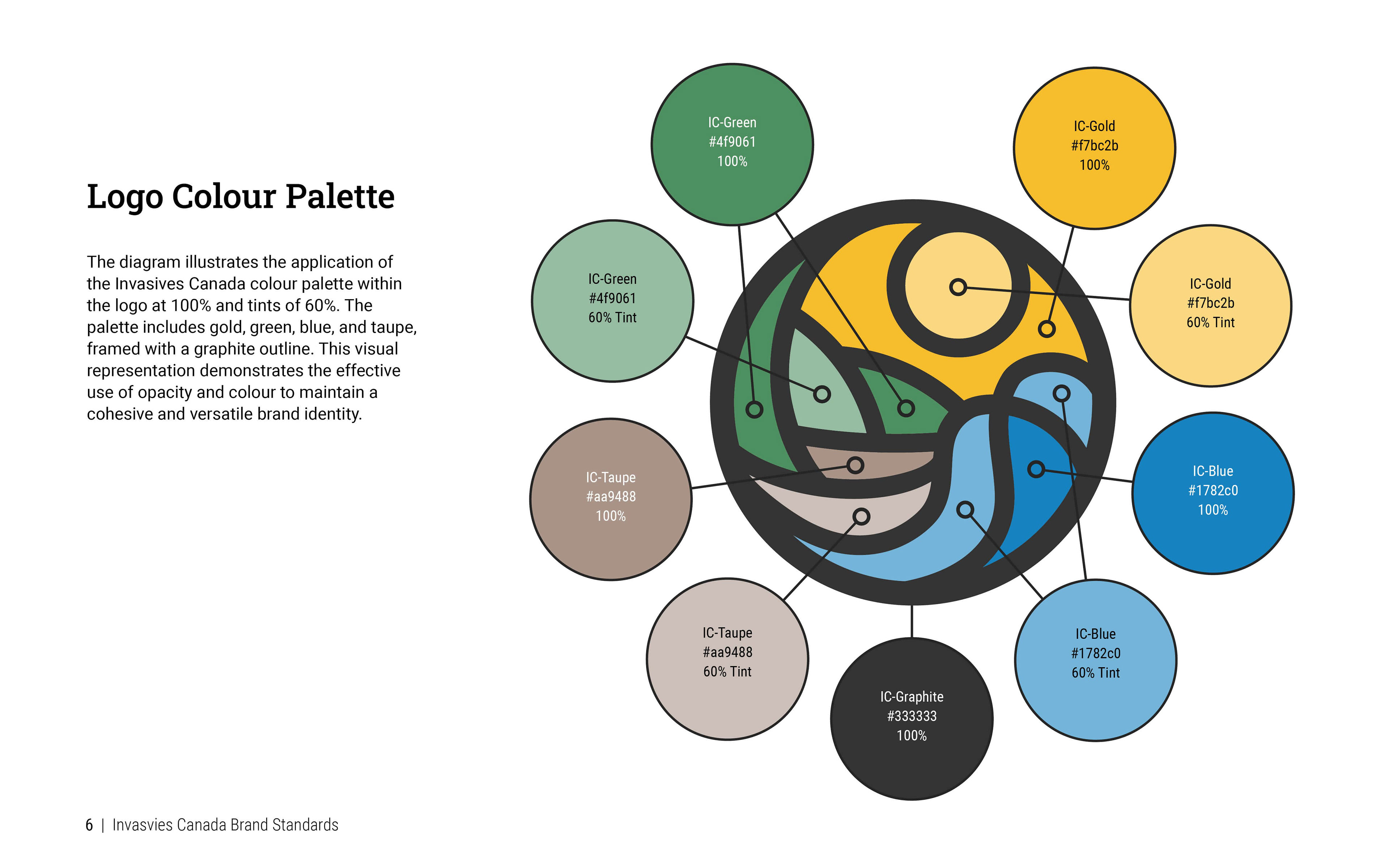
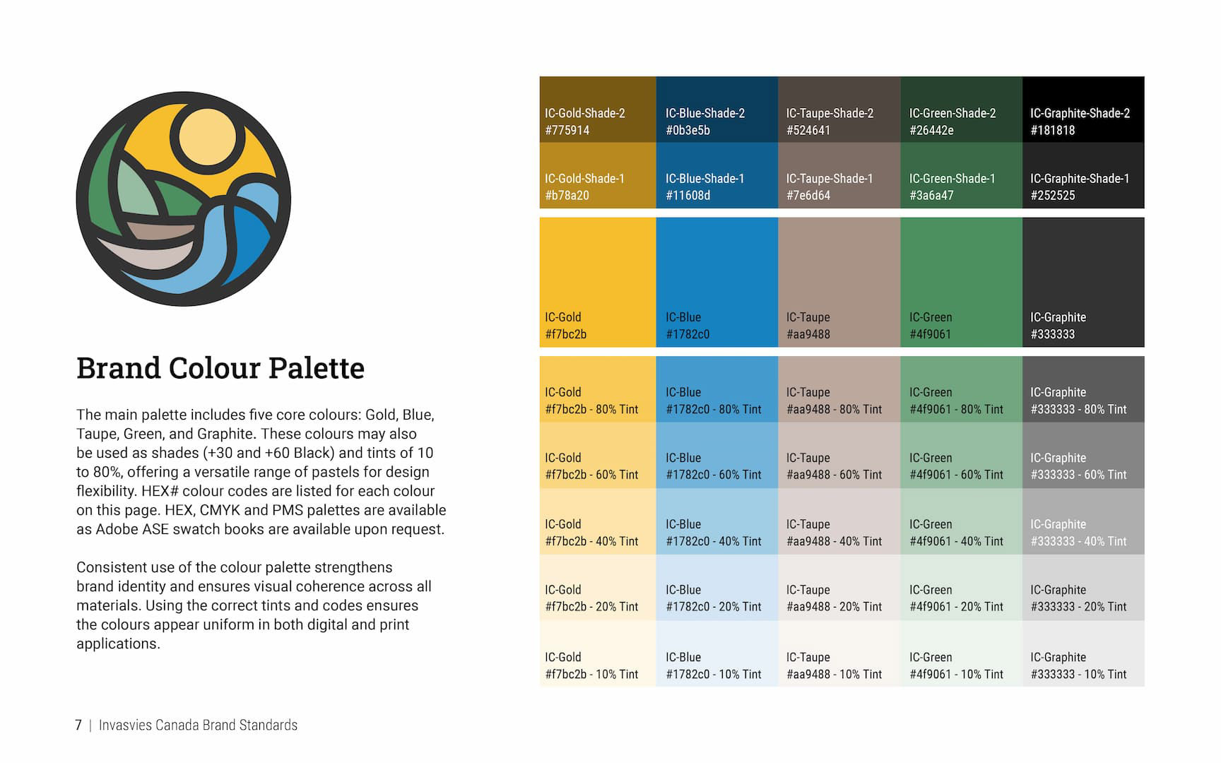
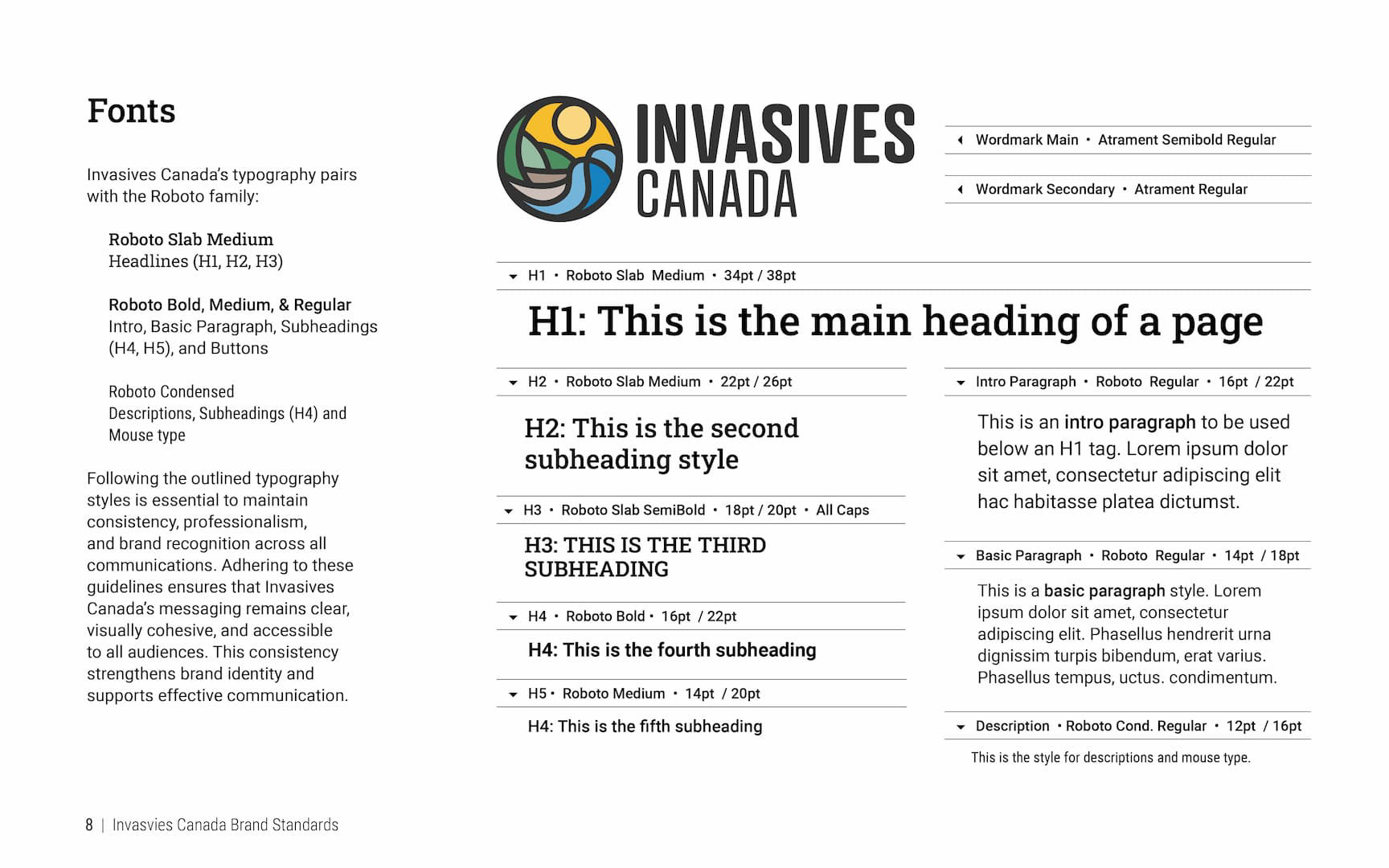
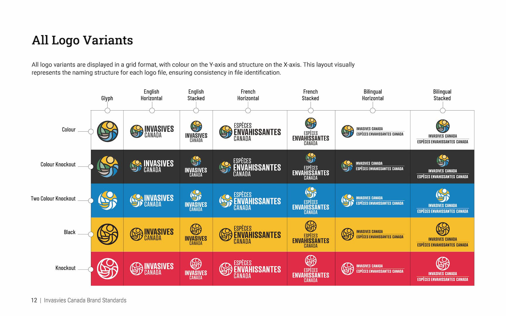
I led every stage: proposed the working name, designed the logo through concept development and focus group testing, and built a complete English, French, and bilingual identity system. The final logo suite covers seven format variants — horizontal, stacked, and glyph — across five colour treatments (full colour, colour knockout, two-colour knockout, black, and white knockout), producing a 35-file asset library organized for staff and production partners. Typography pairs Atrament (wordmark) with the Roboto family (system), with CMYK, RGB, and HEX values documented for both digital and print applications.
The graphic standards were built to be practical — designed for a team that needs to produce materials independently, not a creative department.
Invasives Canada Website
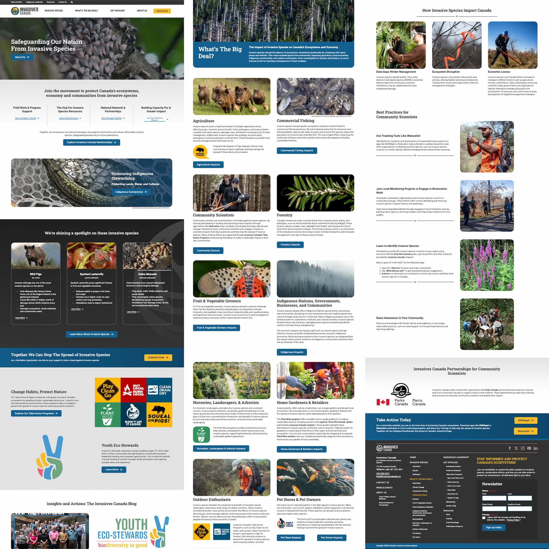

Youth Eco-Stewards
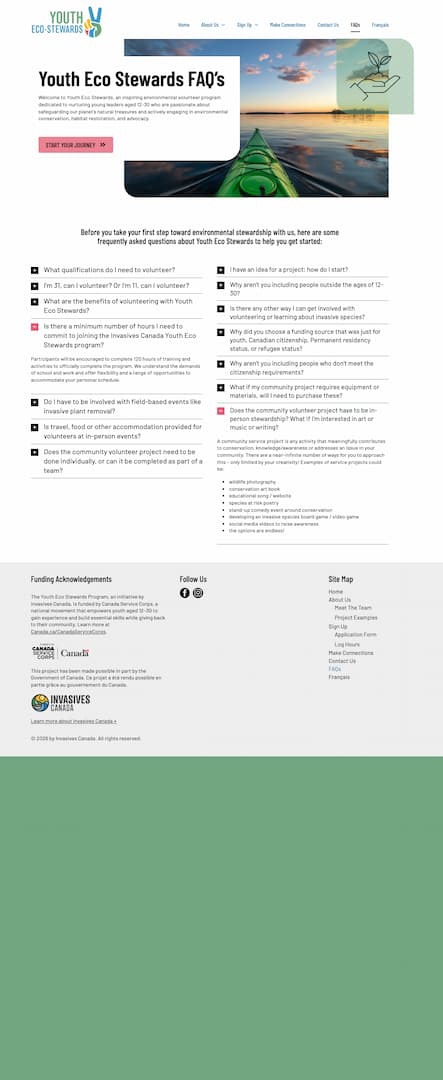
Youth Eco-Stewards is a national conservation skills program led by Invasives Canada and funded by Canada Service Corps, engaging youth aged 12–30 through stewardship projects, mentorship, and career development. When the program relaunched under a new name, the identity I originally built for the Youth Nature Keepers program was updated to carry forward into the new brand.
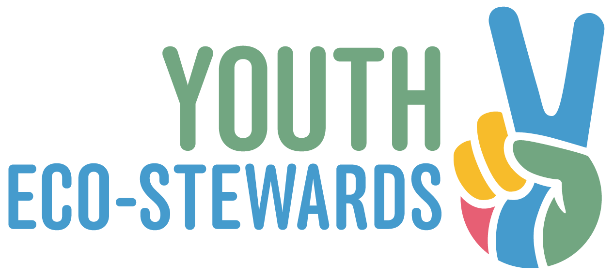
Documentary Video & Photography
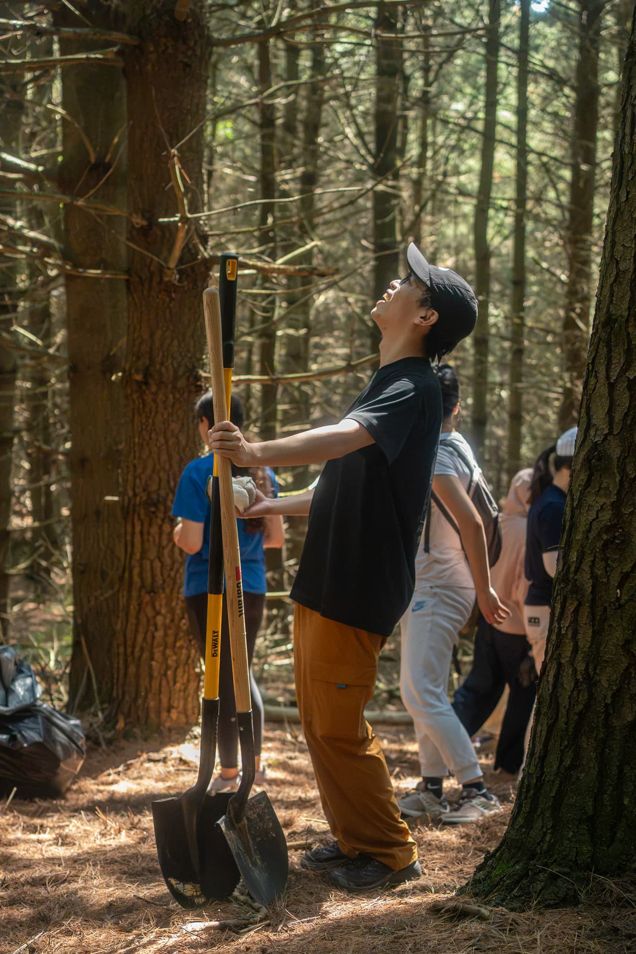
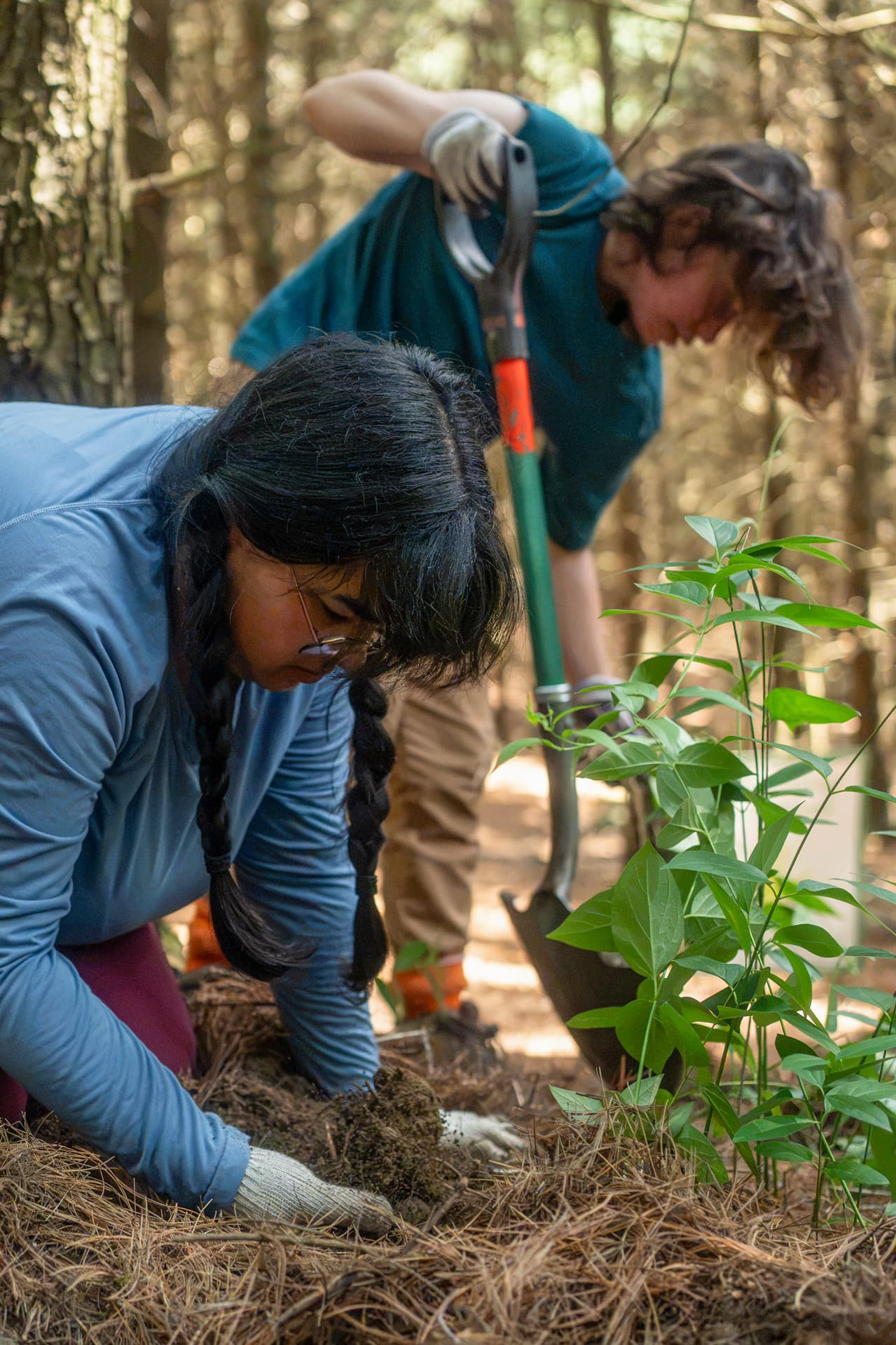
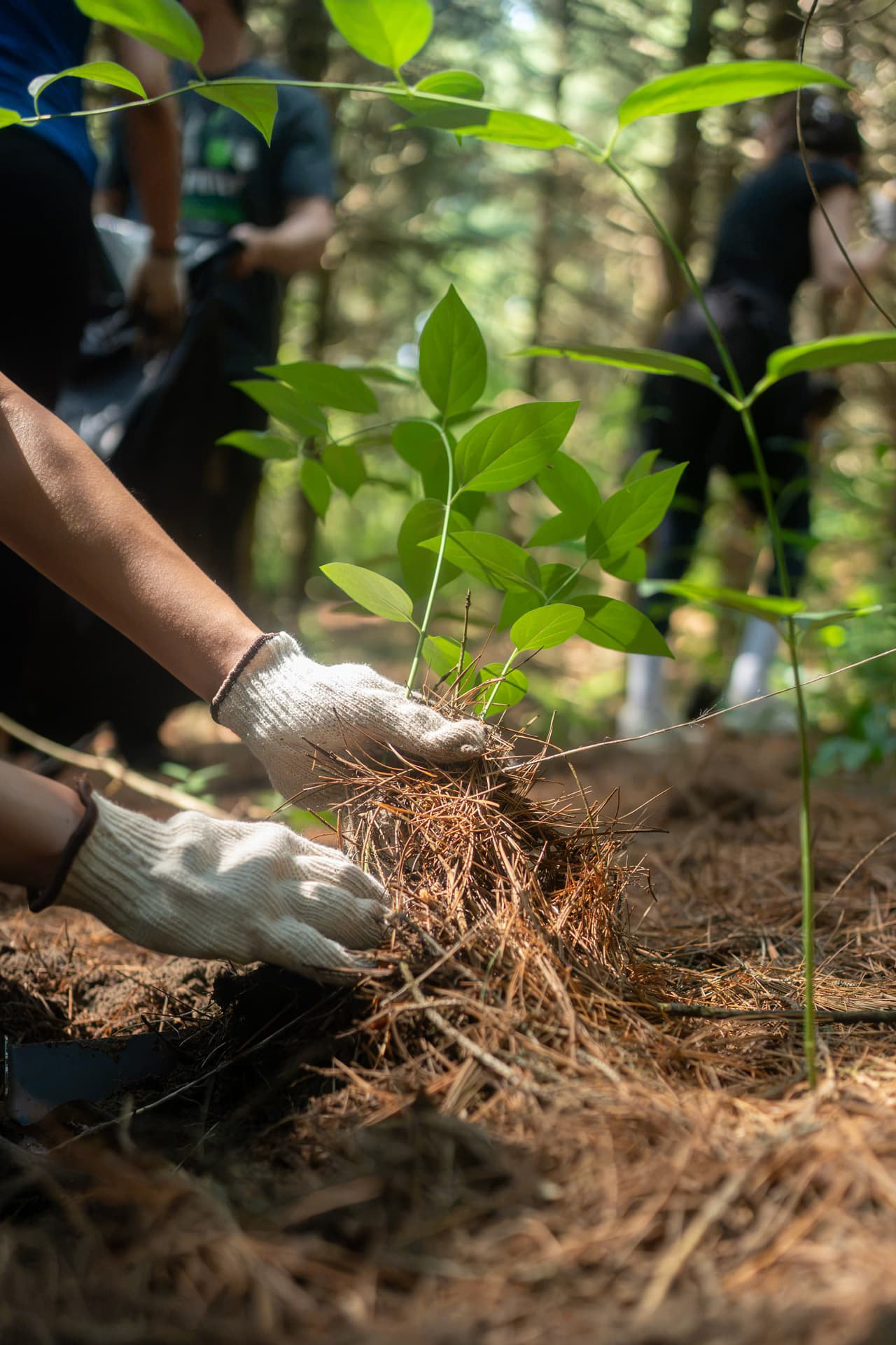
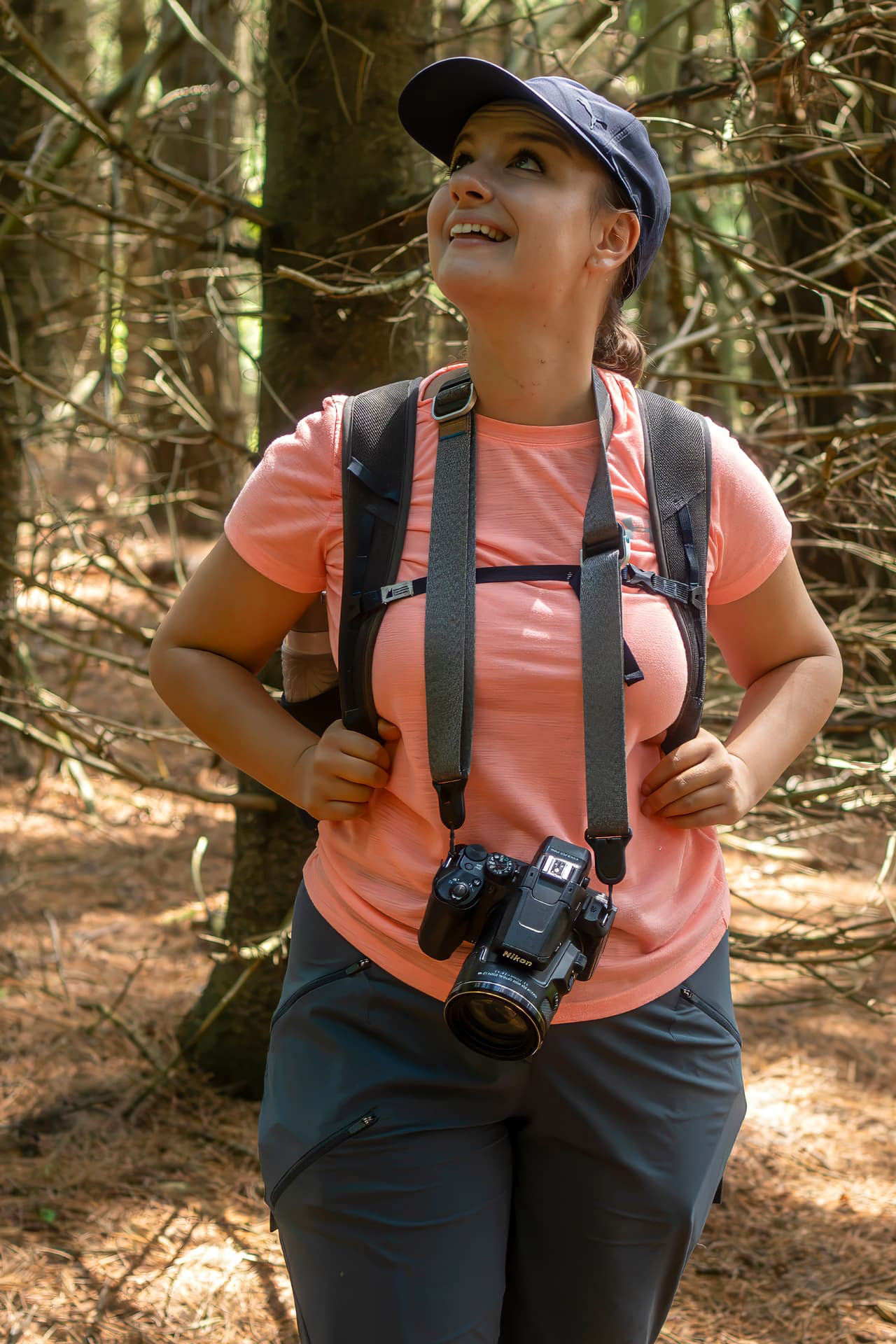
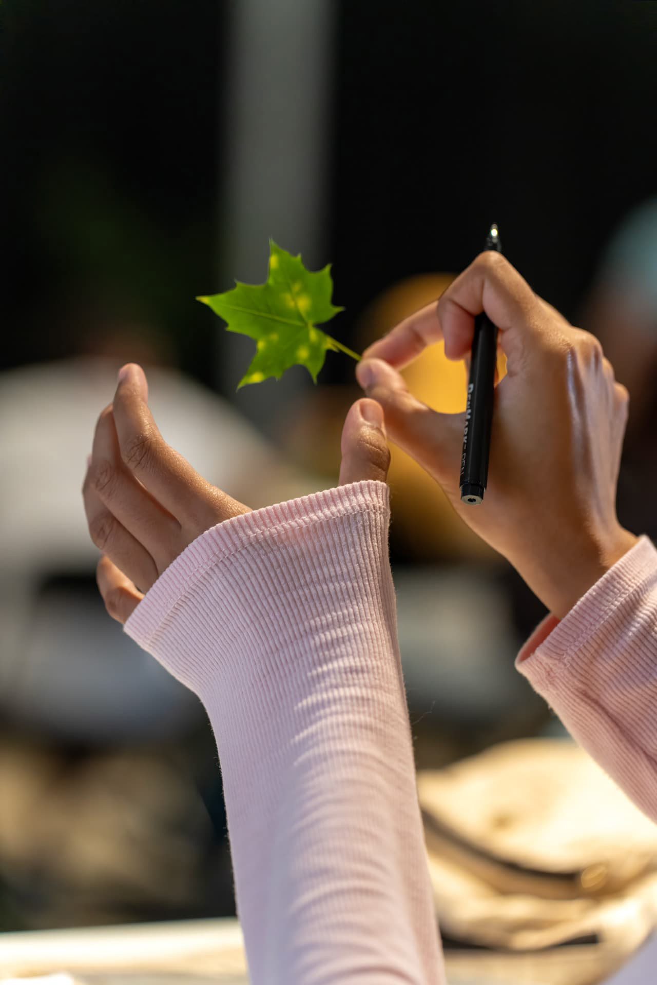
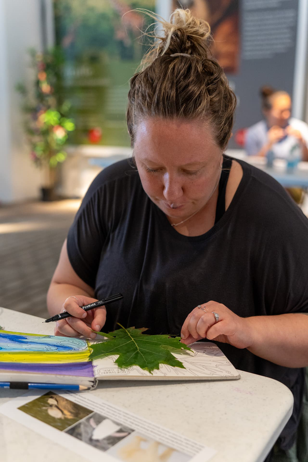
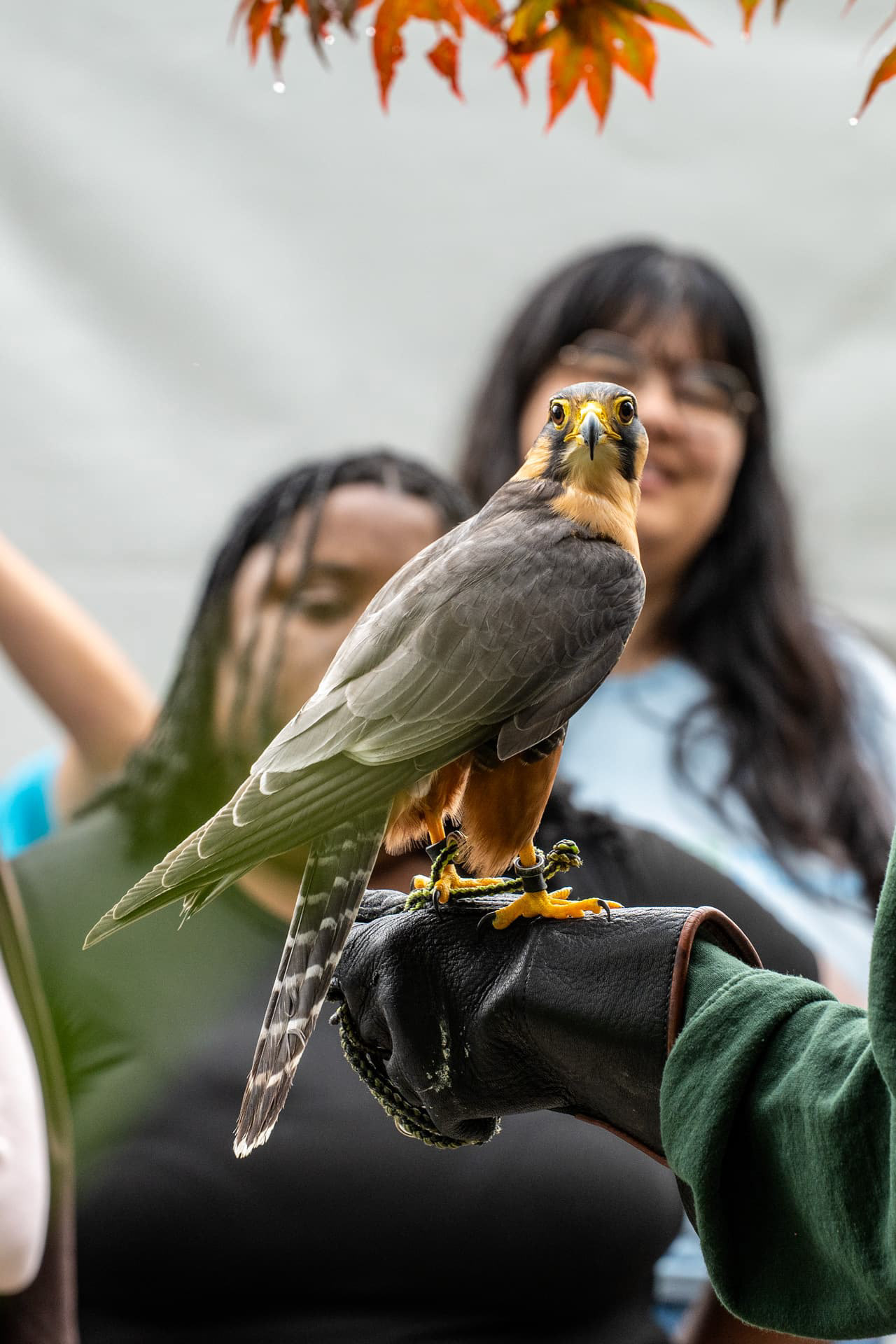
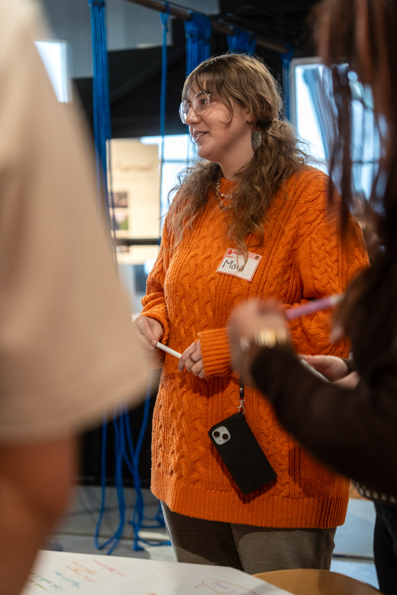
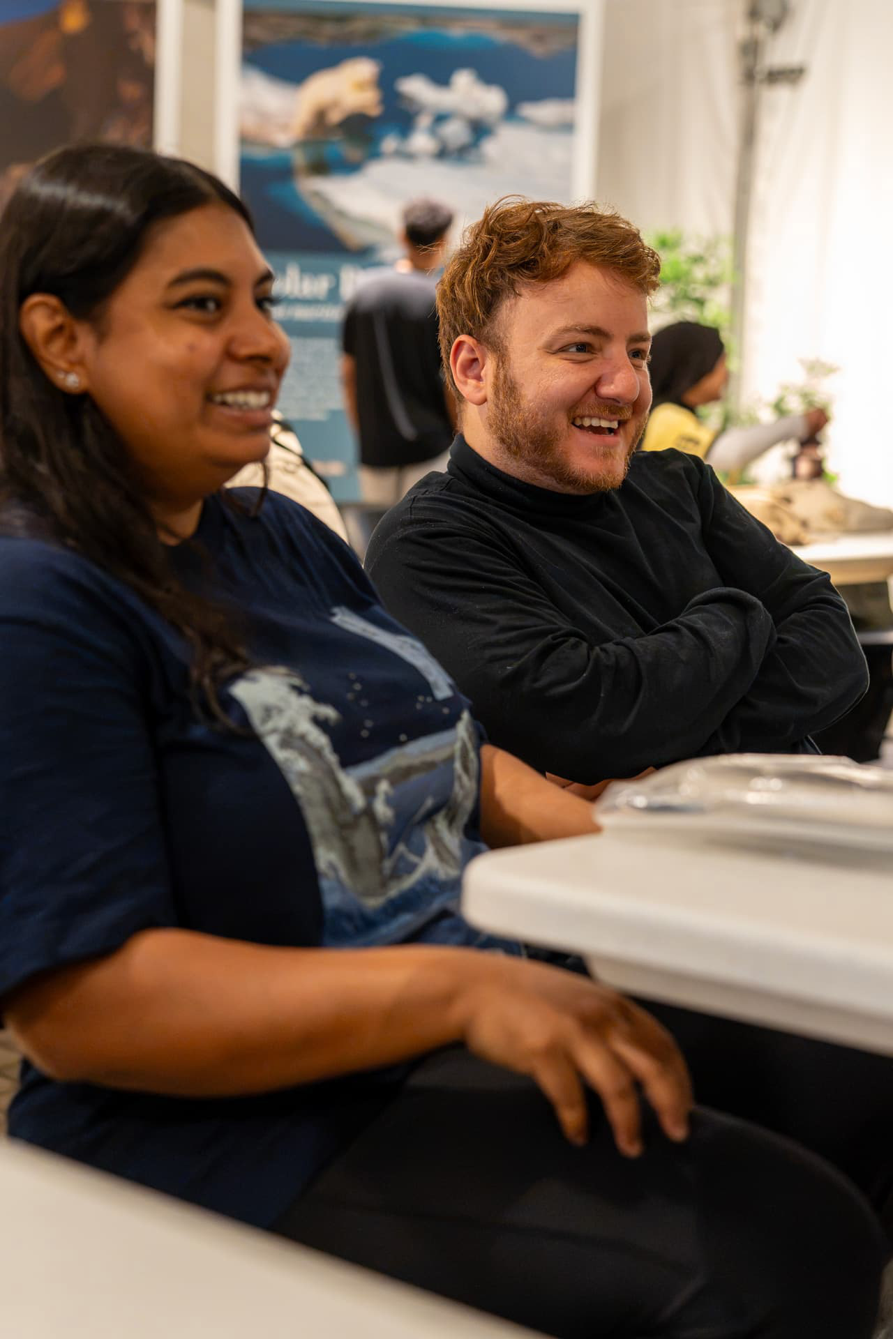
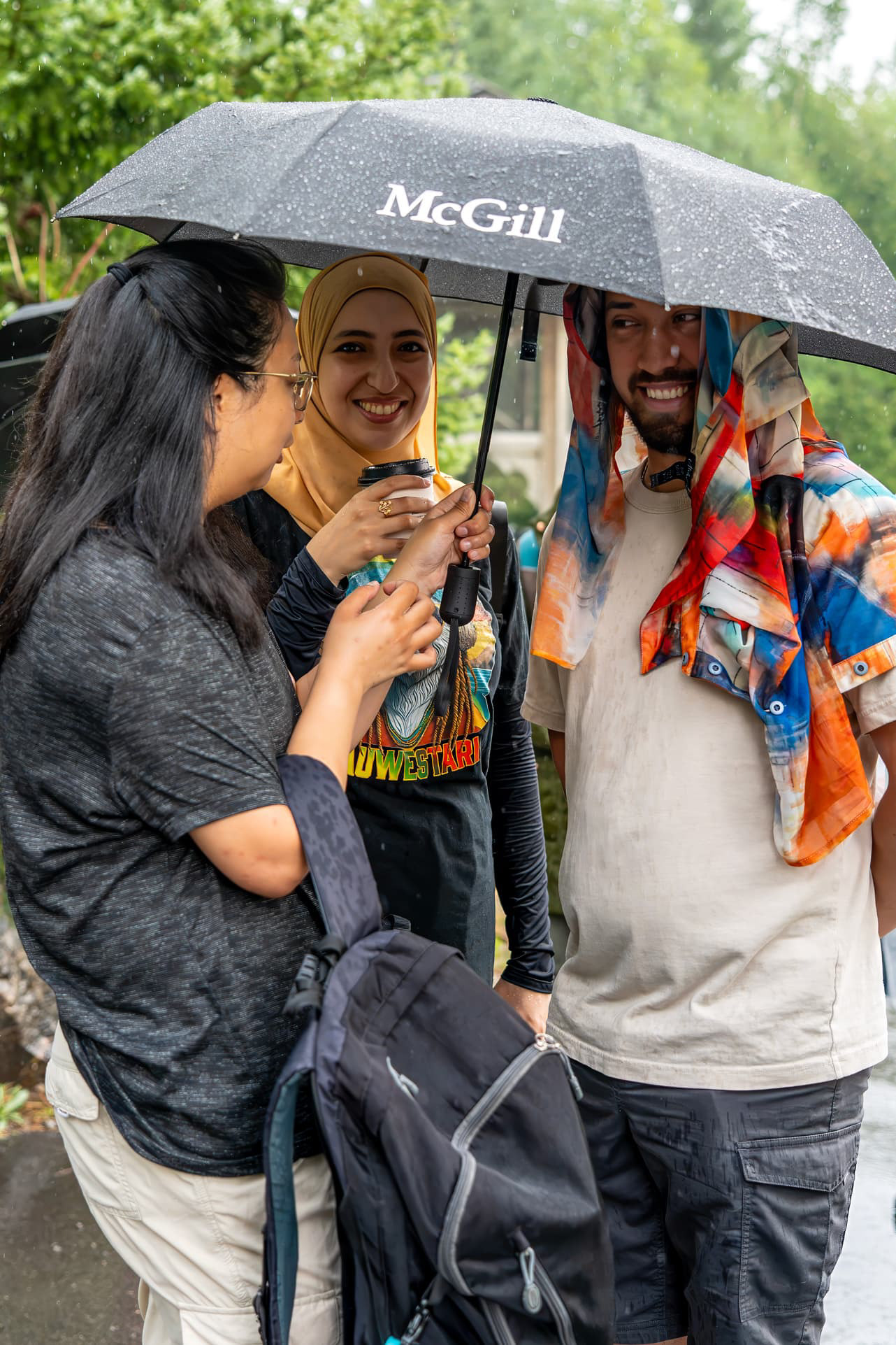
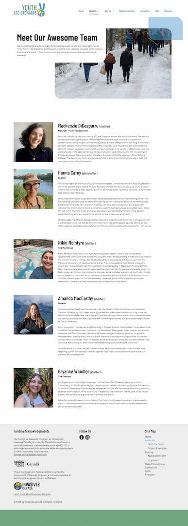
I lead video and photography production for Youth Eco-Stewards, documenting volunteers, coordinators and community partners during field trips, workshops, conferences and youth-led conservation projects across Canada. The work combines documentary interviews, observational footage, environmental portraits and event photography to show both what participants accomplish and what the experience means to them.
Working largely as a solo field producer, I manage the process from planning through delivery: developing story angles, coordinating locations and participants, conducting interviews, capturing stills and supporting footage, and editing the material into long-form stories, field guides and short social content. Captions and transcripts are reviewed for accuracy, speaker identification and accessibility before publication.
The resulting content gives Invasives Canada a growing visual library that supports recruitment, program reporting, partner communications and public outreach. More importantly, it puts the voices and experiences of young volunteers at the centre of the program—turning individual field experiences into stories that can reach audiences well beyond the event itself.





Print and outdoor collateral draw on an illustrated figure group and biodiversity character system developed by a colleague at Invasives Canada. Directing their integration — scale, colour, cropping across formats — was the design work: a two-sided tent wall and teardrop flags (pink and gold colourways) at outdoor scale; a six-panel brochure and recruitment poster at print scale. All pieces lead with the call to action for youth 12–30 and point to EcoStewards.ca.
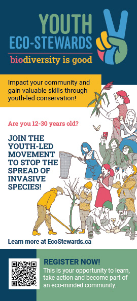
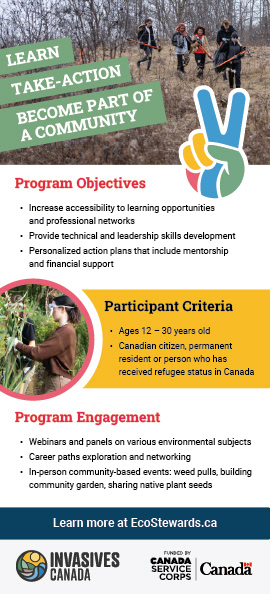
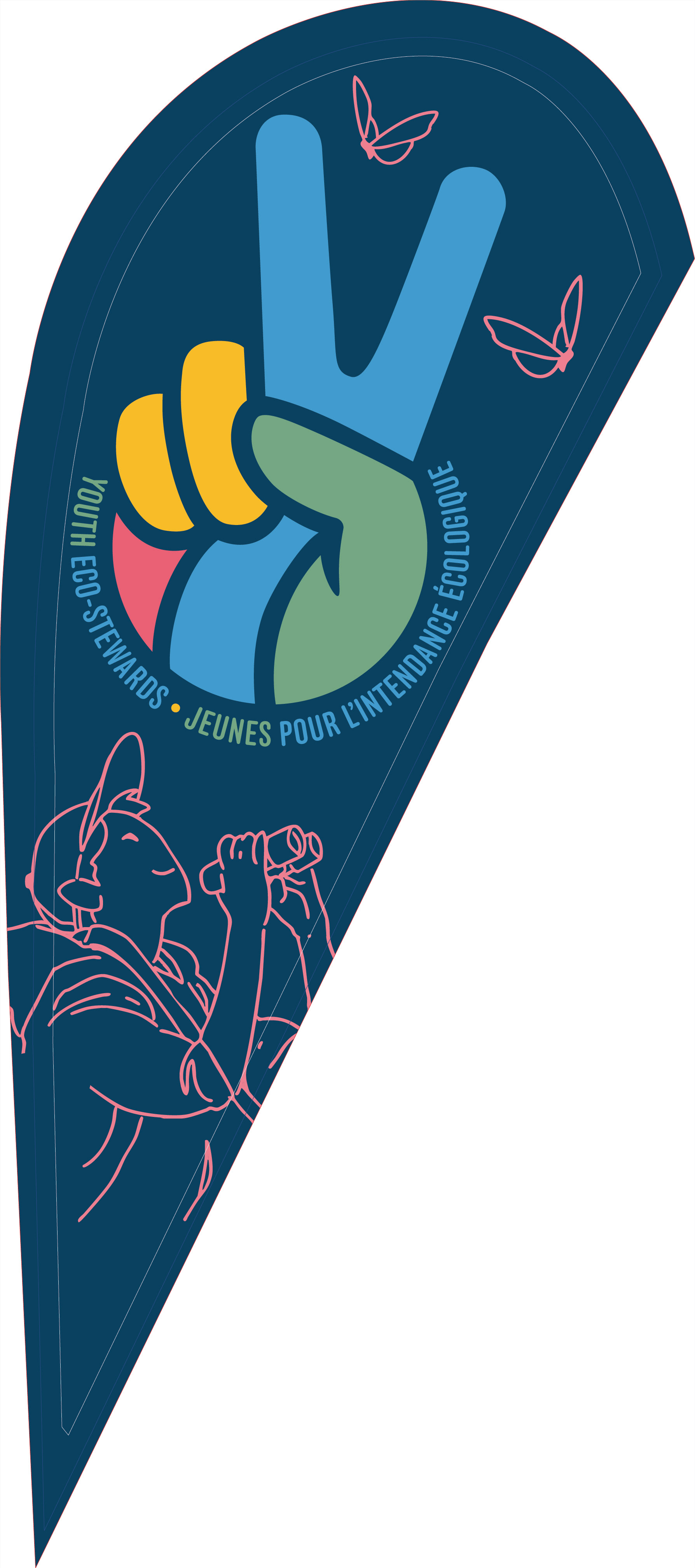
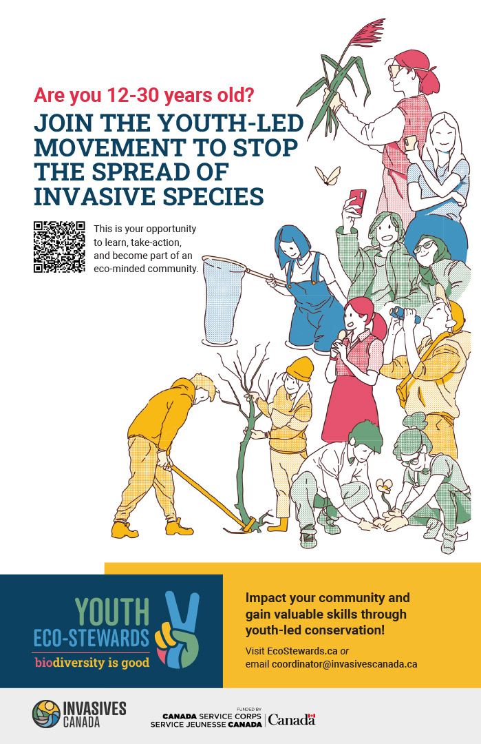
The identity centres on a multicolour peace-hand mark — four fingers in blue, yellow, green, and pink — readable as a peace sign, a victory V, and a Y for youth simultaneously. The tagline "biodiversity is good · c'est bon la biodiversité" runs bilingual throughout. English and French wordmarks were developed as separate primaries, giving regional coordinators the right mark for their context rather than forcing a single bilingual lockup everywhere.
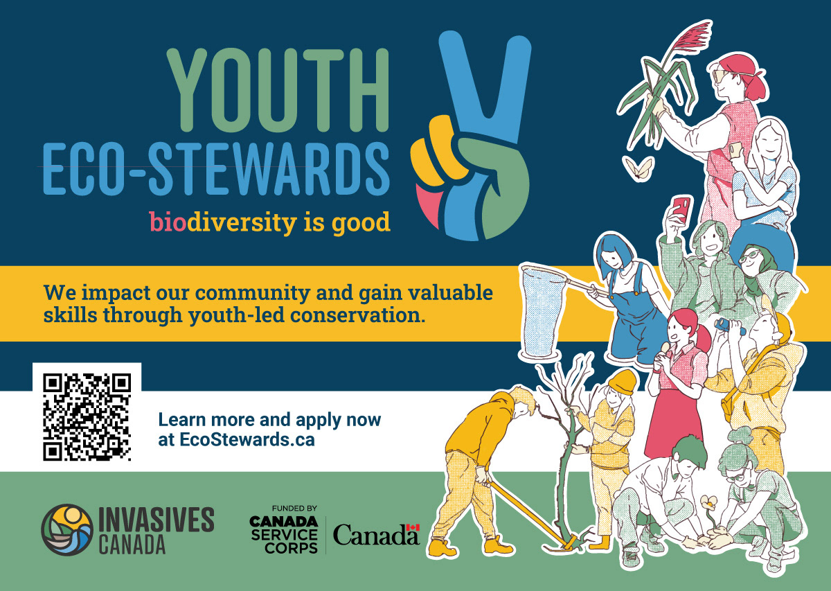
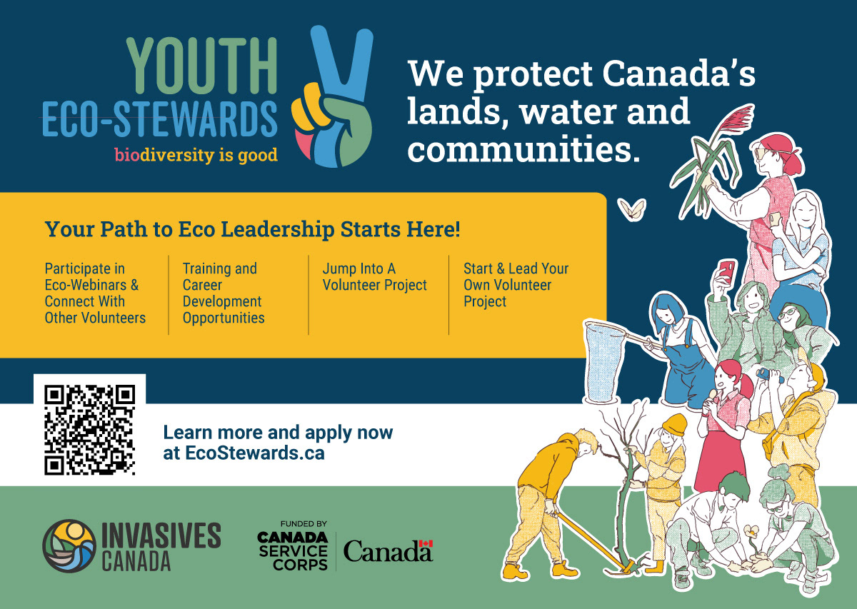
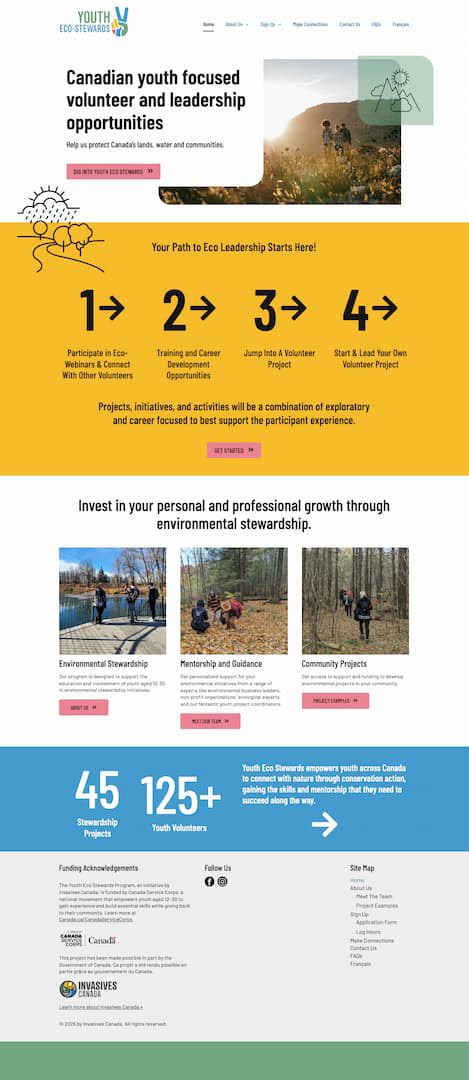
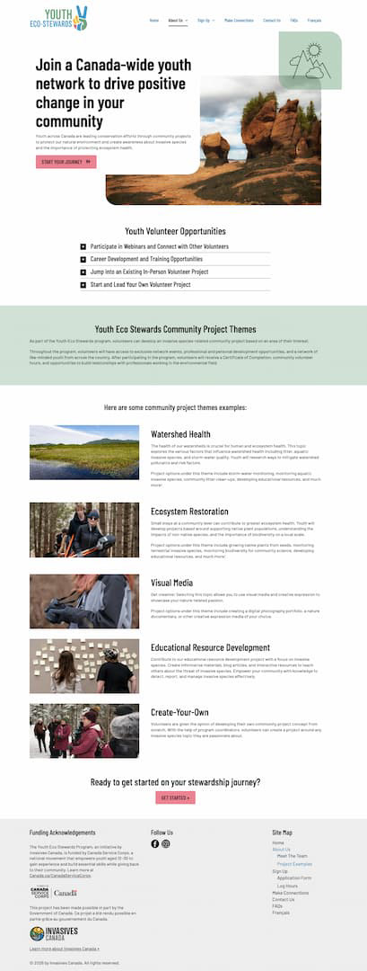
Website design structured the four-step participant journey and the community project themes — Watershed Health, Ecosystem Restoration, Visual Media, Educational Resource Development, and Create-Your-Own — to help prospective volunteers picture where they fit. A national mini-doc series produced for social channels puts individual youth and their projects on camera, extending the program's reach well past what print can do.


Wild Pigs Canada
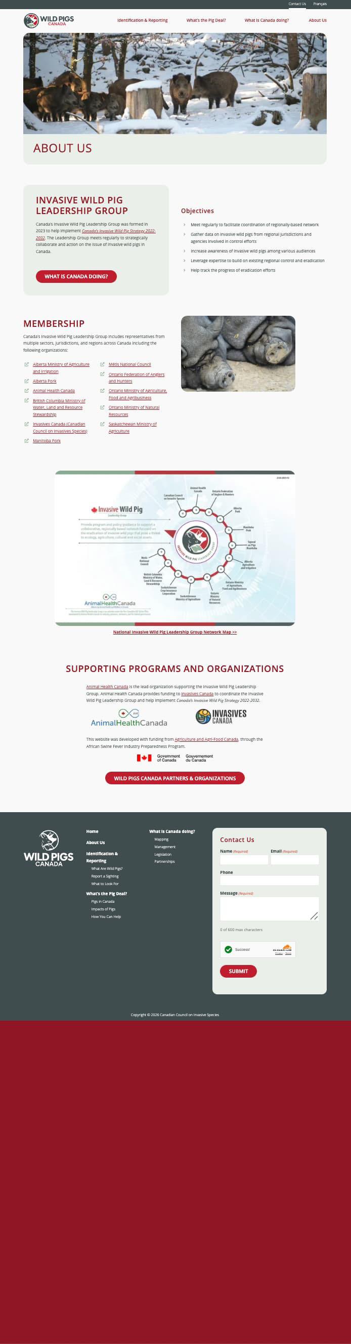
Wild Pigs Canada is a national initiative managed by Animal Health Canada to address the growing threat of invasive wild pigs across Canadian farmland and ecosystems. Invasives Canada serves as the delivery partner.

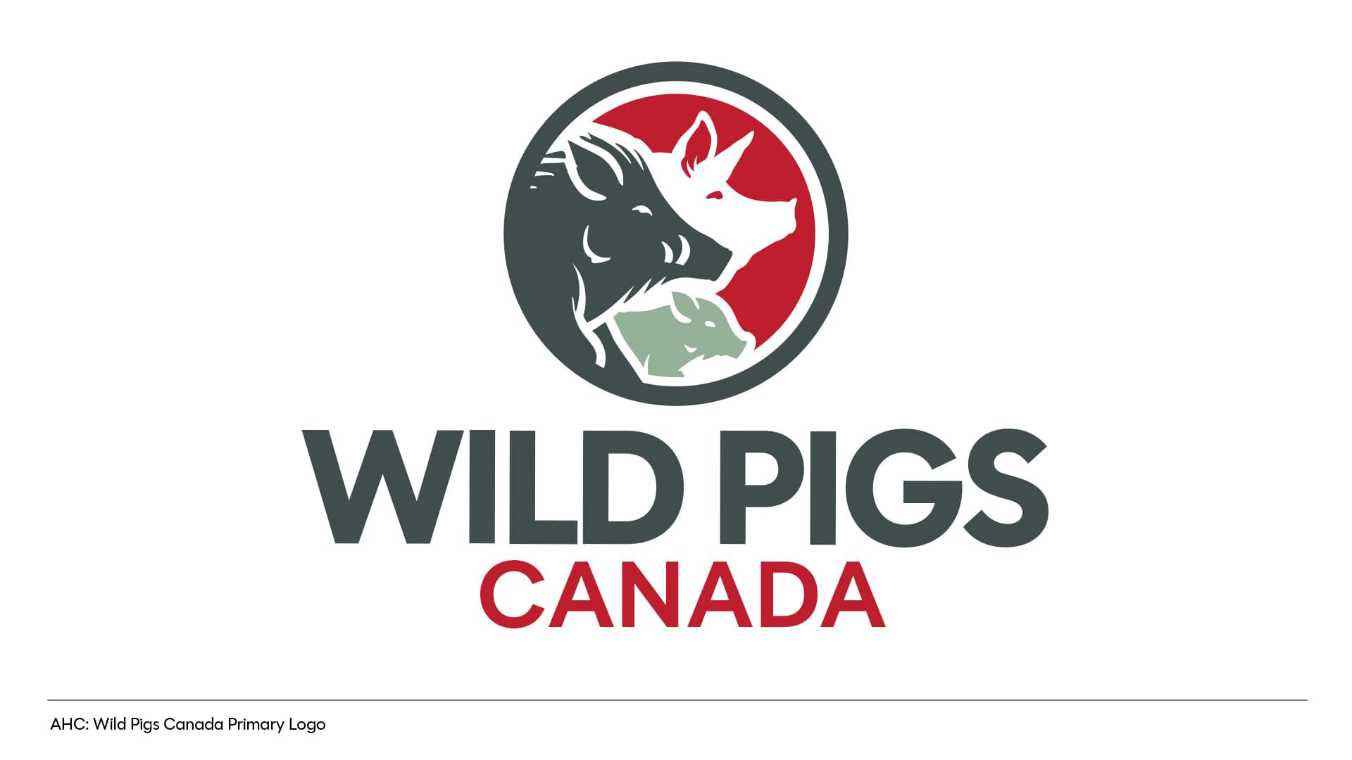
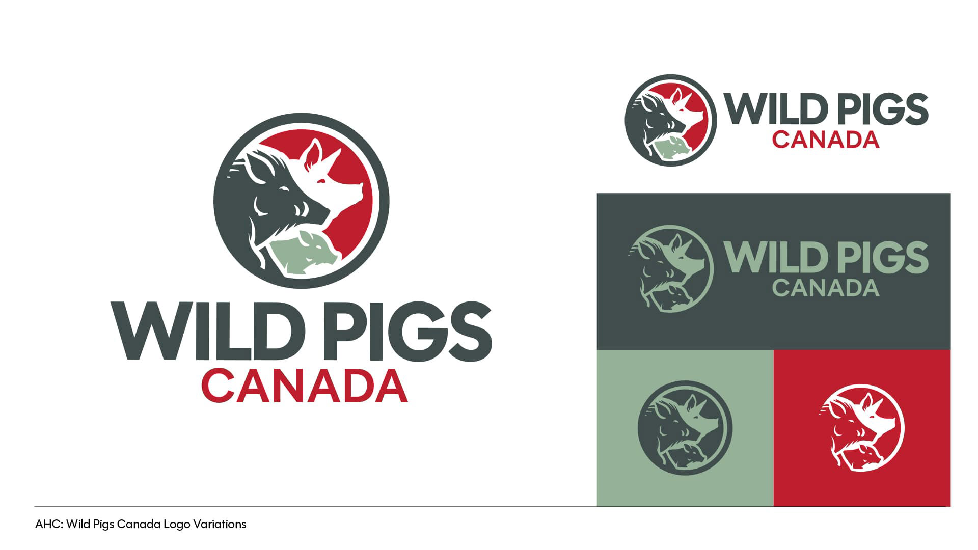
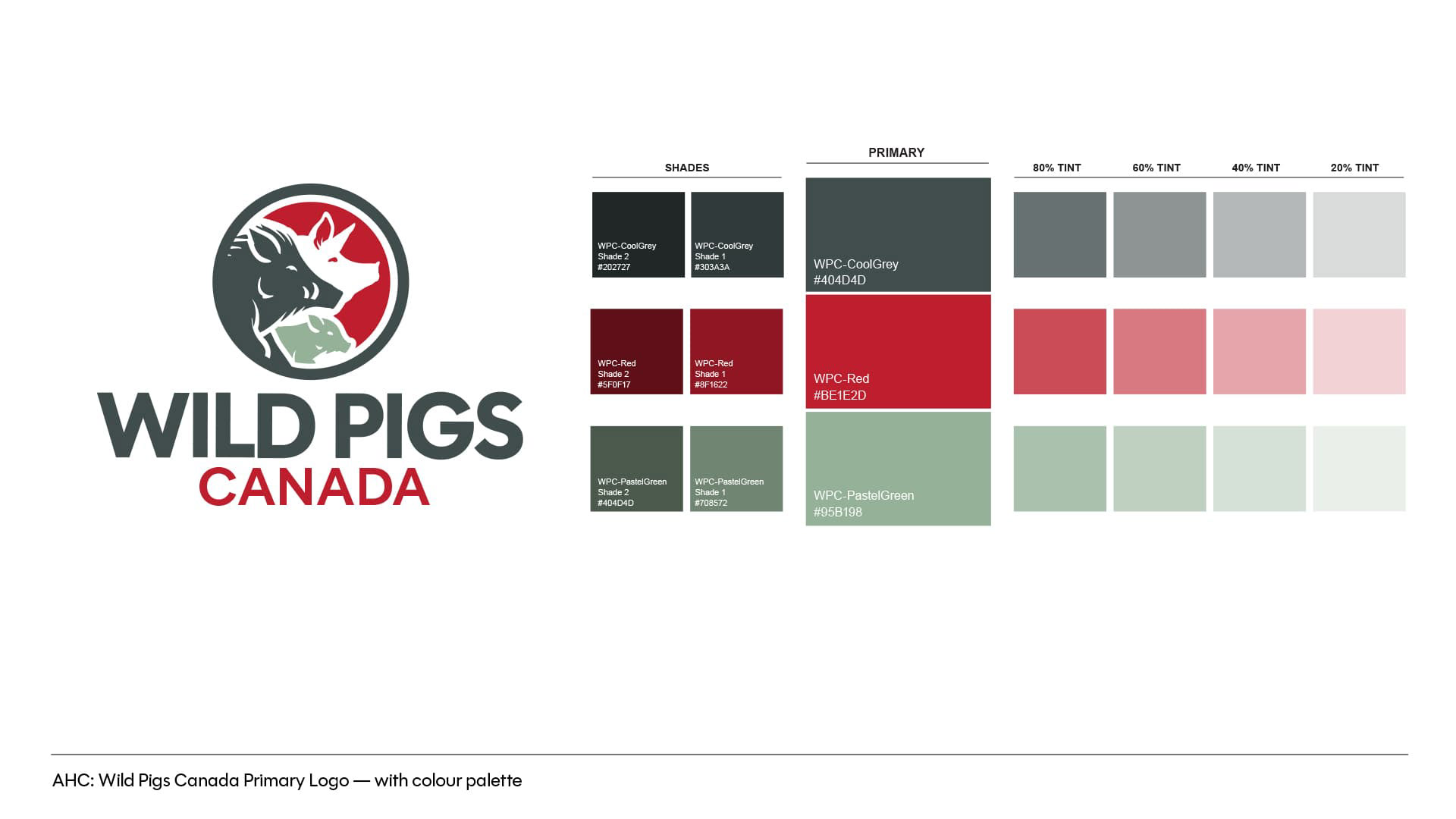
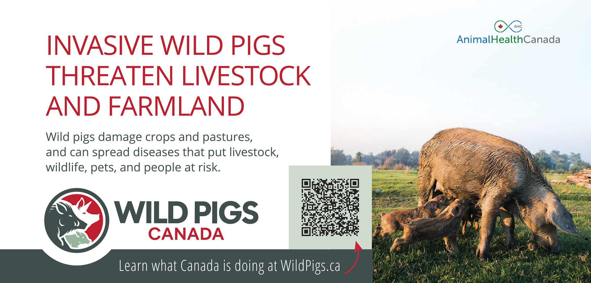
I designed the full brand identity: a logo built around an illustrated glyph that combines wild boar, domestic pig, and piglet in a single circular mark — representing the three forms an invasive pig can take on the Canadian landscape. The palette (Cool Grey, Red, Pastel Green) stands out in an agricultural context, deliberately avoiding the commodity green typical of conservation brands. The system pairs Polymath Display Semibold for the wordmark with Open Sans across the web.
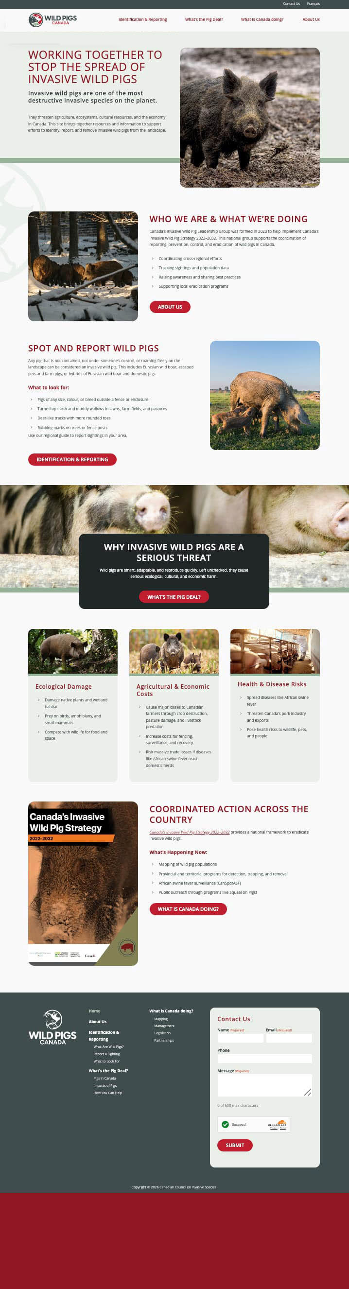
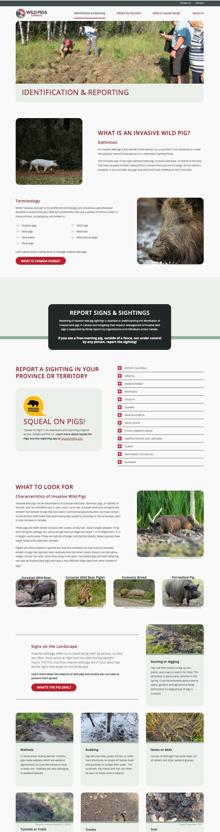
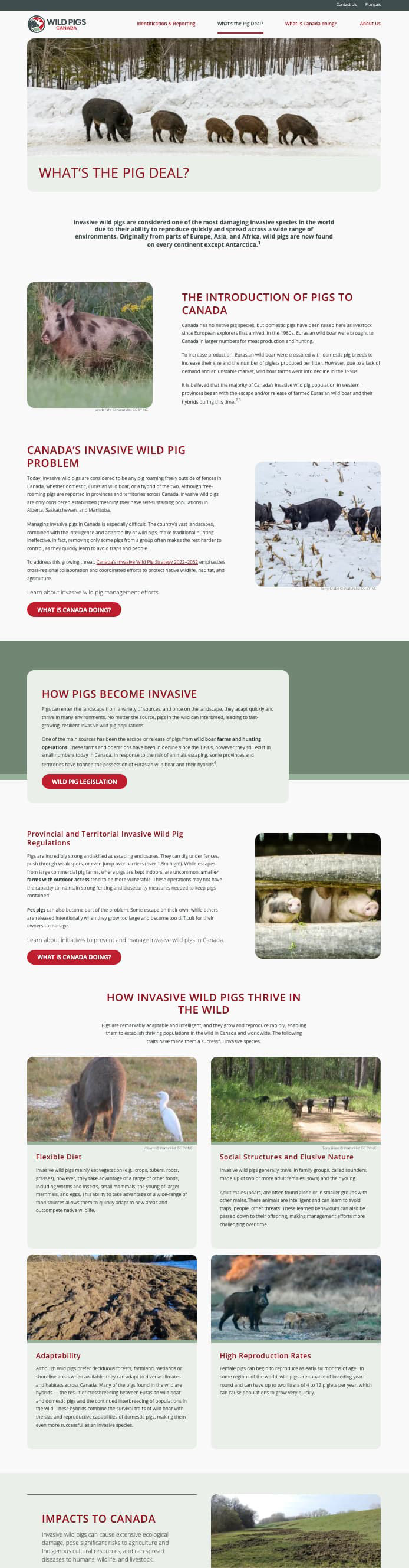
I designed WildPigsCanada.ca in Figma and directed the WordPress build and launch — a content-rich, multi-section site covering identification and reporting, the ecological threat, Canada's Invasive Wild Pig Strategy 2022–2032, and regional management activity. Reporting is integrated directly into the Identification & Reporting section through Squeal on Pigs, with province-by-province pathways.
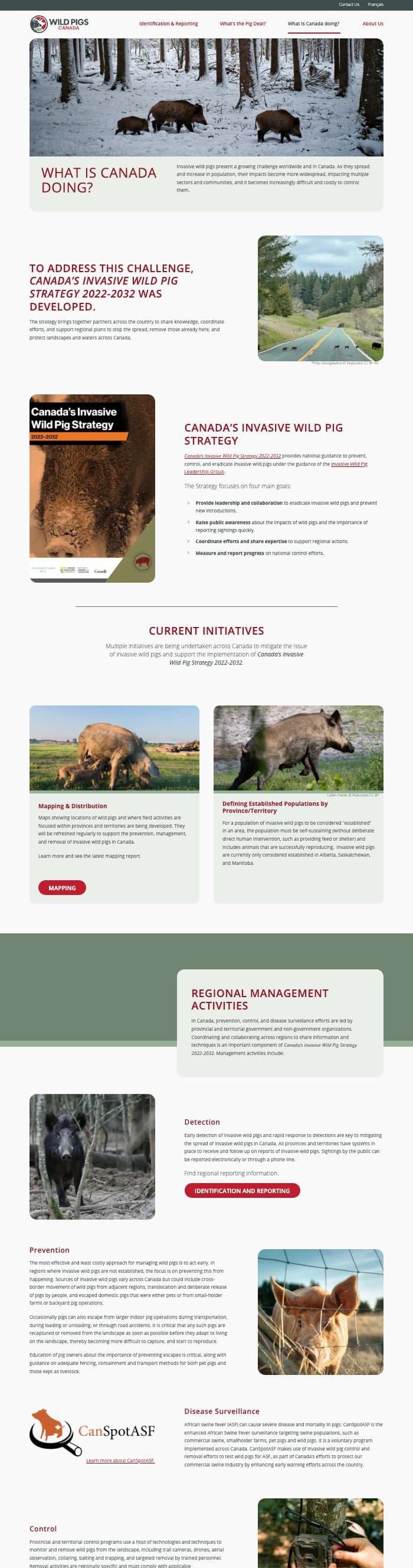
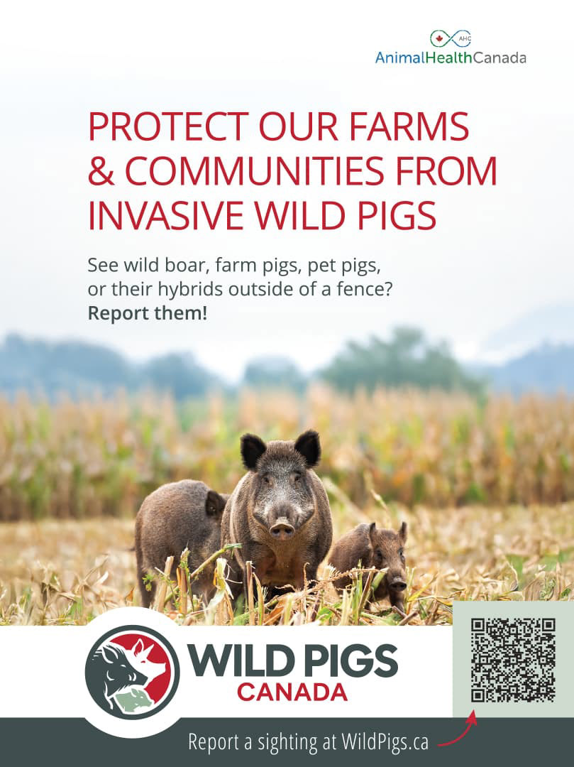
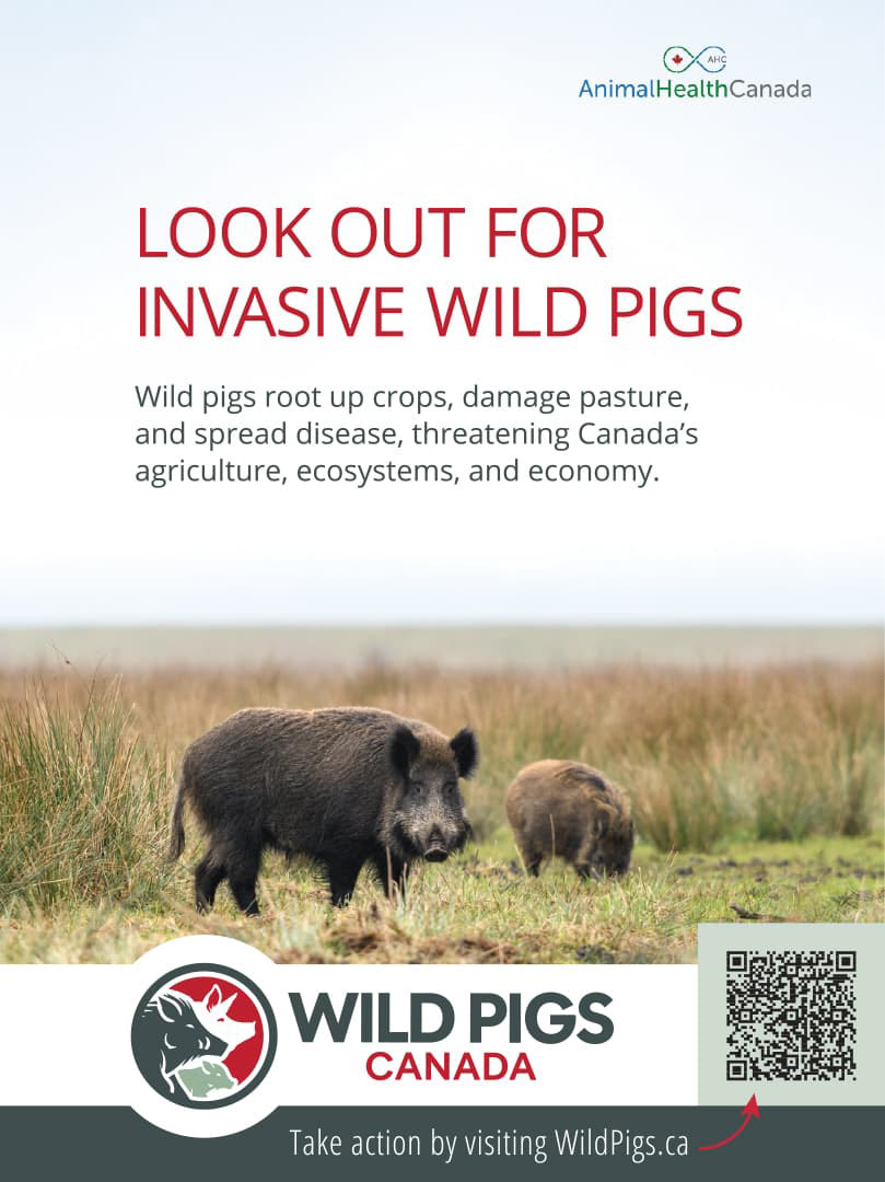
The brand extended into a three-publication print ad campaign commissioned by Animal Health Canada, each ad carrying a message tailored to its readership:
Ecological Destruction (Western Producer): "Look out for invasive wild pigs" — leading with landscape and crop damage
Community Reporting (Farmtario): "Protect our farms & communities" — a direct call to report sightings
Livestock & Health (The Canadian Cattlemen): "Invasive wild pigs threaten livestock and farmland" — disease risk and economic exposure

Plant Wise & Grow Me Instead - Brand Refresh
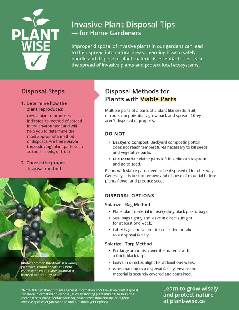
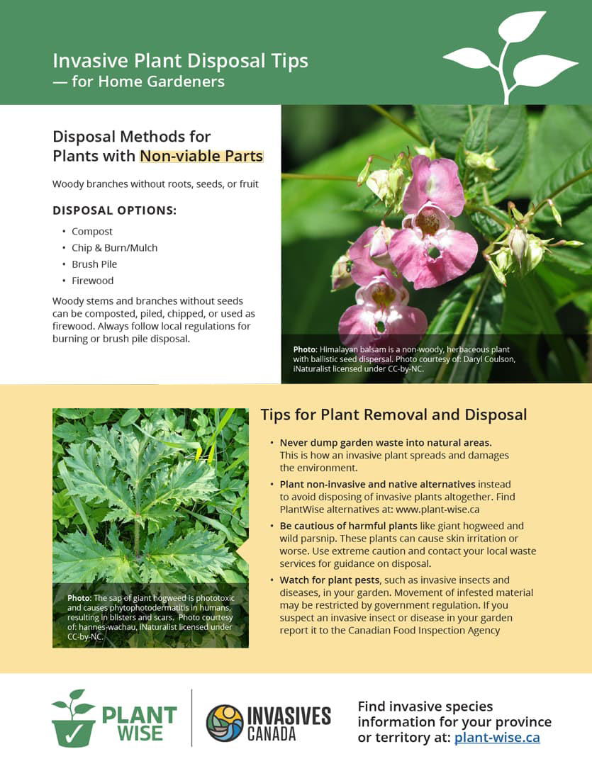
Plant Wise and Grow Me Instead are ECCC-funded programs supporting the ornamental horticulture industry — gardeners, landscapers, and retailers — in transitioning away from invasive plant species. Both programs carried established identities with real sector recognition, so the mandate was modernization without disruption: sharpen the visual language, align with the refreshed Invasives Canada brand, and meet AODA accessibility standards without undermining the equity partners had built over years of outreach.
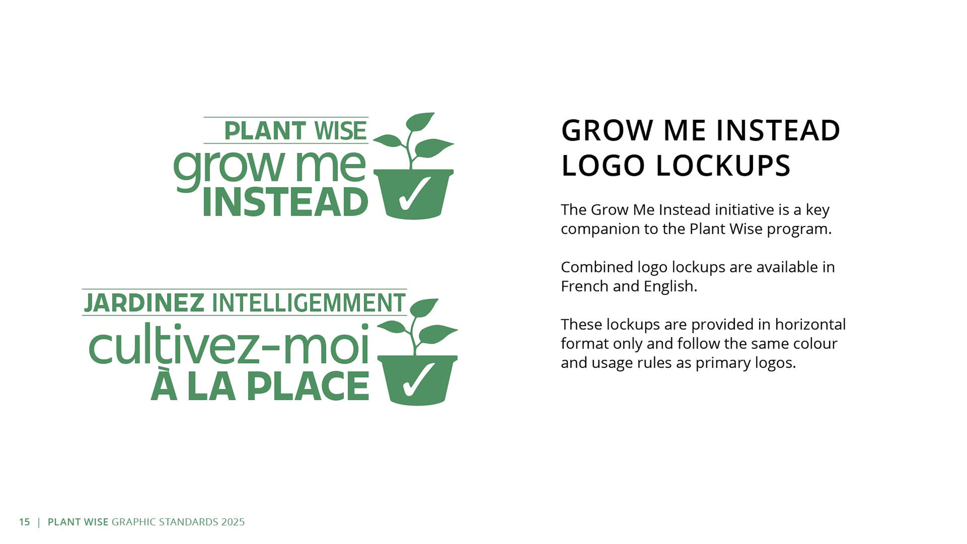
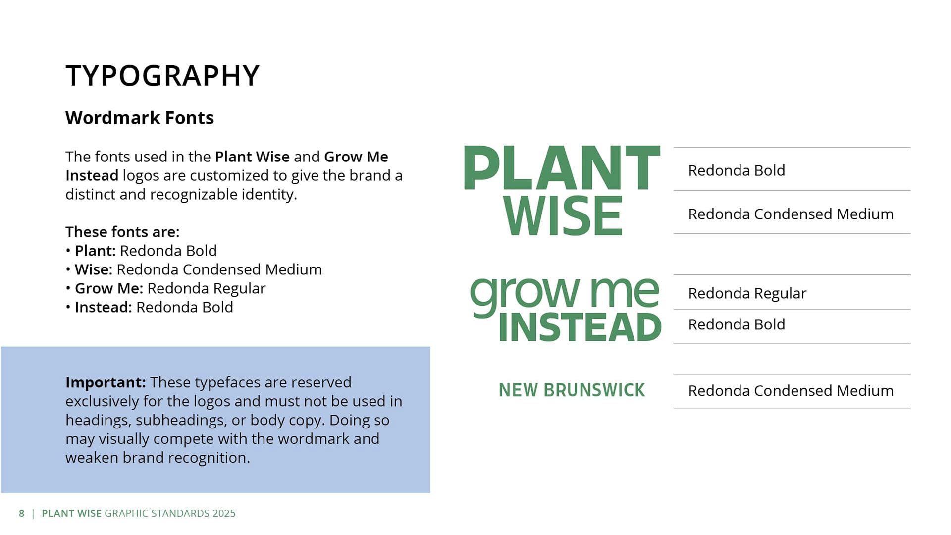
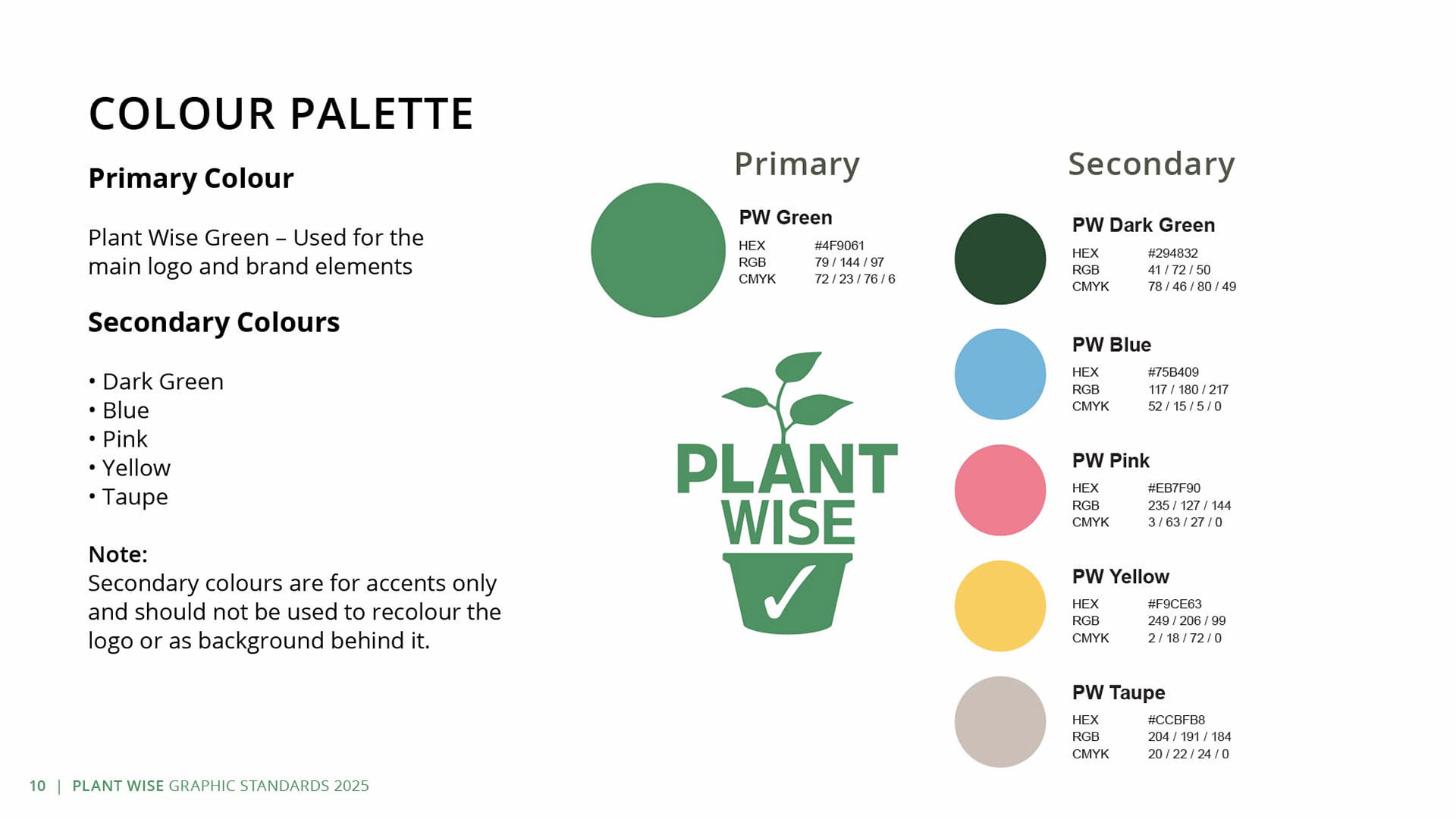
The Plant Wise refresh focused on three areas. The program green was deepened to improve contrast against white backgrounds — a direct AODA compliance requirement. The wordmarks were refined using the Redonda typeface family: Bold for "PLANT" and "INSTEAD," Condensed Medium for "WISE," and Regular for the lowercase "grow me" in Grow Me Instead. The variation in weight and width across the two wordmarks creates distinct visual personalities while keeping the suite typographically cohesive. Body copy across all collateral uses Open Sans — Bold for headings, SemiBold for subheadings, Regular for body — providing a clean, accessible system across print and digital formats.
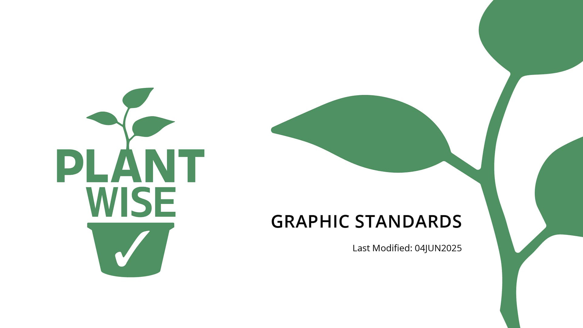
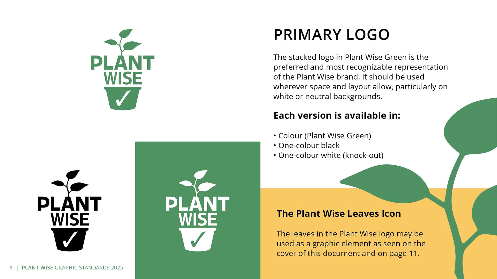
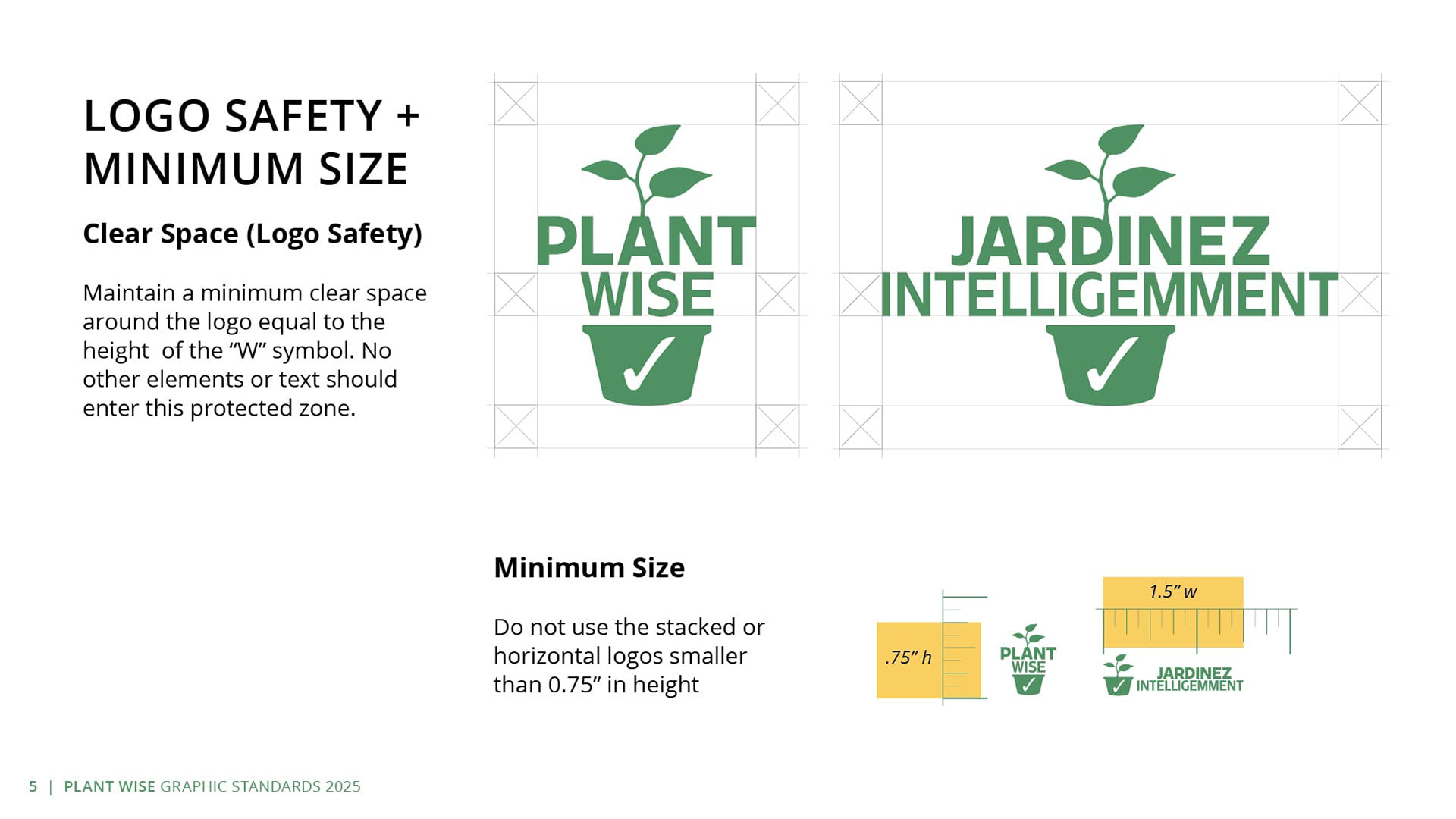
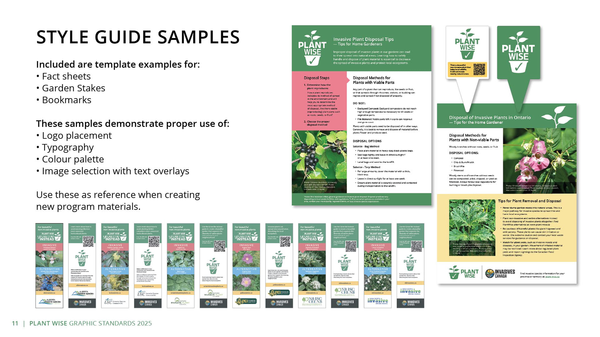
The leaf graphic was also codified as a standalone brand element, giving designers and partners a flexible asset for social tiles, co-branded applications, and signage beyond the full wordmark lockup. Complete standards were developed in English, French (Jardinez Intelligemment), and bilingual formats, with defined minimum sizes and safety zones calibrated for the small-format applications both programs rely on — nursery tags, seed packets, retail signage, and printed bookmarks.

Squeal on Pigs - Media Kit
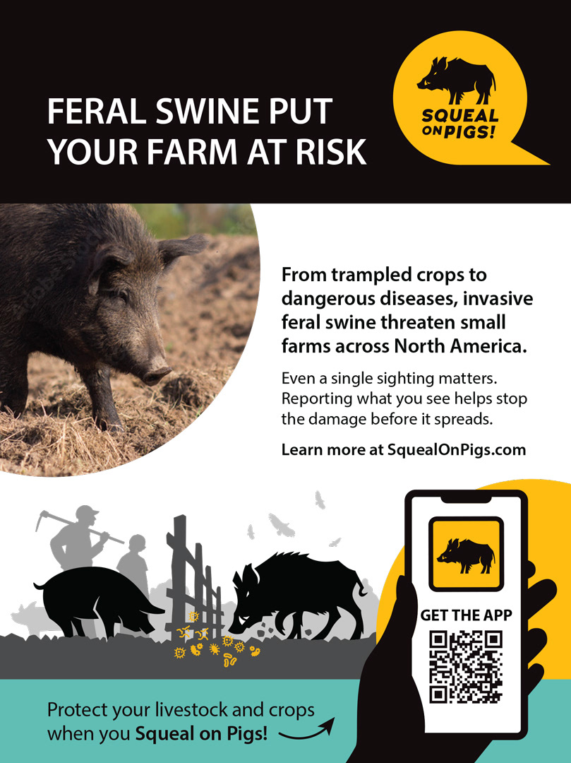
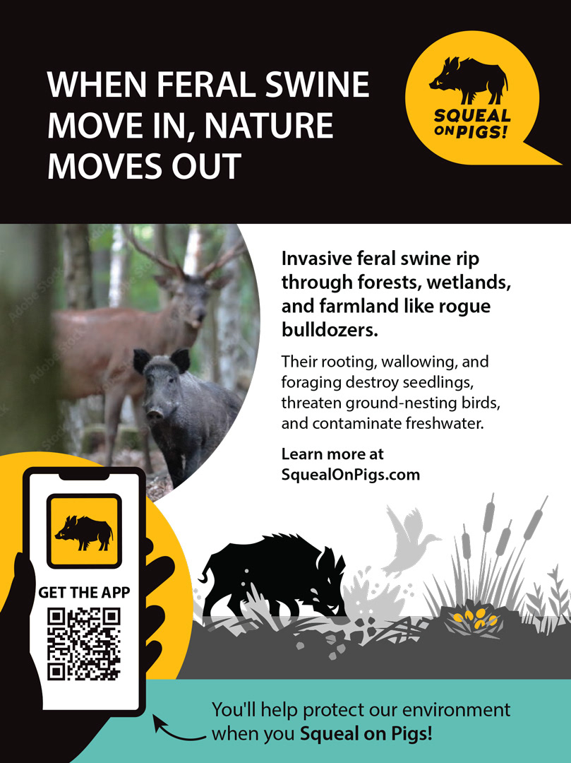
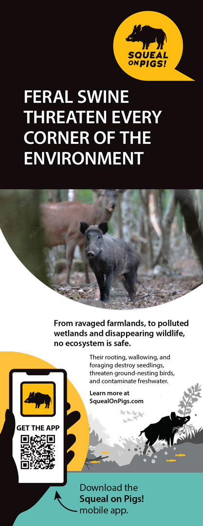
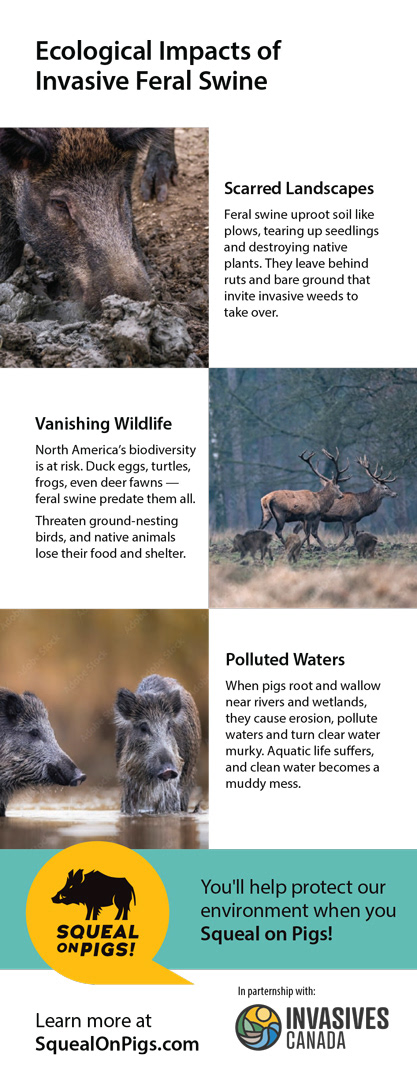
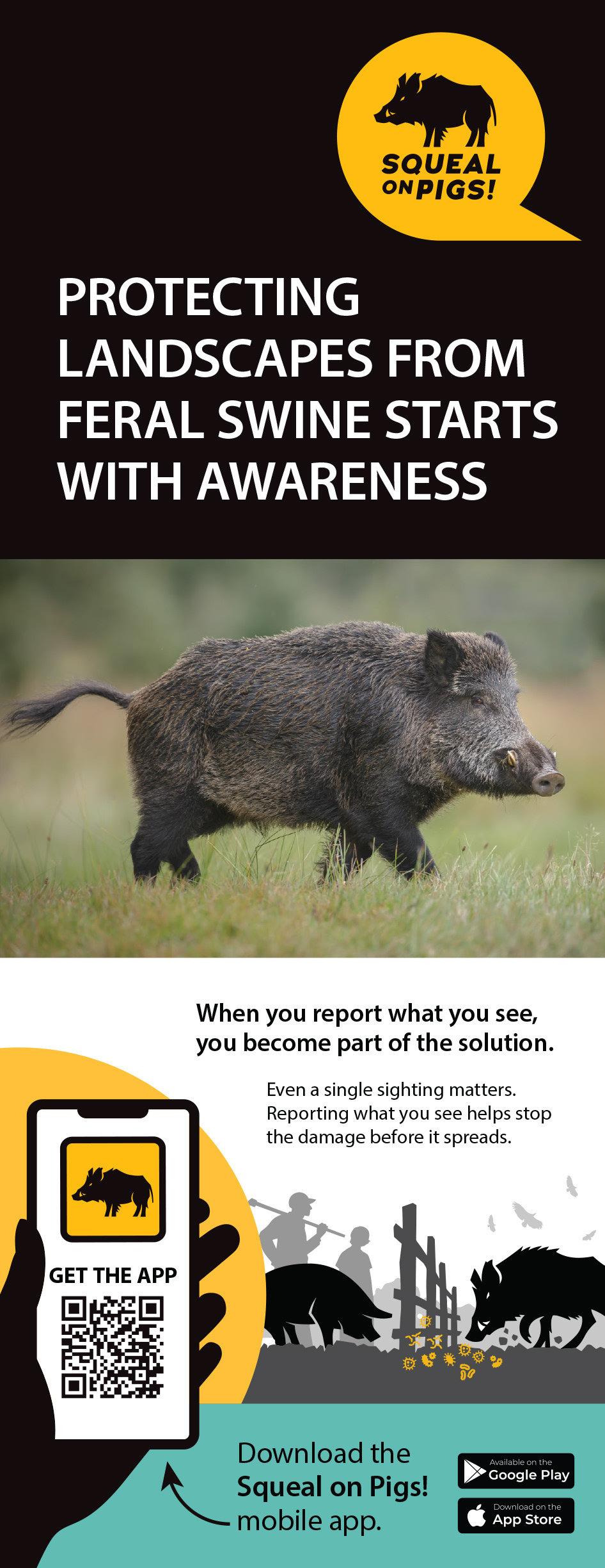
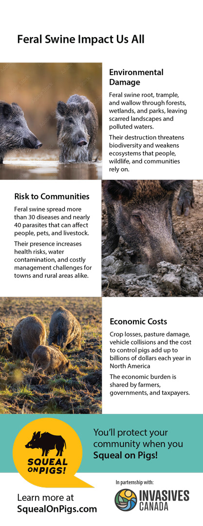
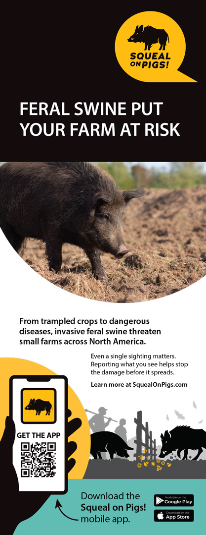
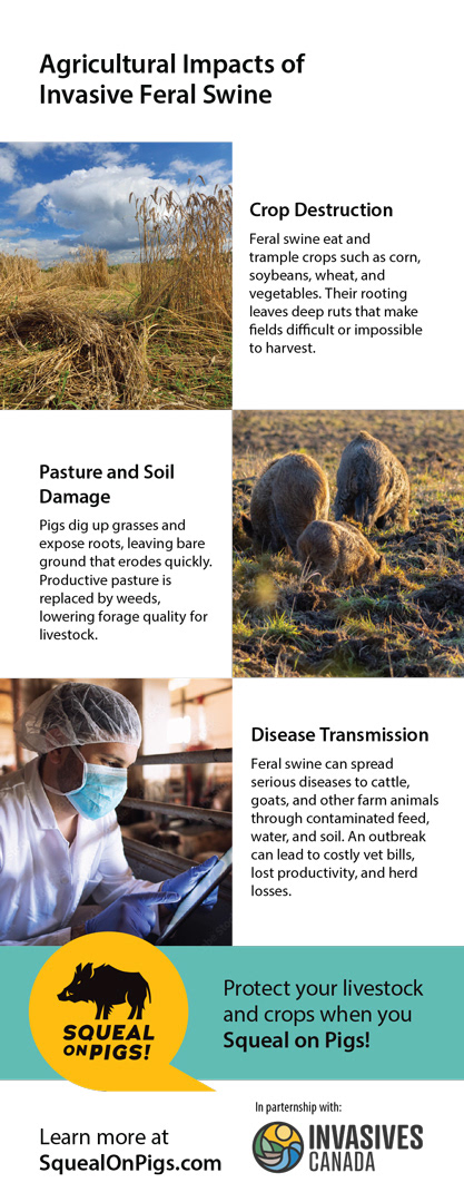
Squeal On Pigs is a USDA-originated national feral swine reporting program — Invasives Canada serves as the Canadian delivery partner, supporting awareness and adoption of the program and its mobile app. Working within existing graphic standards and a provided illustration library, the task was to produce a complete print media kit adapted for three distinct Canadian audiences: small farm operators, general public reporting awareness, and ecological impact.
Rather than producing a single campaign stretched across formats, each audience received its own media kit with its own message angle. The Ecology kit leads with environmental consequence; the Reporting kit leads with individual agency; the Small Farm kit leads with economic reality. Within each kit, the content scales from quick-read to detailed: two print ads for publication placement (portrait and landscape formats), a two-sided rack card designed for counter and display distribution, a two-sided six-panel brochure for engaged readers, and a poster summarizing the three core impact areas with photography, section headlines, and supporting copy.
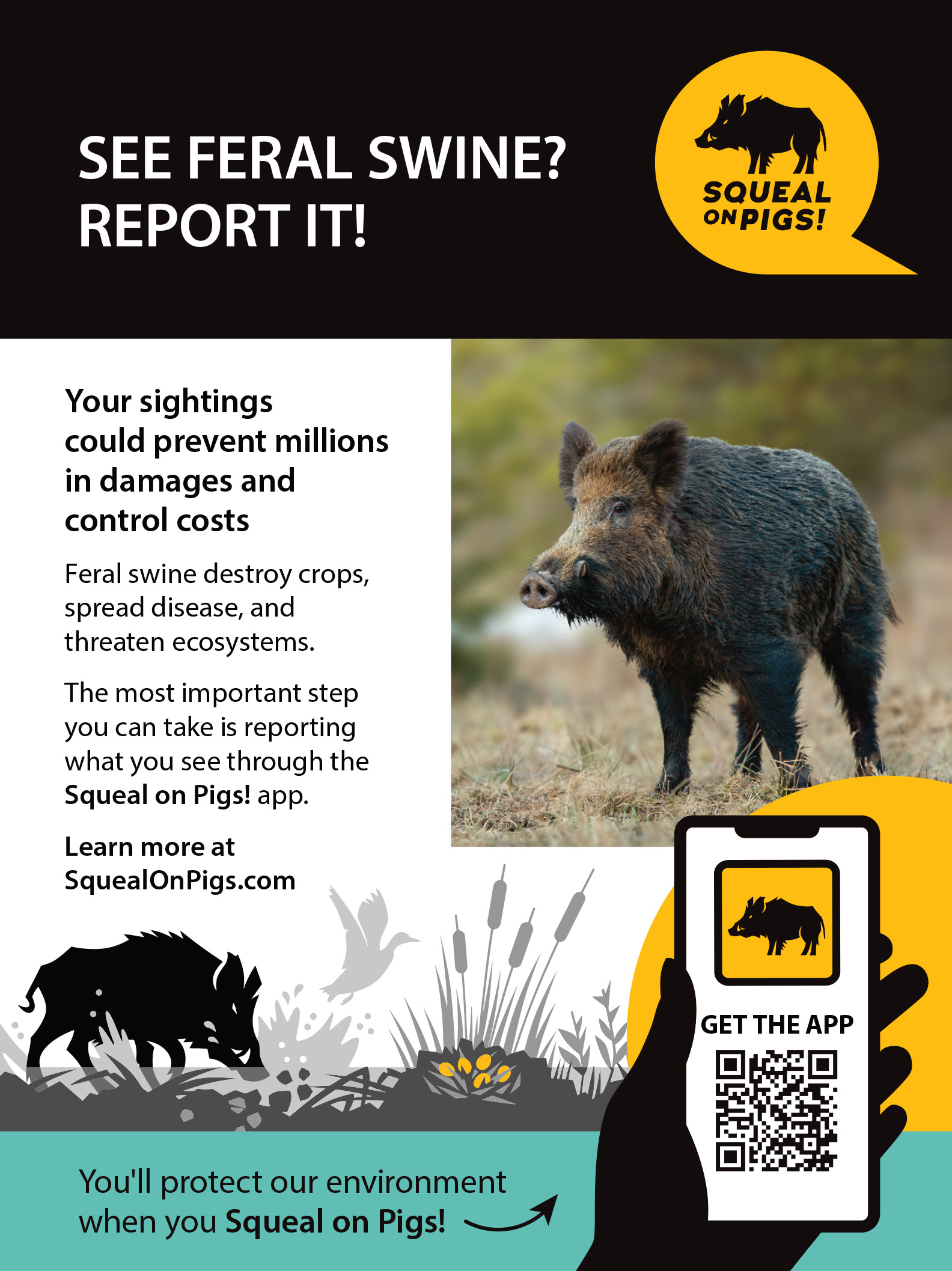
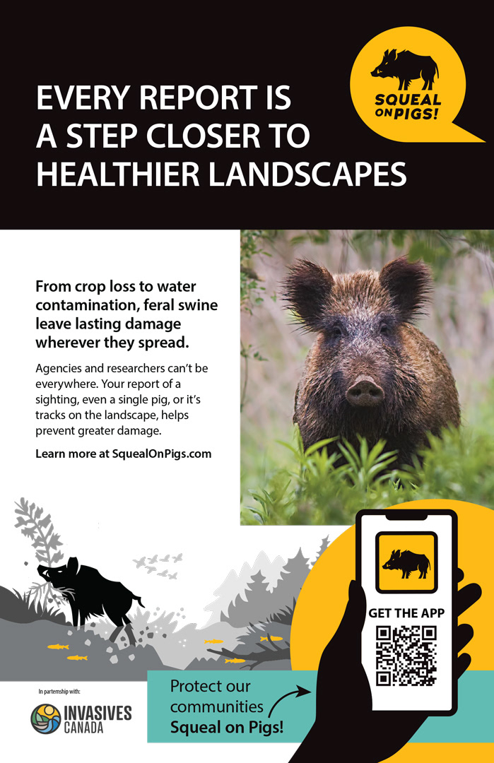
The brochure fold sequencing was designed to create a specific reveal experience — the cover panel anchors in the Squeal on Pigs brand and the kit's core claim, with interior panels progressively expanding the case.
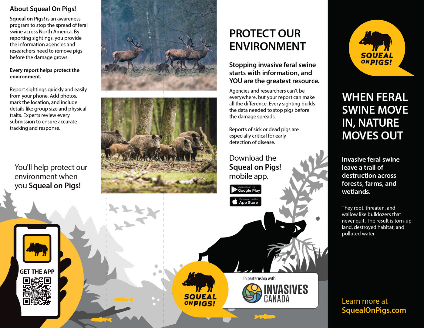
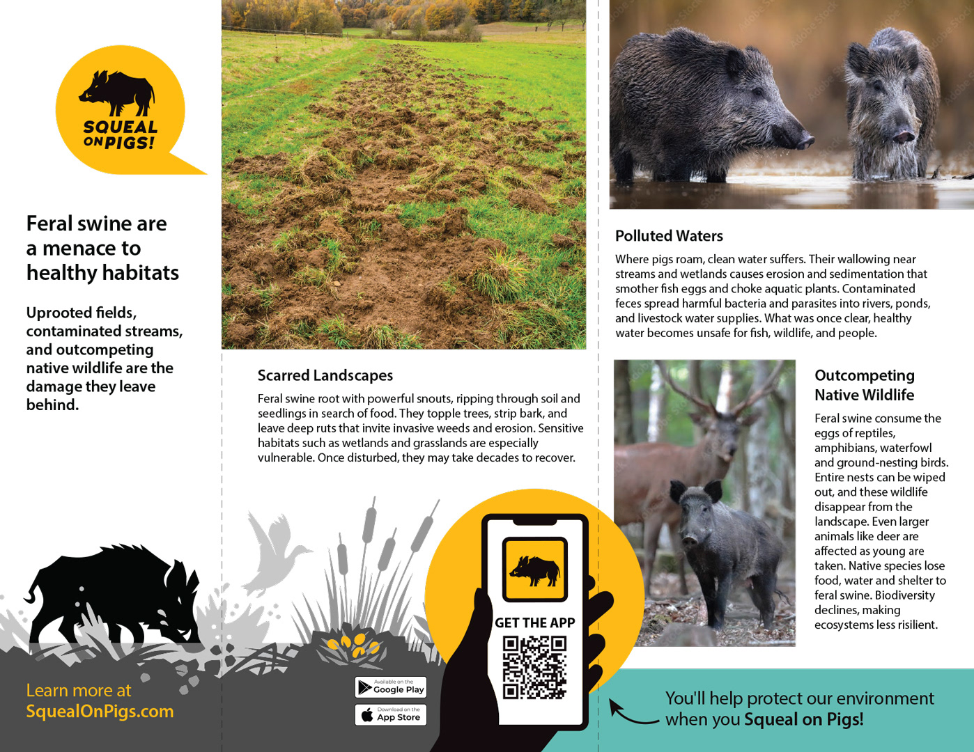
The rack cards were structured so the front delivers the hook and the back closes with a different angle and the call to action, making each side self-sufficient for a reader who picks it up from either end. Every piece drives to SquealOnPigs.com and the Squeal on Pigs mobile app, with the Invasives Canada delivery partnership credited throughout.

OTHER WORK
Invasives Canada | Granum | Trail Hub | Nest Restaurant | Rayment & Collins
