Building the creative operation
Over eight years, I helped grow the agency team from two to eight — five designers and three account coordinators — supported by a specialist freelance roster.
Managing intake and assignments across a growing client roster, I set creative direction, reviewed work at every stage and led key client relationships. I introduced performance reviews, mentorship and structured skill development into a team that had grown quickly. We pitched successfully against national agencies, winning work that expanded the agency's creative offering and supported its growth.
The prepress depth behind us was a genuine differentiator. That integration allowed us to consider creative, technical and production implications in the same conversation.

Sleeman Breweries
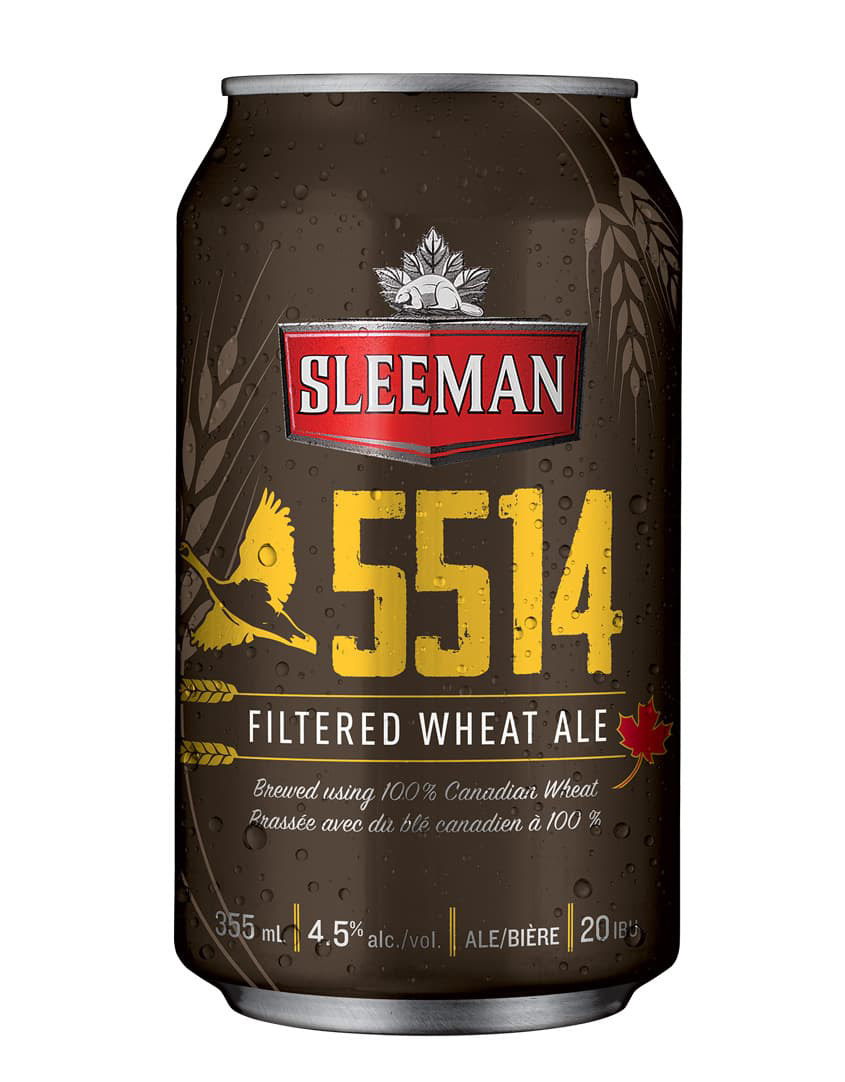
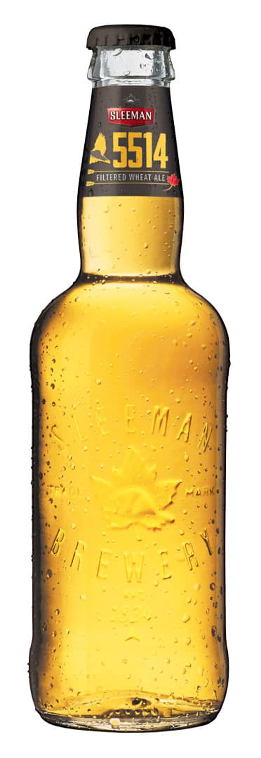
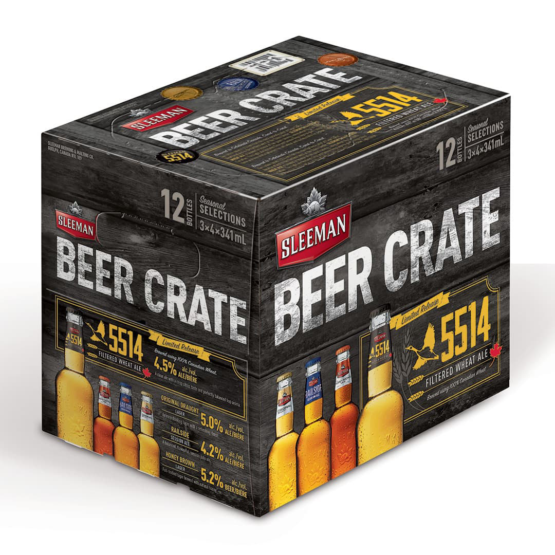
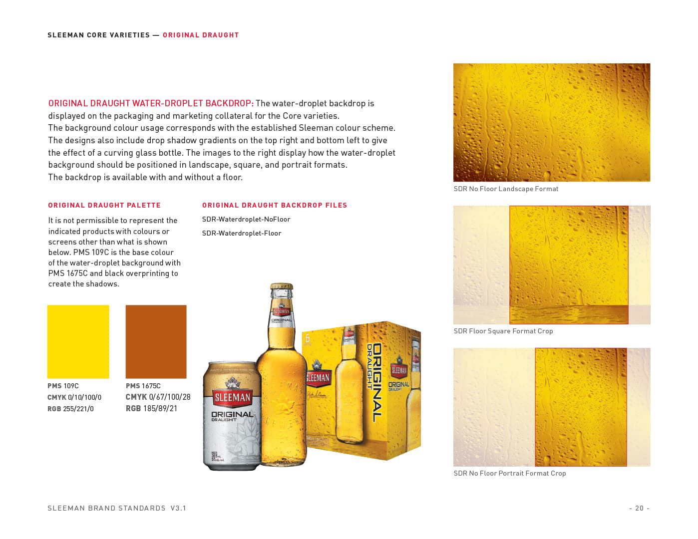
Rayment & Collins was Sleeman Breweries' prepress and production house — trusted with technical execution across a Canadian portfolio that included Sleeman, Sapporo, Pabst Blue Ribbon, Old Milwaukee, Okanagan Spring, Unibroue, and others. That relationship also led to R&C winning the national bar and restaurant promotional program, where my involvement was primarily style guide enforcement and brand oversight.
The creative work I led directly came from within that relationship — specific projects where I identified an opportunity, brought a concept forward, or took a brief from strategy through delivery.

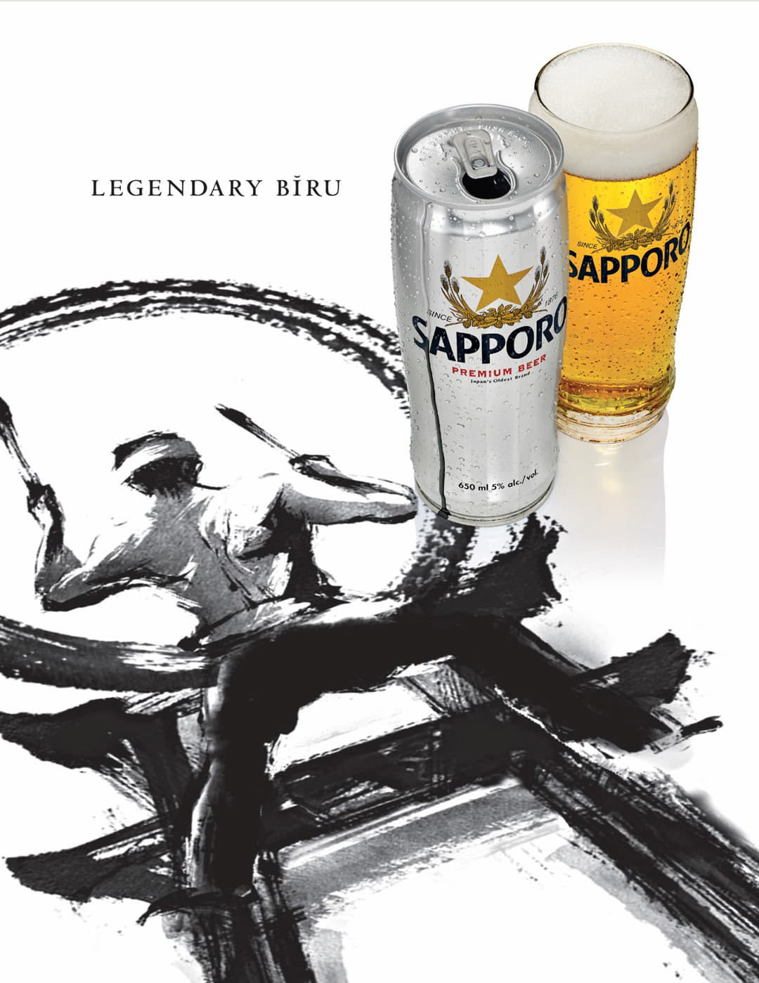
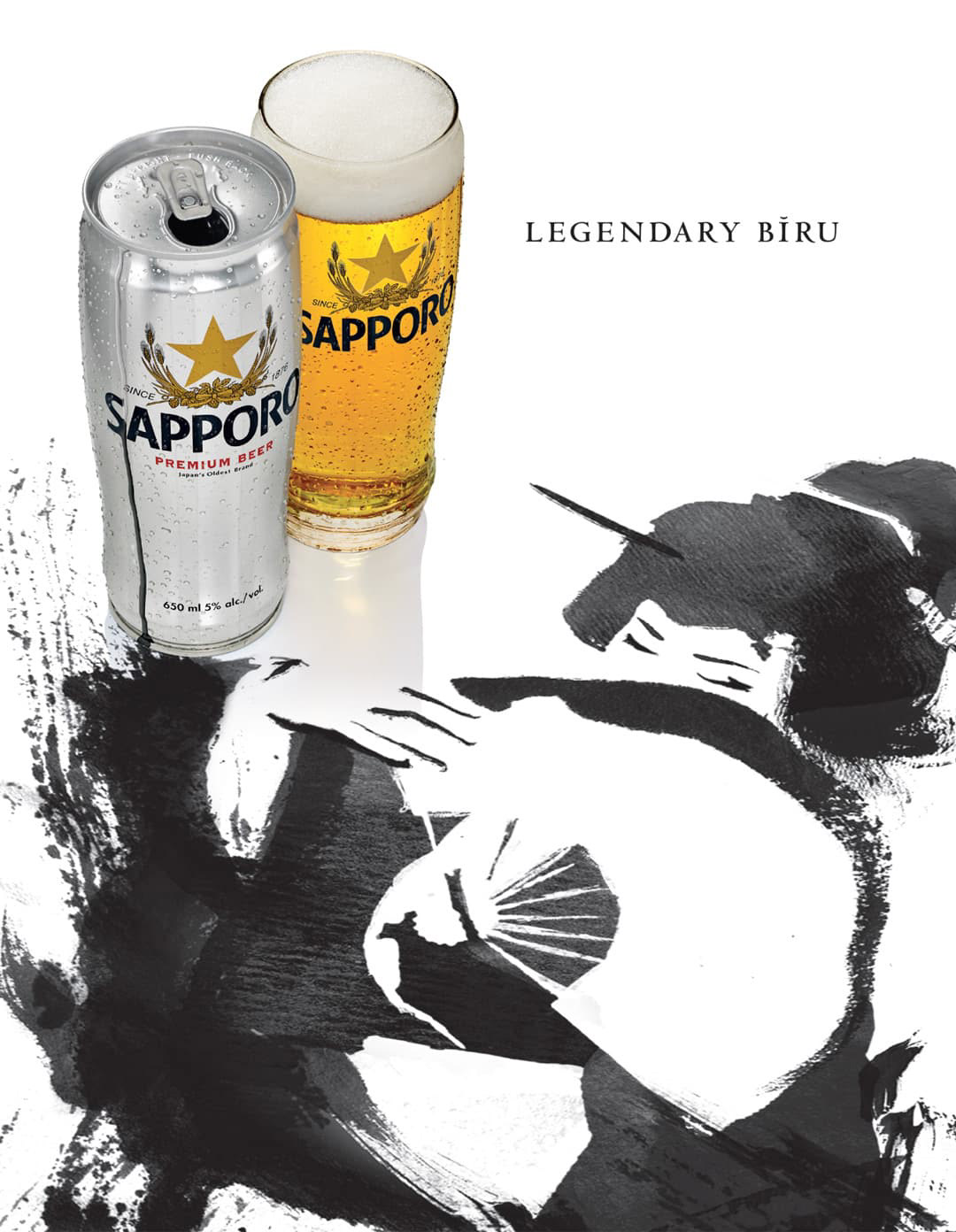
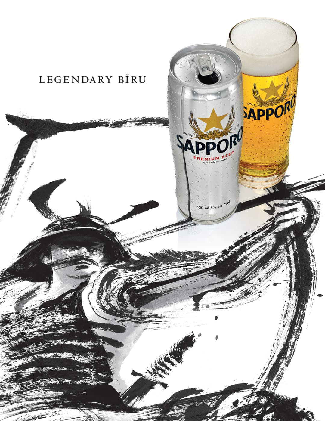
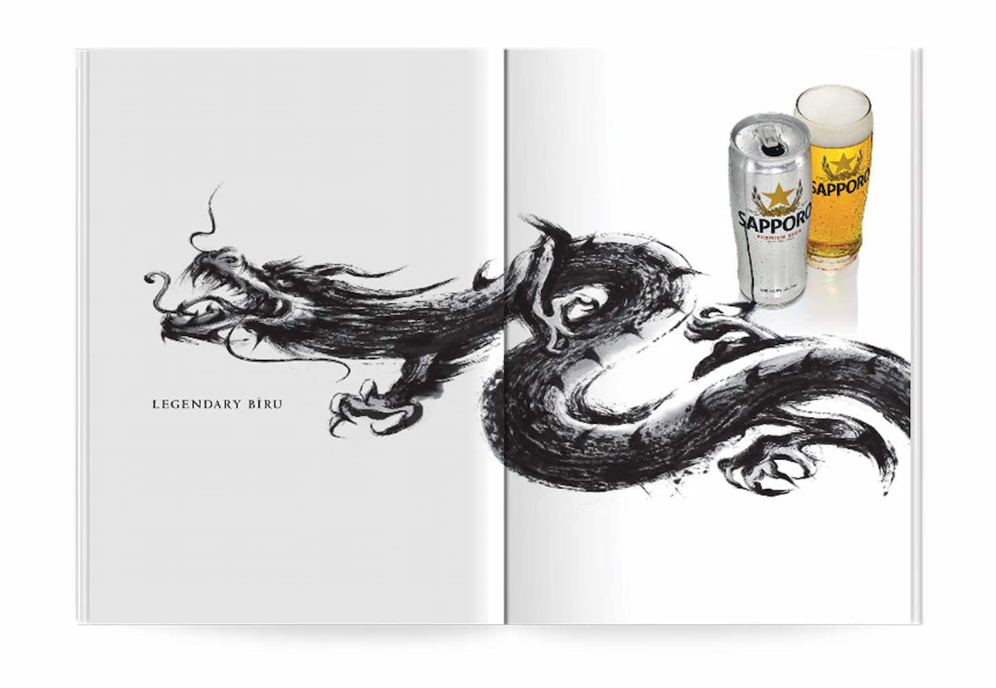
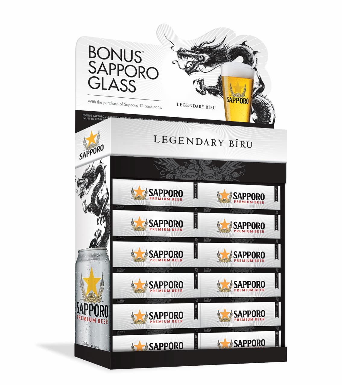
Sapporo — Legendary Bīru
DentsuBos created Legendary Bīru — an exceptional campaign platform built around sumi-e ink art: dragons, warriors, and the visual language of Japan's oldest beer brand.
During a Sapporo photo shoot, I proposed extending the platform into print — using the sumi-e dragon as the focal point, with enough space and restraint to let the image carry the campaign on its own. The brand manager wanted to see what we could do with it.
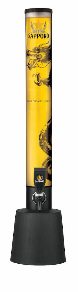
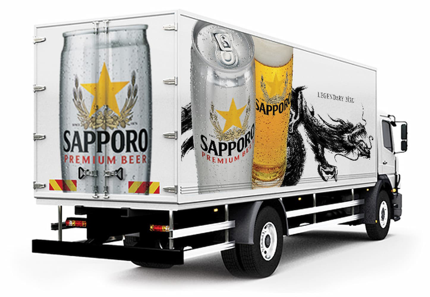
Two weeks later, the first print execution was approved. What followed was a broader campaign system built on the DentsuBos platform and developed by R&C across print and out-of-home advertising, a delivery truck wrap, retail displays, gift and specialty packaging, branded merchandise, and multiple SKU formats.

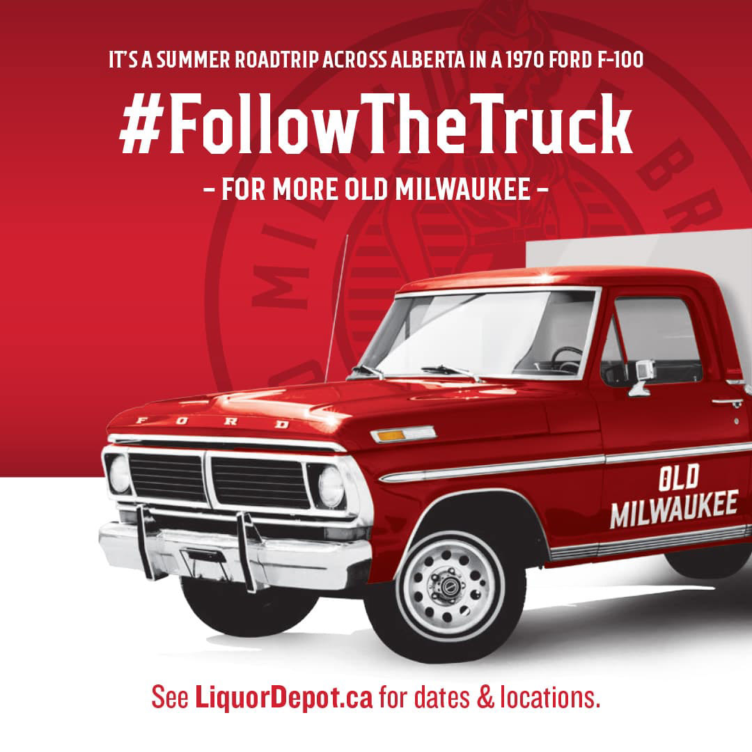
Old Milwaukee — Follow the Truck
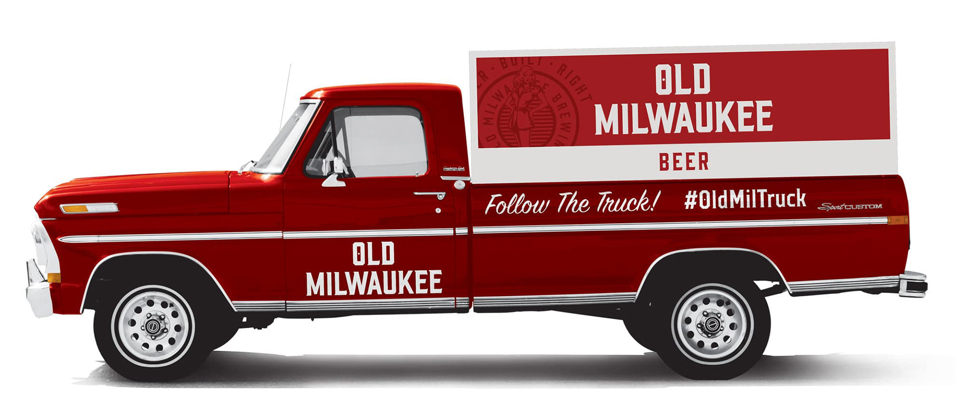
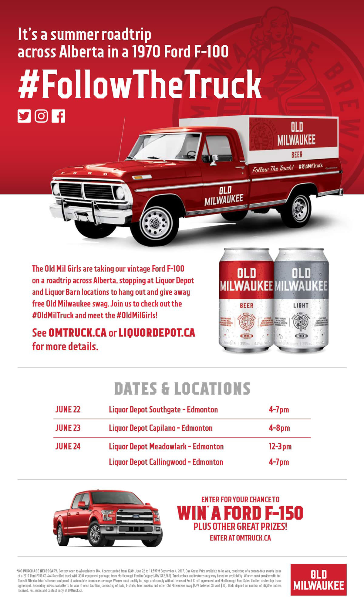
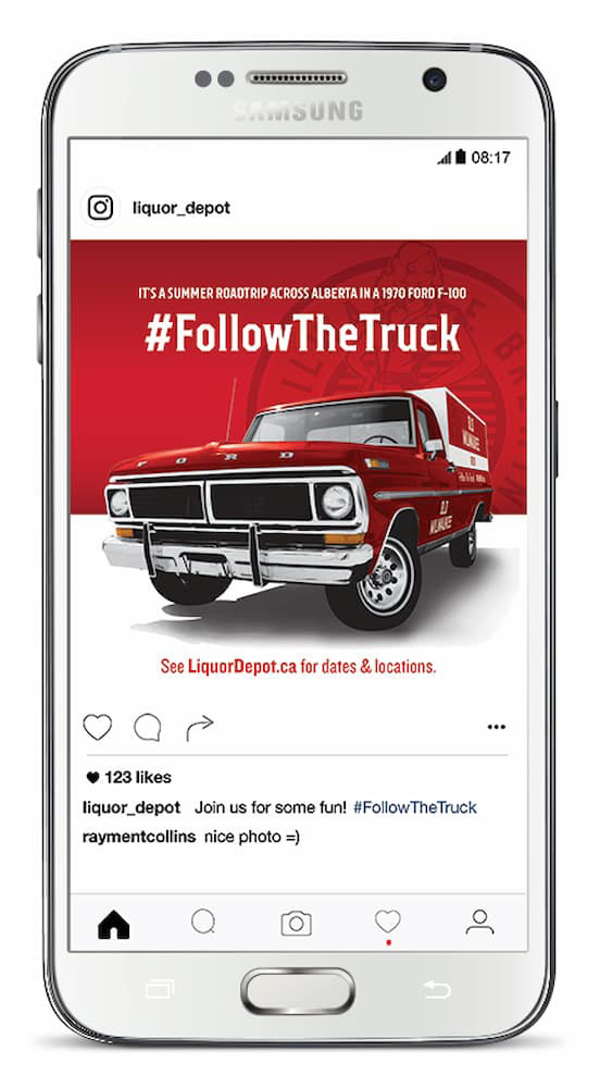
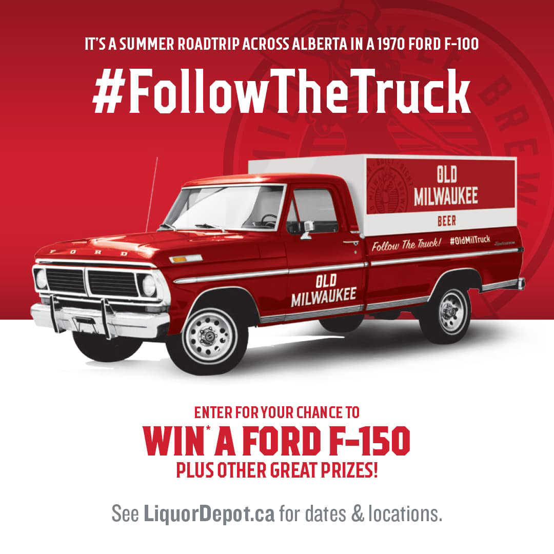
A summer activation for Old Milwaukee was built around a restored 1970 Ford F-100. I designed the vehicle graphics and a one-off truck cap that transformed the back of the pickup into an oversized 12-pack carton. The account manager worked with a carpenter to translate the concept into construction plans and fabricate the custom structure.
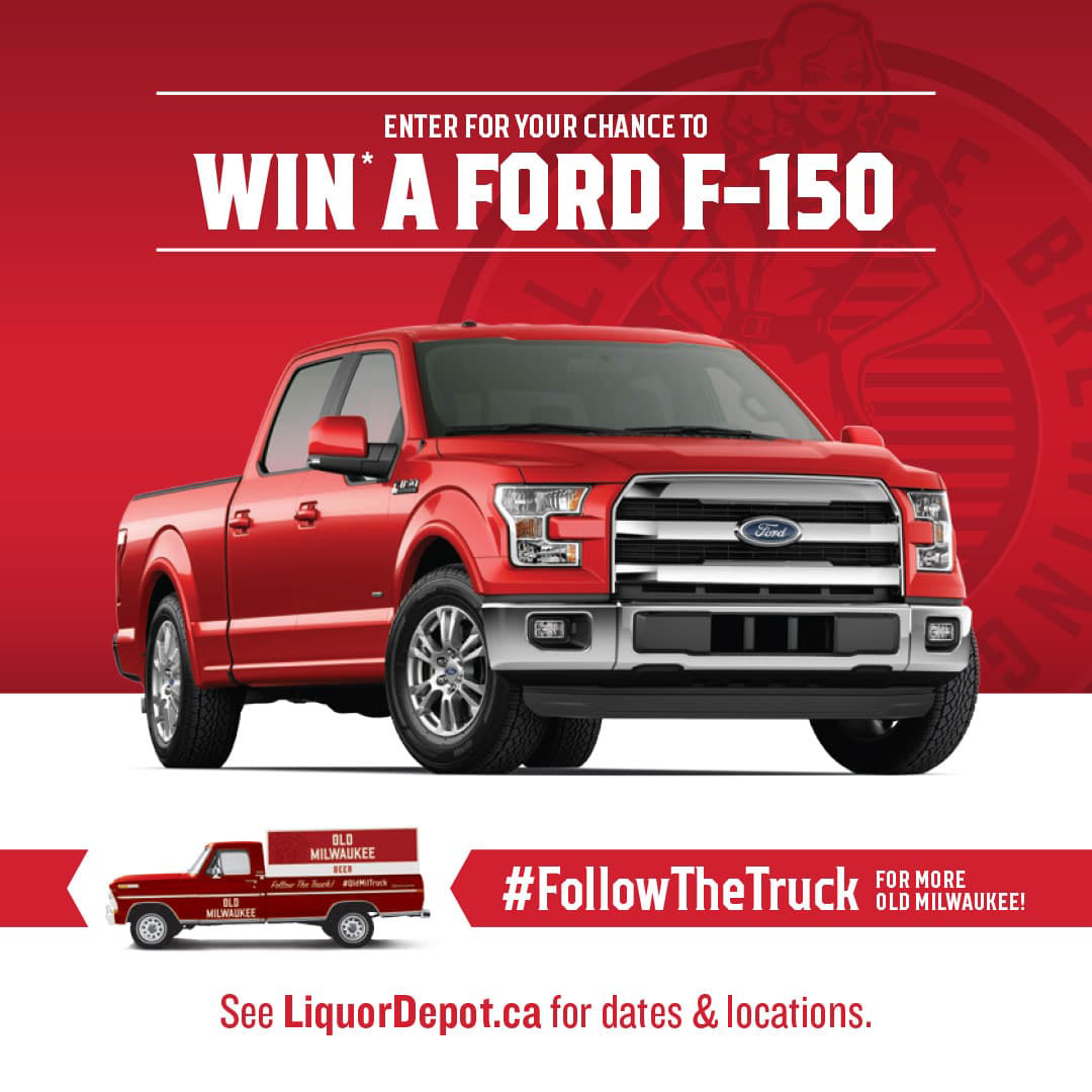
We then developed the supporting print and digital campaign. The truck toured Alberta under #FollowTheTruck, promoted through Liquor Depot's social channels and an email campaign for the Old Milwaukee Celebration Club.

Pabst Blue Ribbon
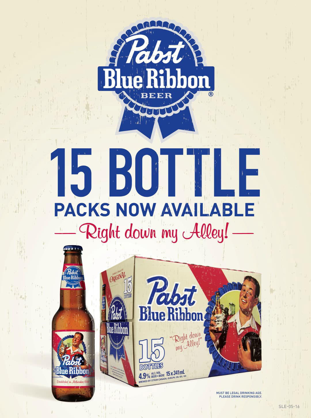
PBR came to us through its US parent company, with significant latitude for Canadian executions. I led concept development through press approval across two distinct series.
The Vintage Pack series drew from original 1947 LIFE magazine advertisements that I sourced on eBay, then scanned, restored, and colour-corrected to meet current production standards and Liquor Board requirements.
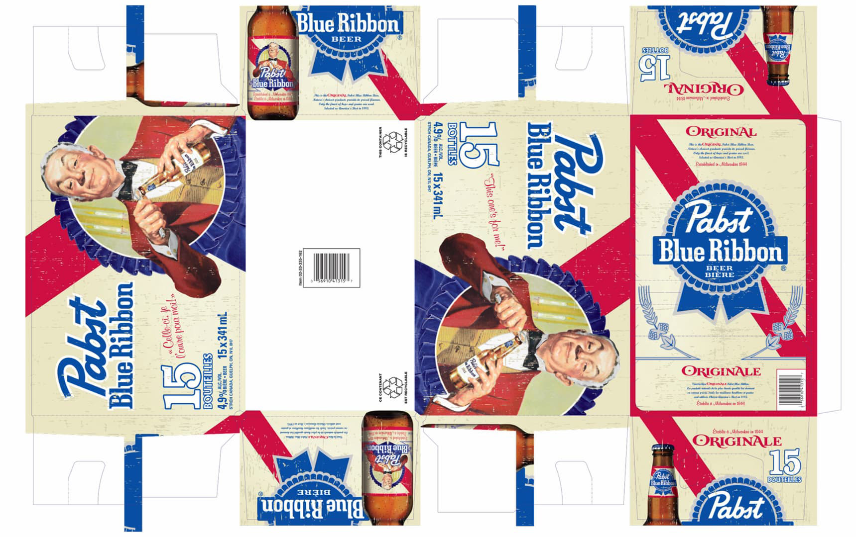
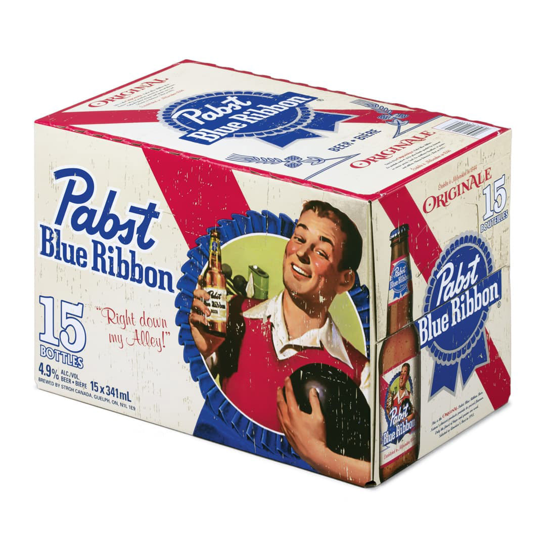
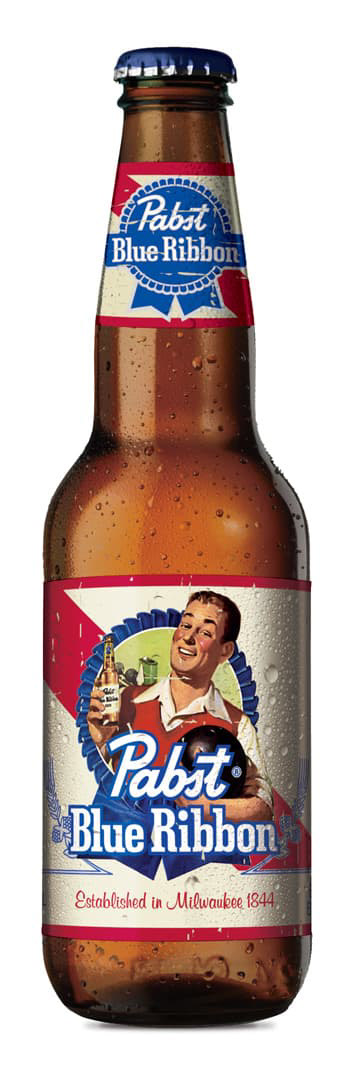
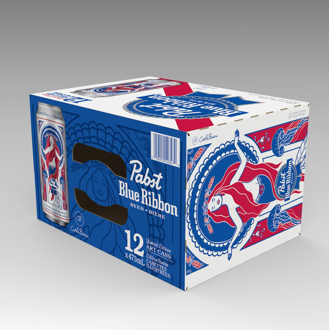
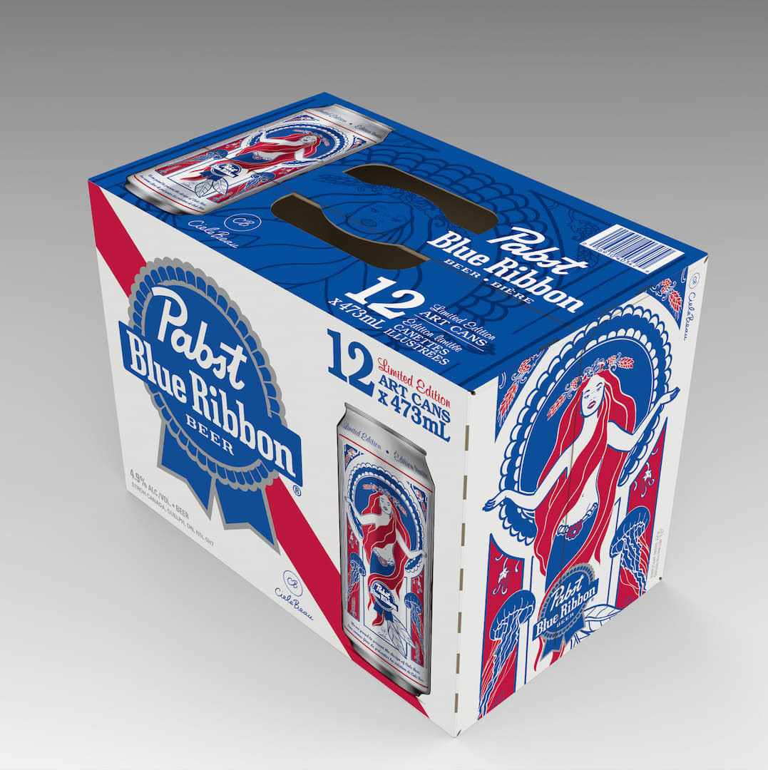
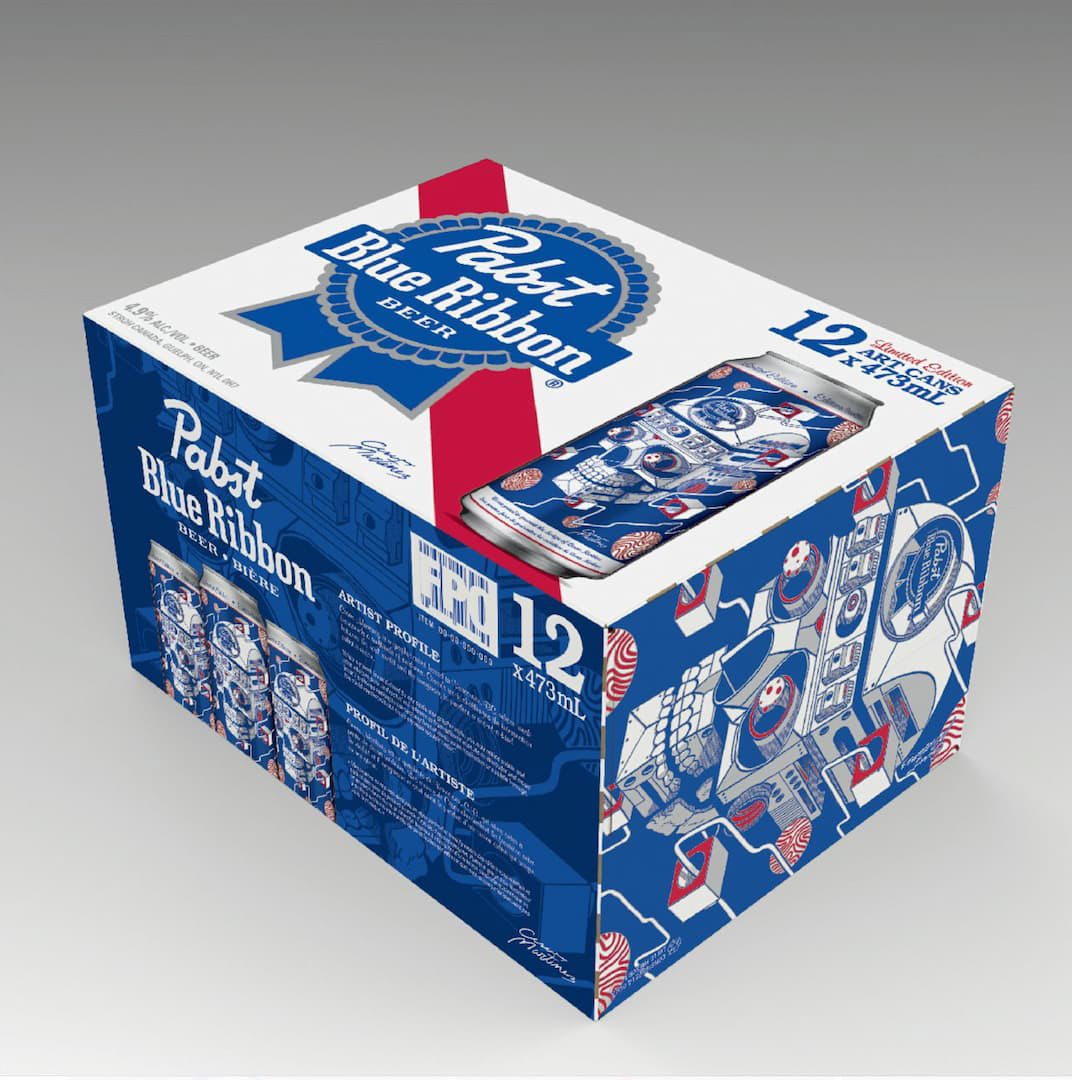
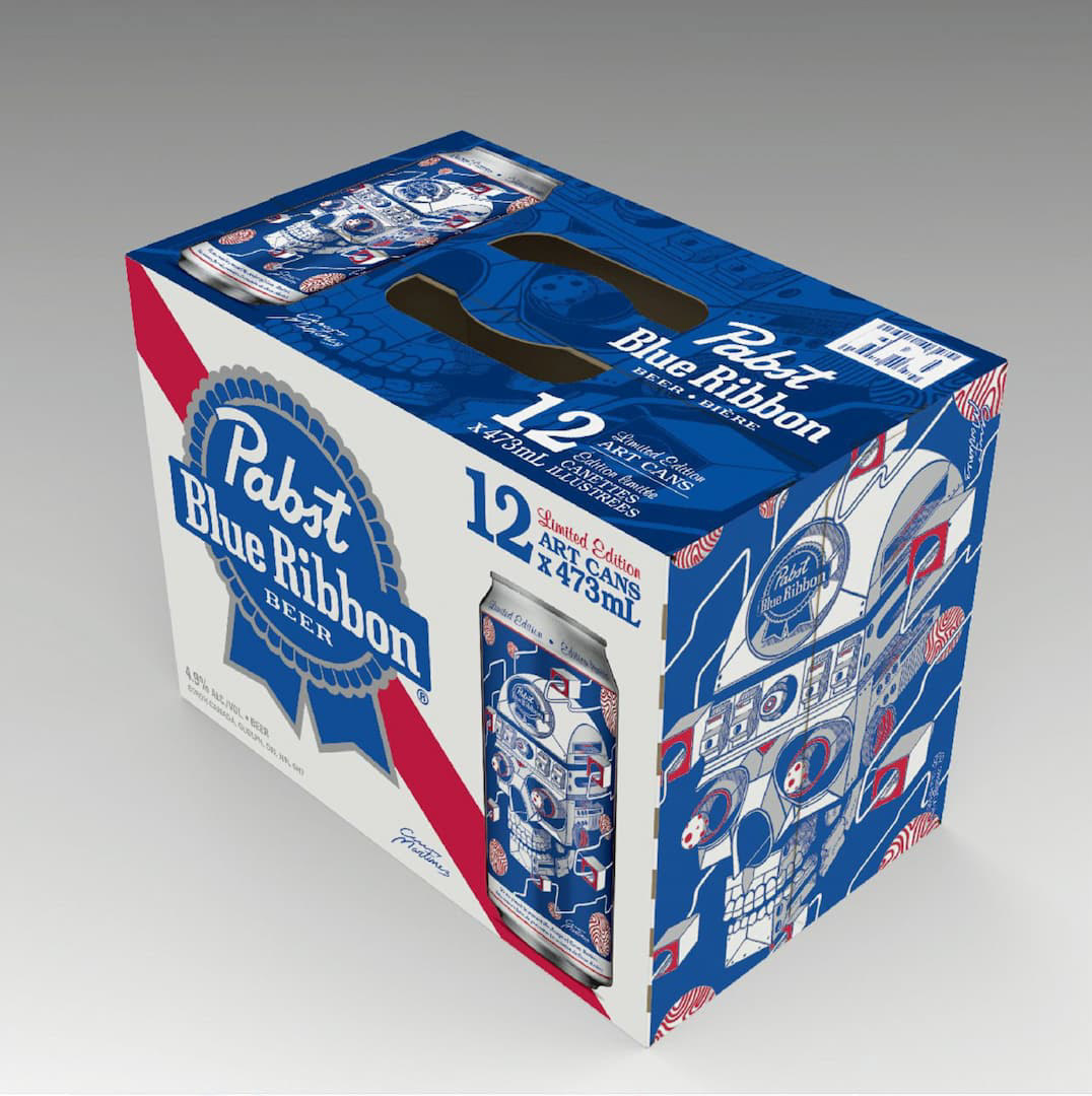
The Artist Series took a different approach. Commissioned illustrations anchored the end panels, while duotone treatments carried the artwork across the handles and bottom panels. This marked the first time PBR Canada approved placing a product photograph on secondary packaging.

Ed's Bock
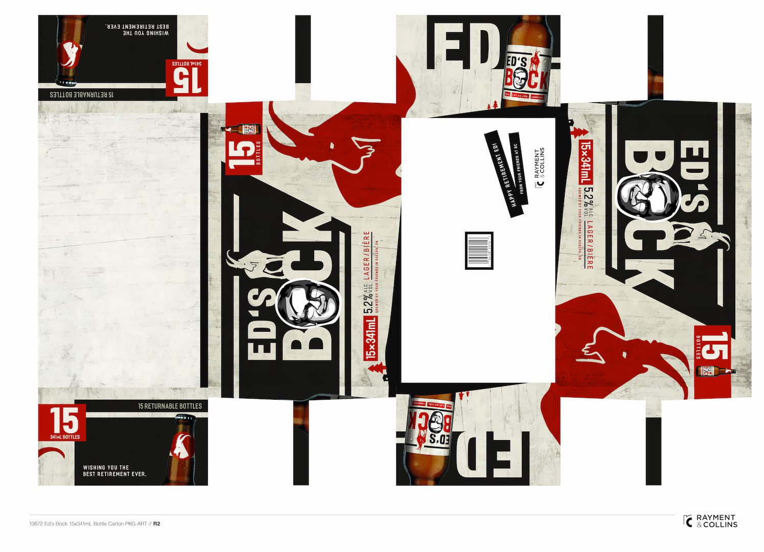
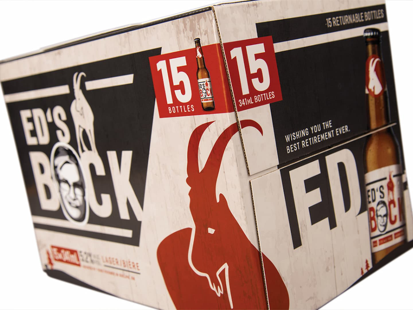
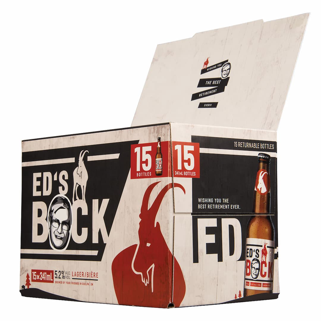
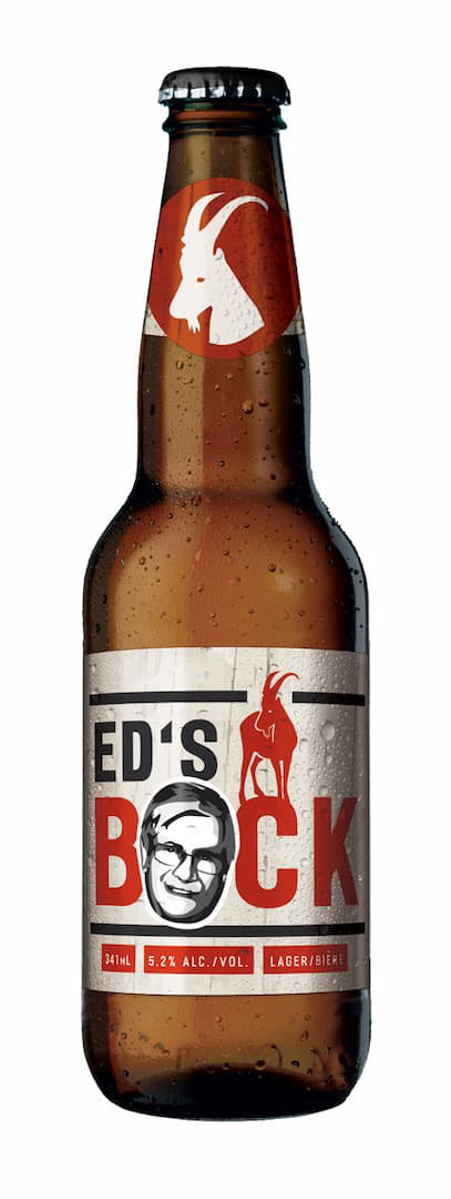
Created to mark brewmaster Ed McCallum's retirement, Ed's Bock transformed one of his prized formulations into a custom identity, bottle label, and hand-assembled 15-pack. The magnetic carton doubled as a card for guests to sign at the retirement celebration, where 500 bottles were served.
Graphis Design Annual 2017 — Packaging — Silver

AMD
AMD was an outlier in the agency's portfolio — a global technology brand in a client list dominated by food and beverage.
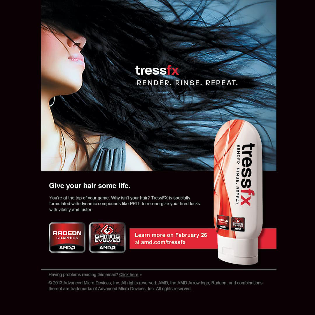
The most memorable piece was a launch teaser for TressFX, AMD's hair-rendering technology for games. Rather than announce it as a graphics card feature, we framed it as a shampoo. The mock product — "Render. Rinse. Repeat." — was designed as an email teaser that revealed its actual subject only at the end, directing recipients to AMD.com on launch day.
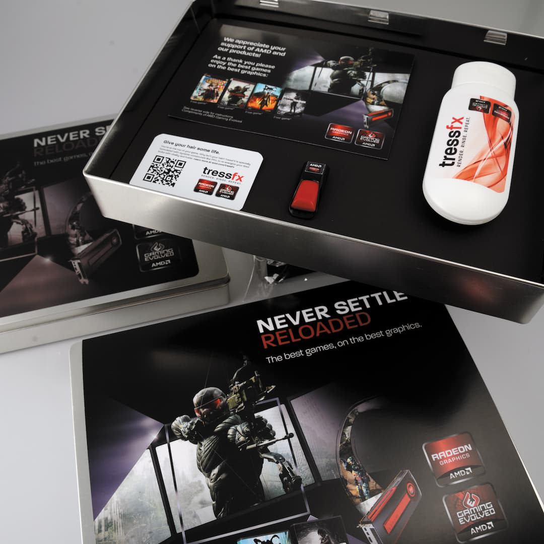
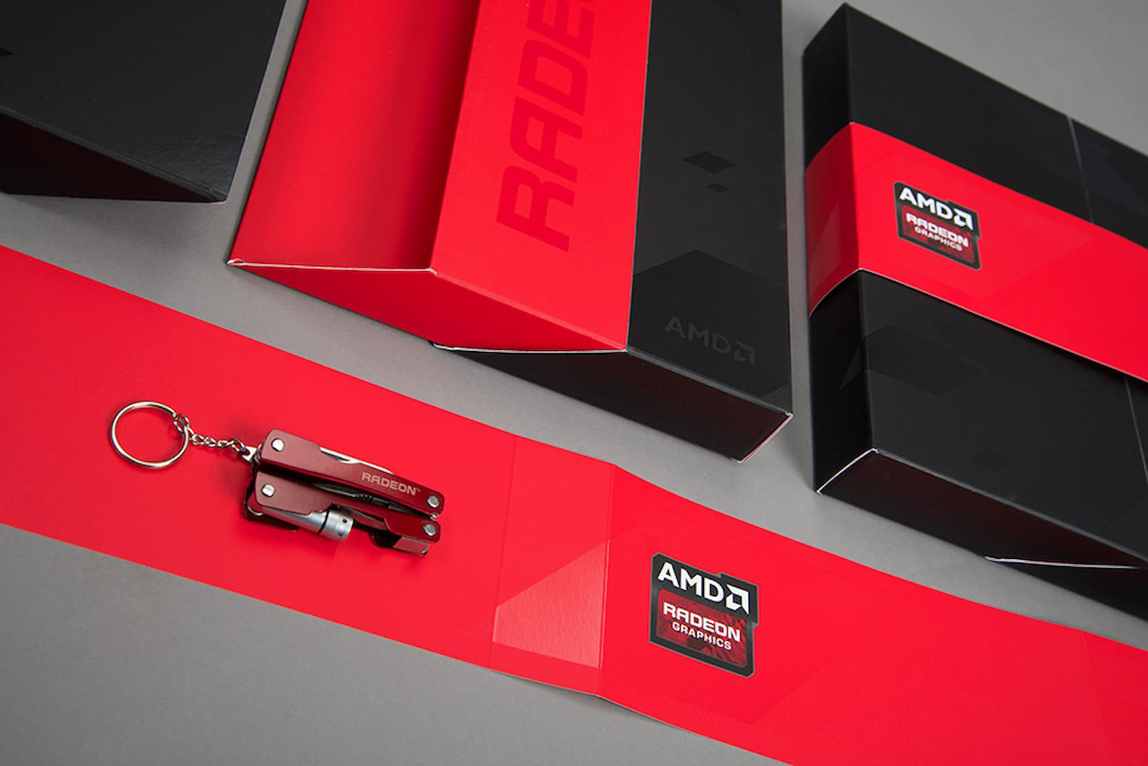
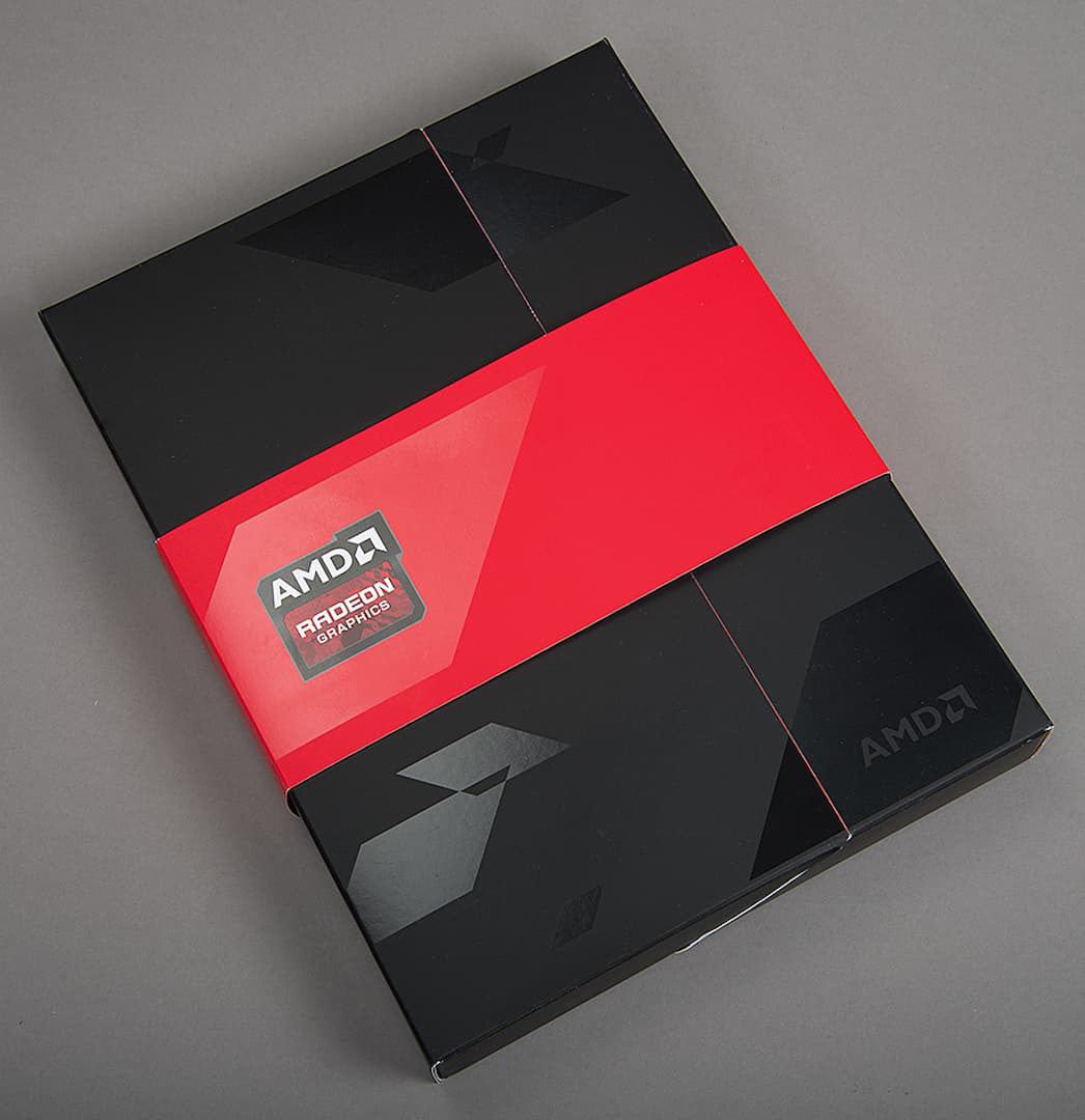
Beyond that, I designed the Radeon Graphics swag box system — premium specialty packaging for hardware promotions and media kits — and landing pages for a secure game-key distribution platform R&C built for AMD's hardware partners.

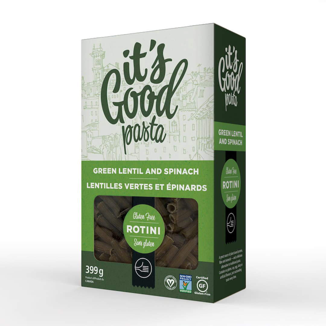
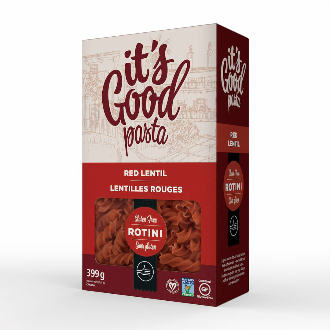
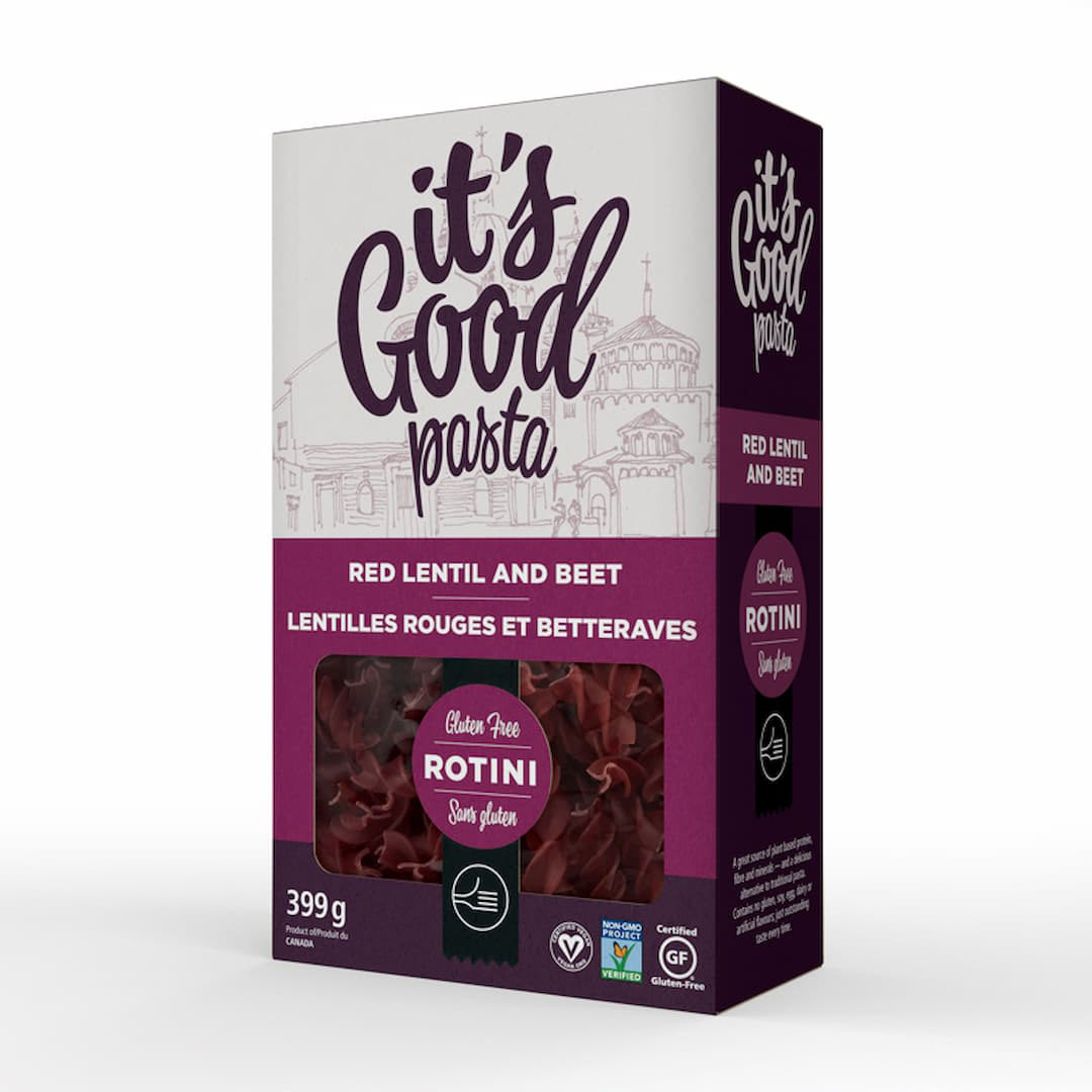
National Pasta — It's Good Pasta
The name came from the owner. She said it often enough in our early conversations that it became the obvious answer.
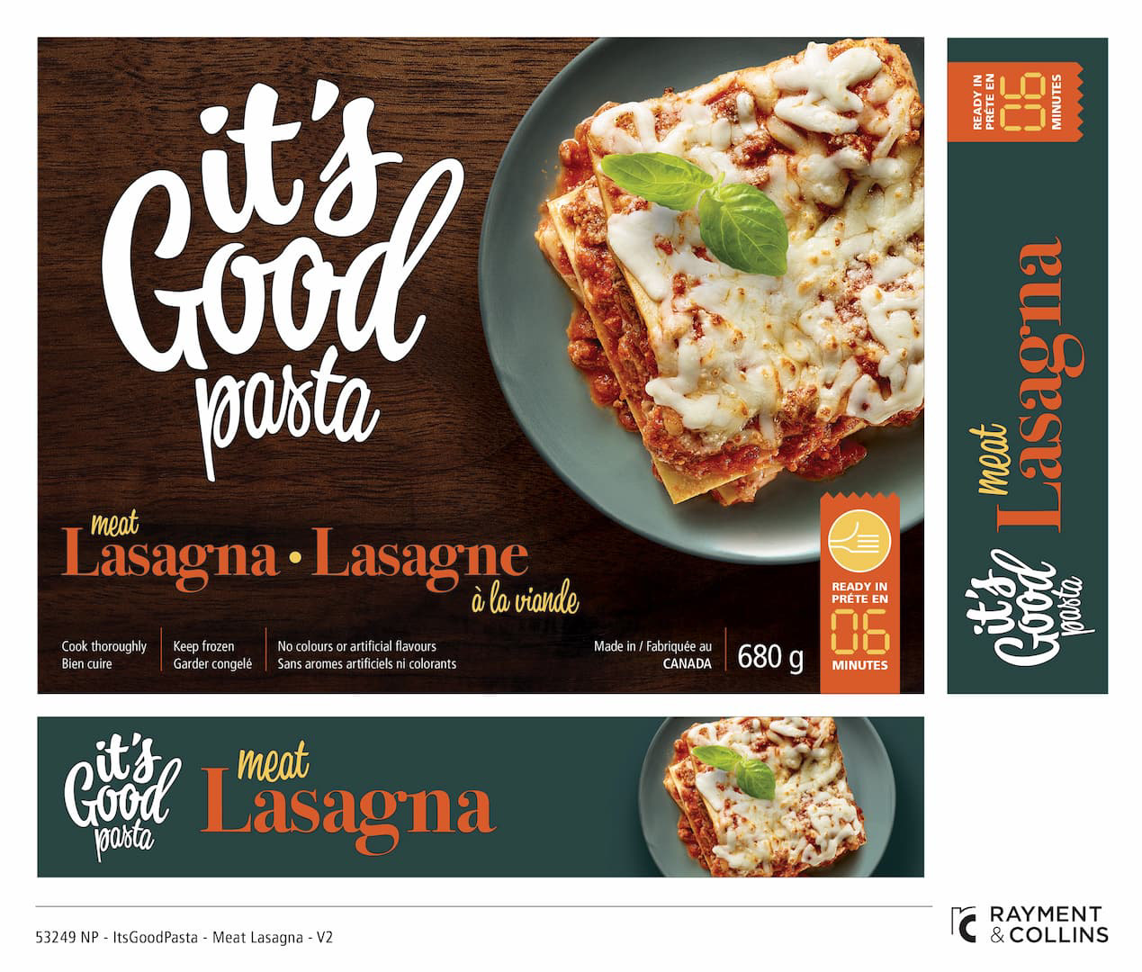
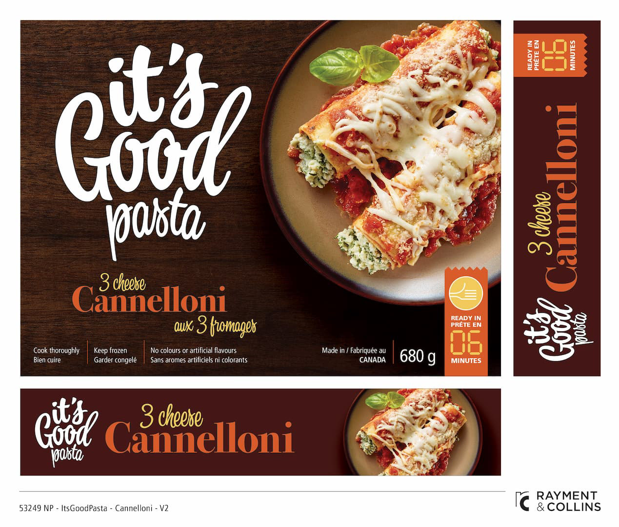
Starting from that phrase, I developed the full brand: name, wordmark, packaging, copy, photography direction, and food styling across the product line.
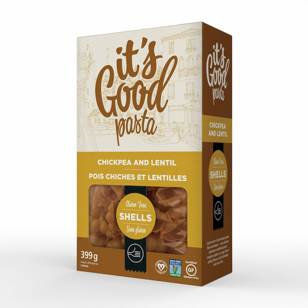
The gluten-free extension added another layer — colour-coded by pasta variety, with illustrations of Italian cities and die-cut windows on the packaging.

Green Ocean Seafood — GO Seafood
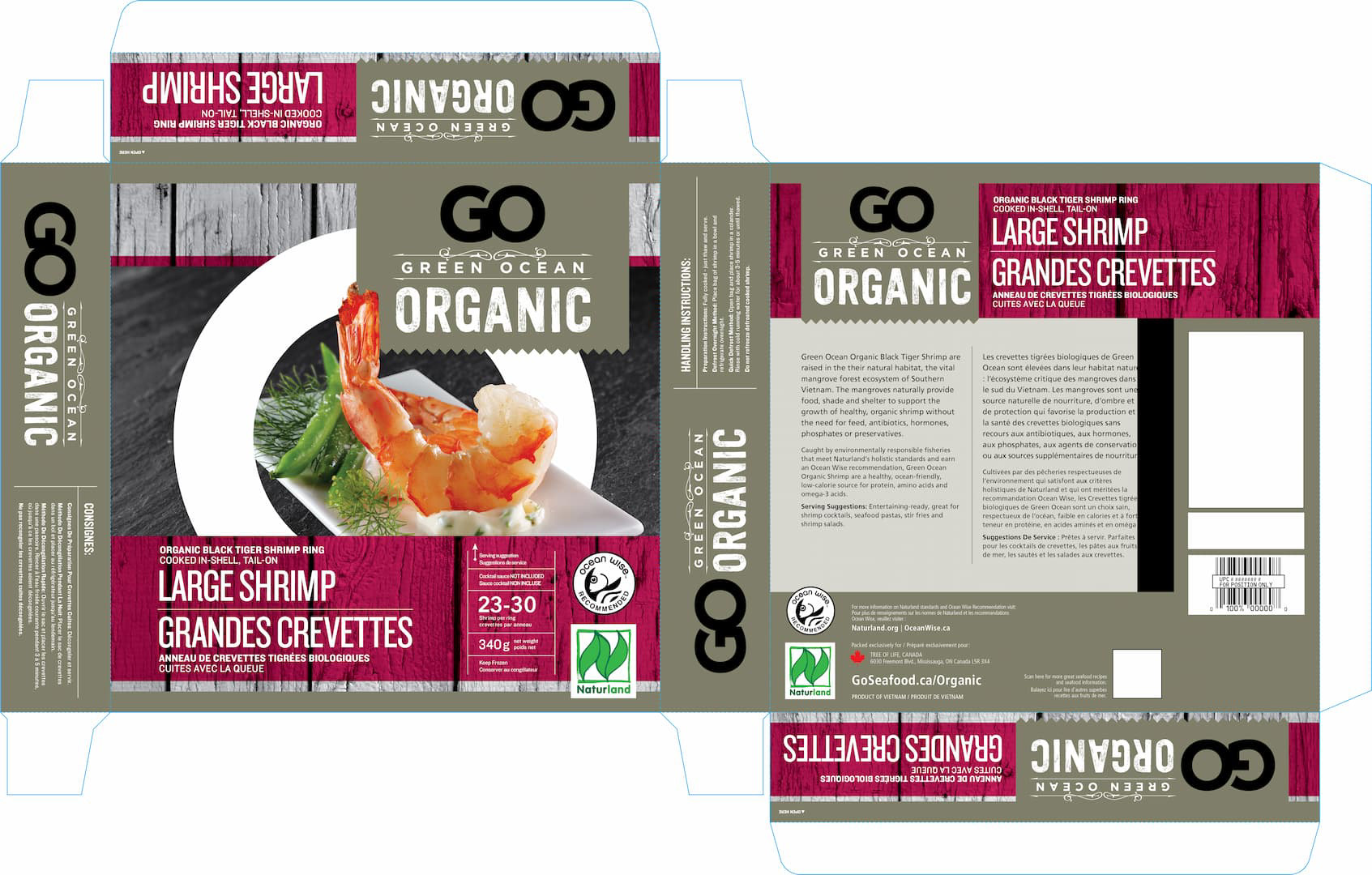
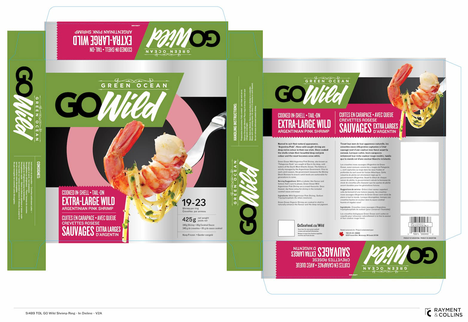
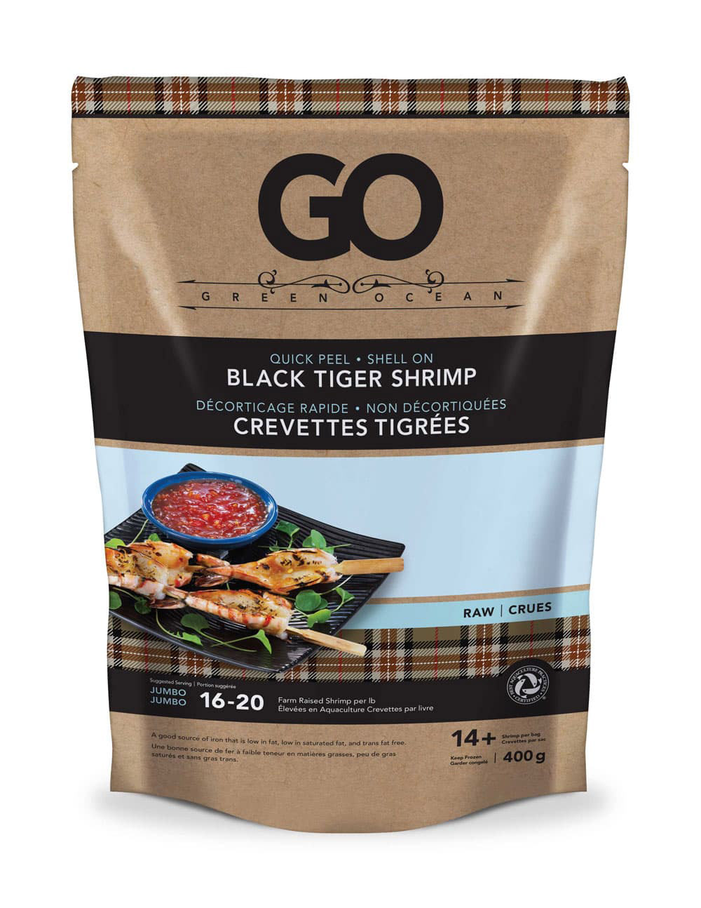
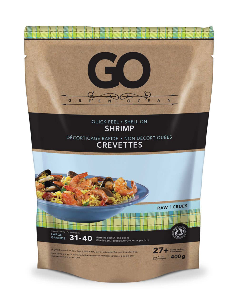
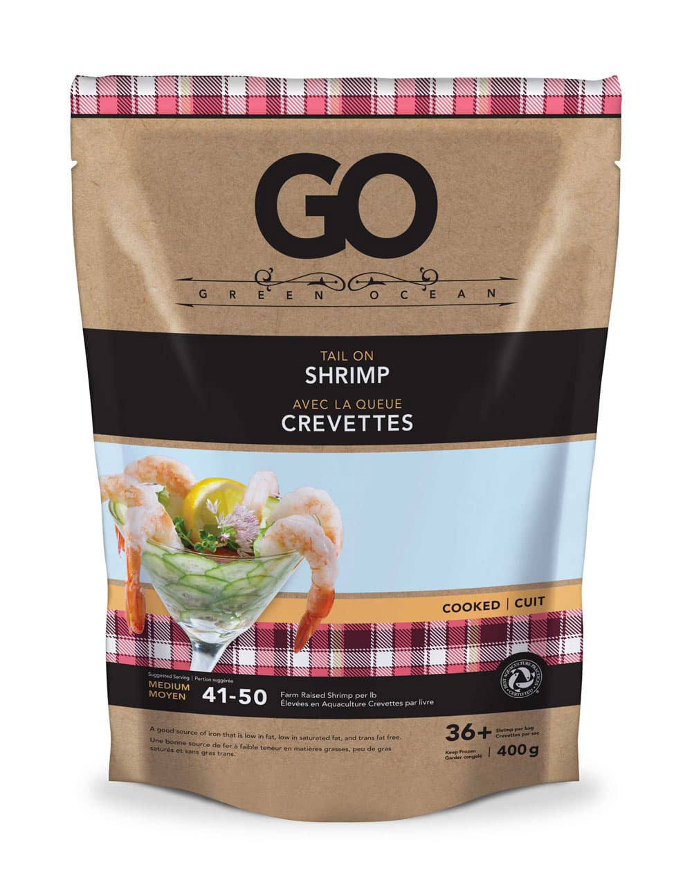
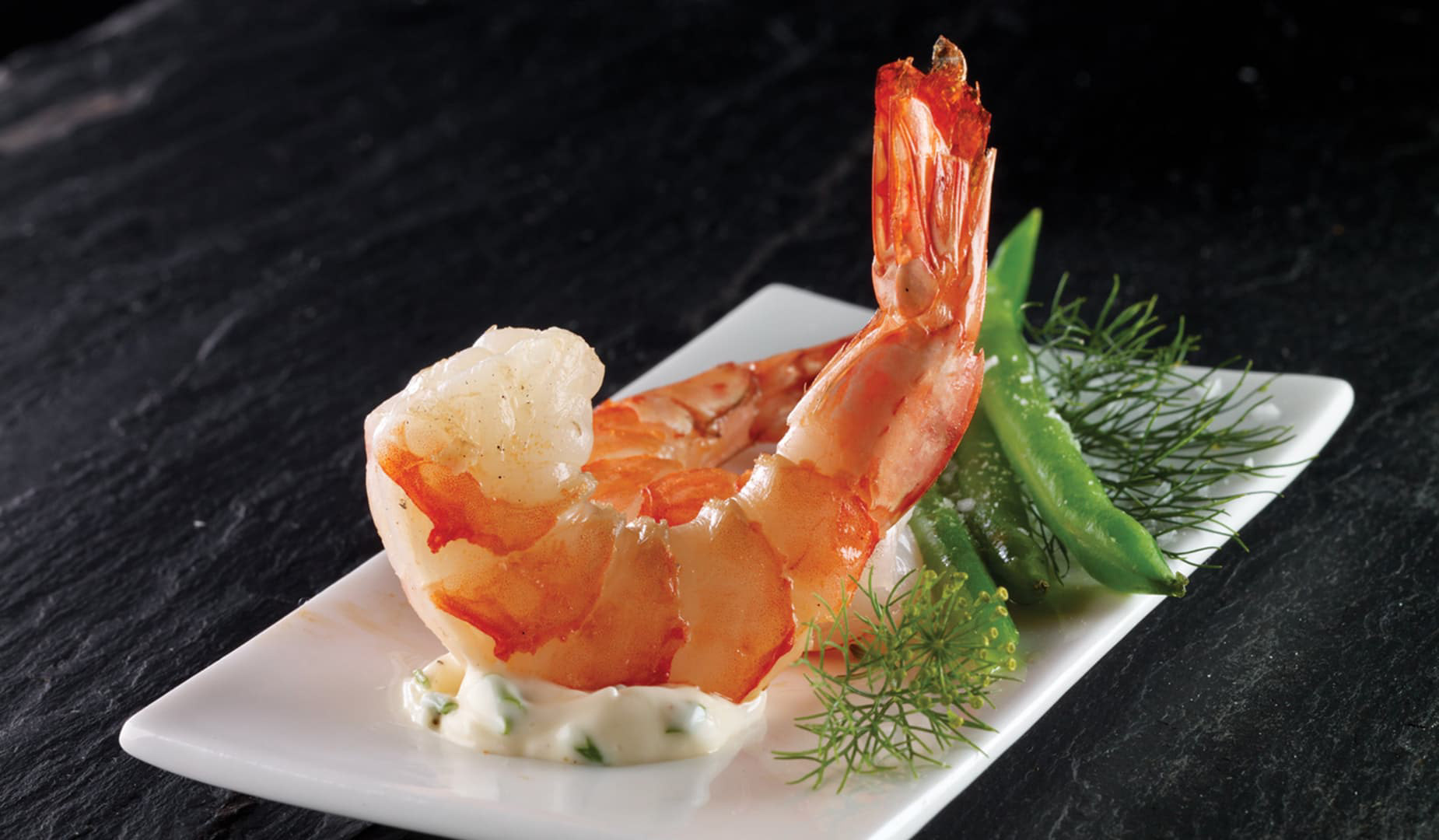
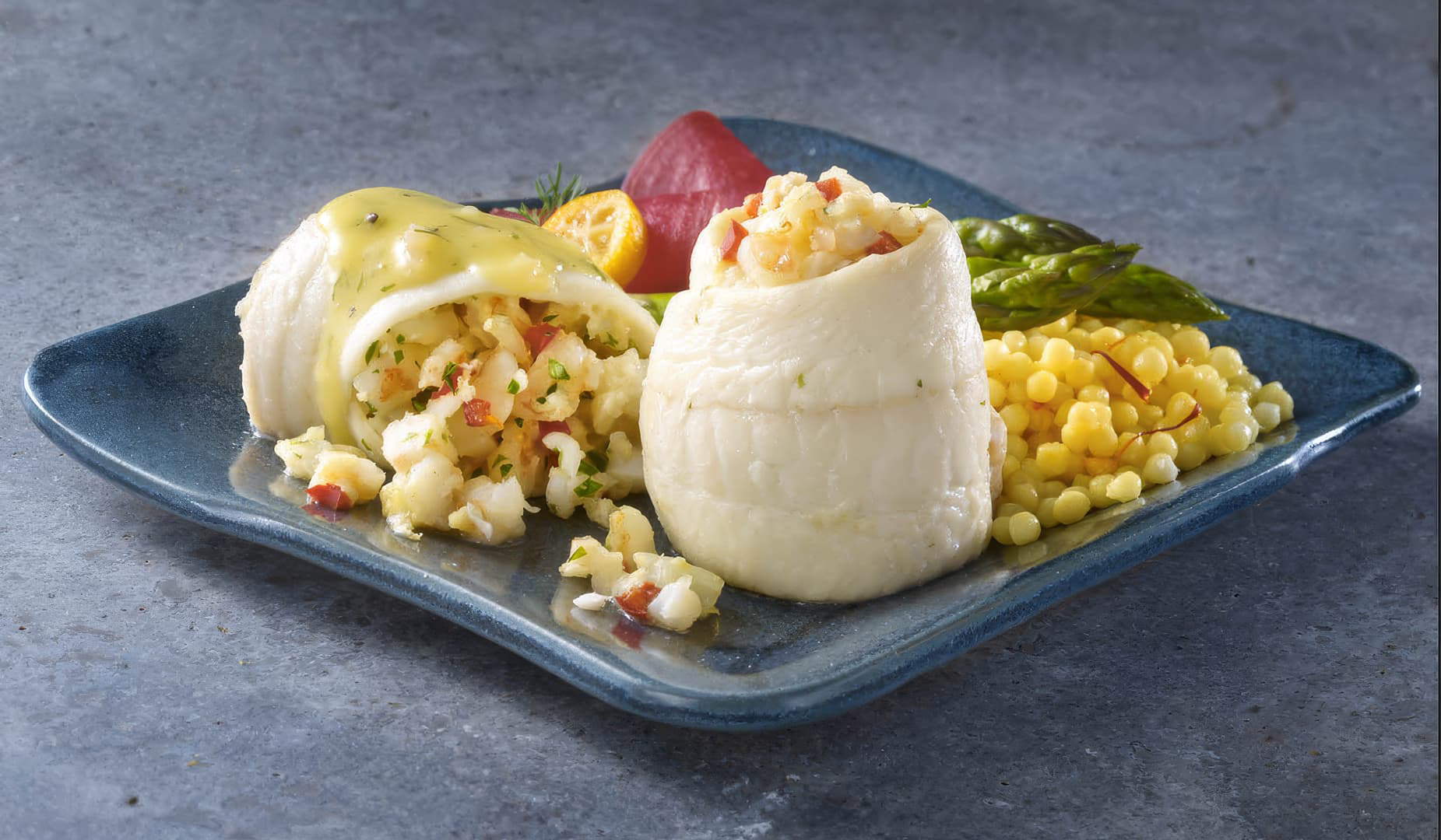
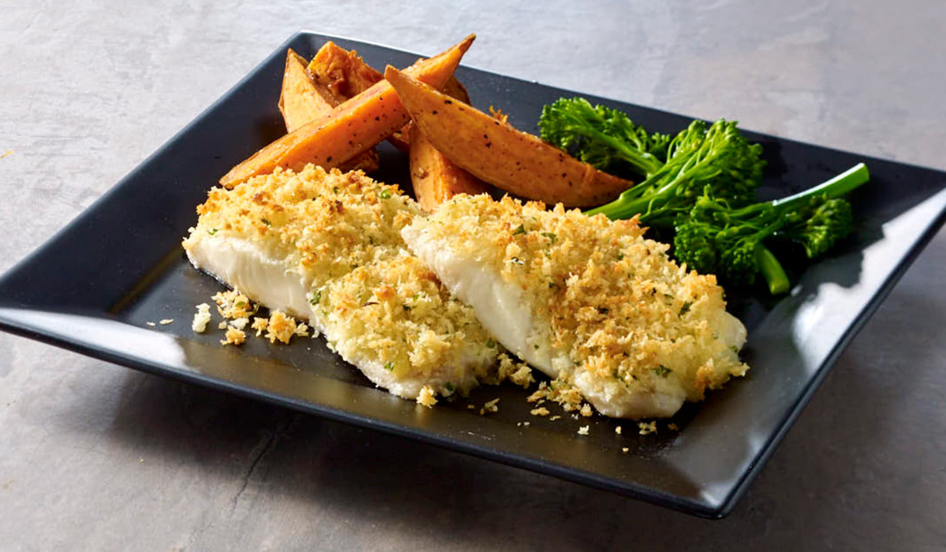
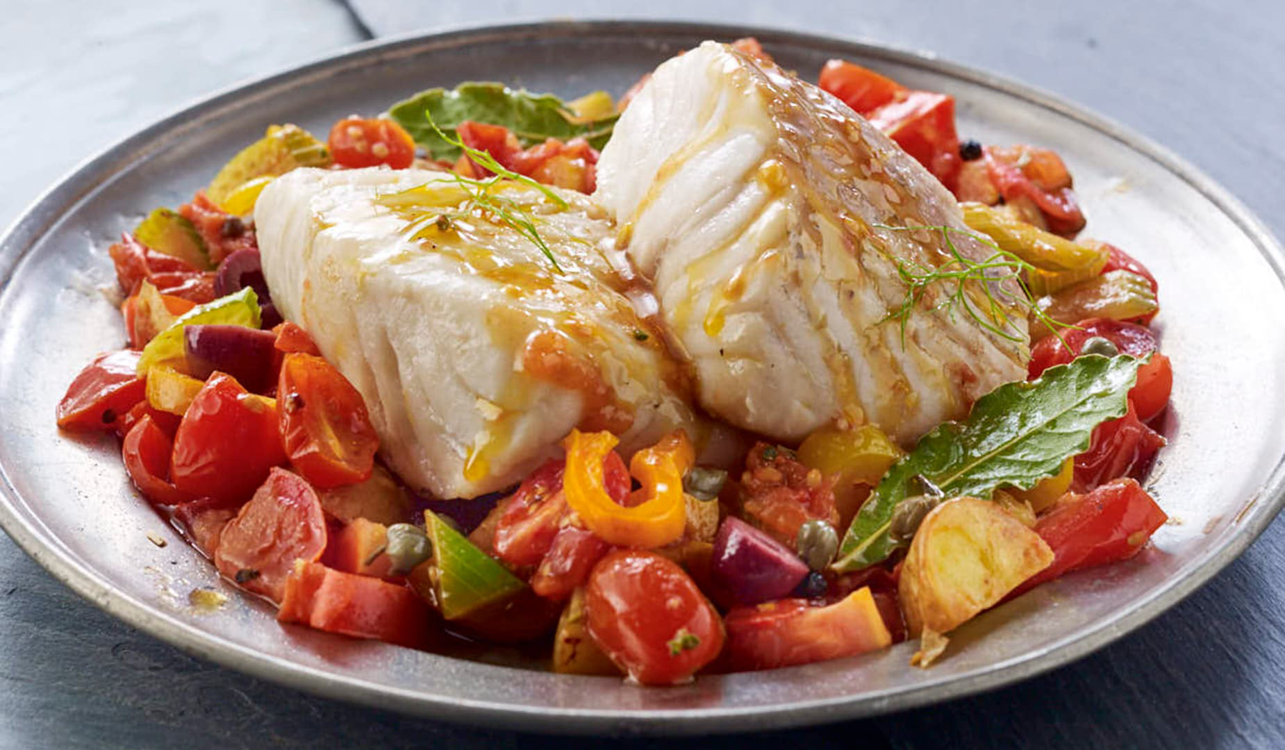
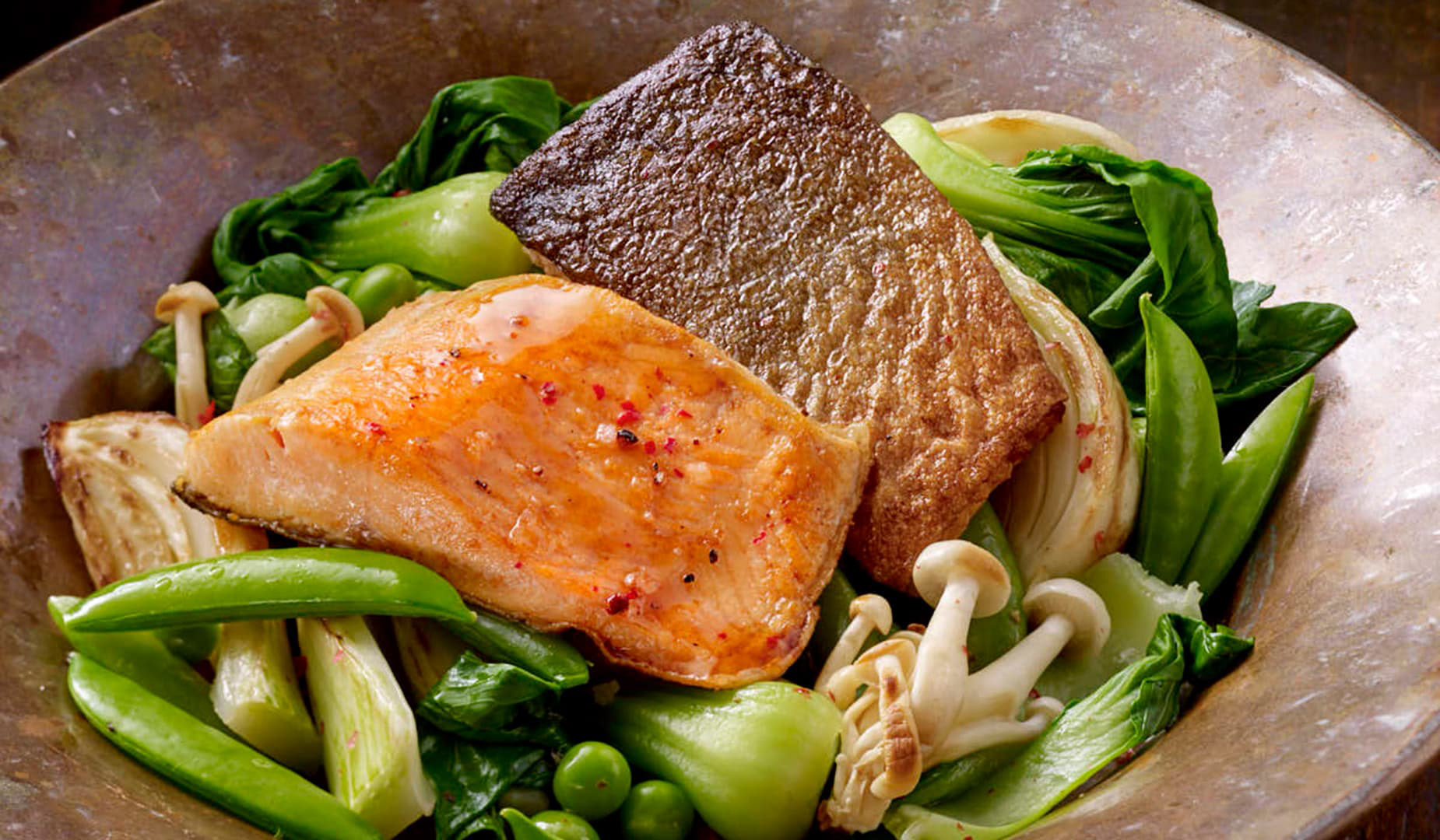
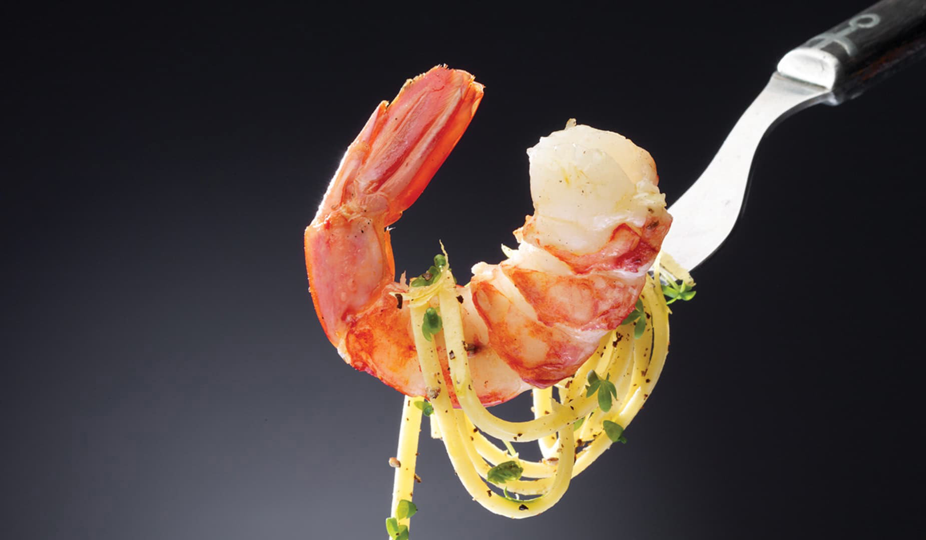
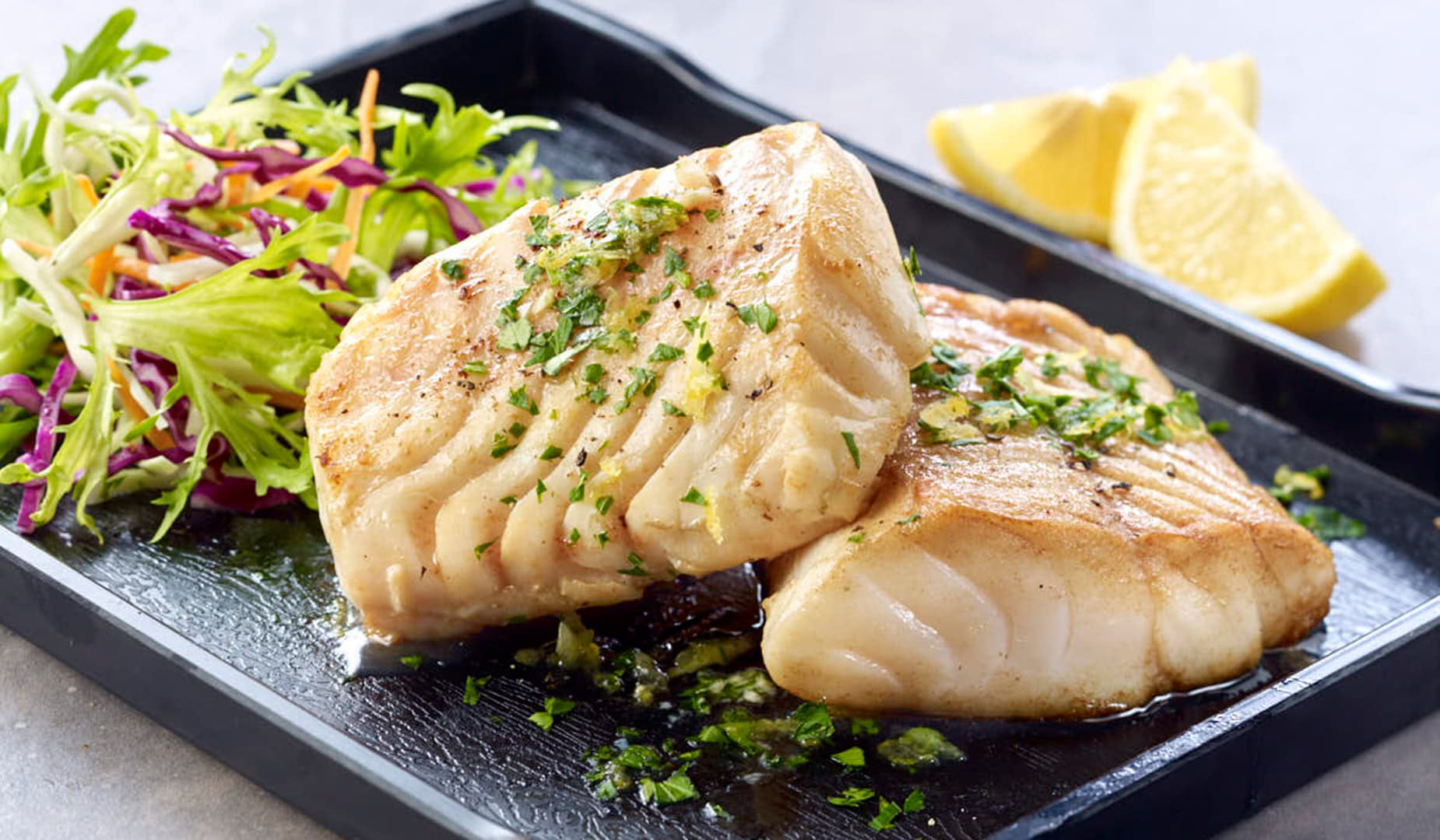
Over the course of the relationship, we built three distinct brand systems under the GO umbrella — the flagship tartan line, GO Wild for the premium wild-caught range, and GO Organic — each with its own visual language, food photography, and packaging architecture.

What we built
Over eight years, the work evolved from production support into a full creative offering — built around a team that could think conceptually, execute precisely, and manage complex brands at scale.

OTHER WORK
Invasives Canada | Granum | Trail Hub | Nest Restaurant | Rayment & Collins
