Brand and Creative Consultant · March 2021–Present
Trail Hub is a family-owned outdoor destination in Uxbridge, Ontario—Canada's Trail Capital—with access to 240 kilometres of trails across 6,000 acres of multi-use forest. The experience brings together mountain biking, hiking, disc golf and skiing, along with a farm-to-table restaurant, trailside bike shop and year-round programming. Its tagline is "Eat | Play | Celebrate," and the brand must make those parts feel like one destination.

Brand Refresh 2025
The primary wordmark is anchored by a custom glyph depicting trees rising above a trail, developed in stacked and horizontal configurations for use across different environments.
As Trail Hub expanded, the brand needed a system that could accommodate new divisions, programs, and events without losing the parent organization's identity. The 2025 refresh delivered a rebuilt identity system with sub-brands, program and event identities and a supporting icon library.
The Bike Shop @ Trail Hub and Disc Golf @ Trail Hub extend the parent identity as distinct but connected sub-brands. Program and event identities followed, each with its own typographic voice.
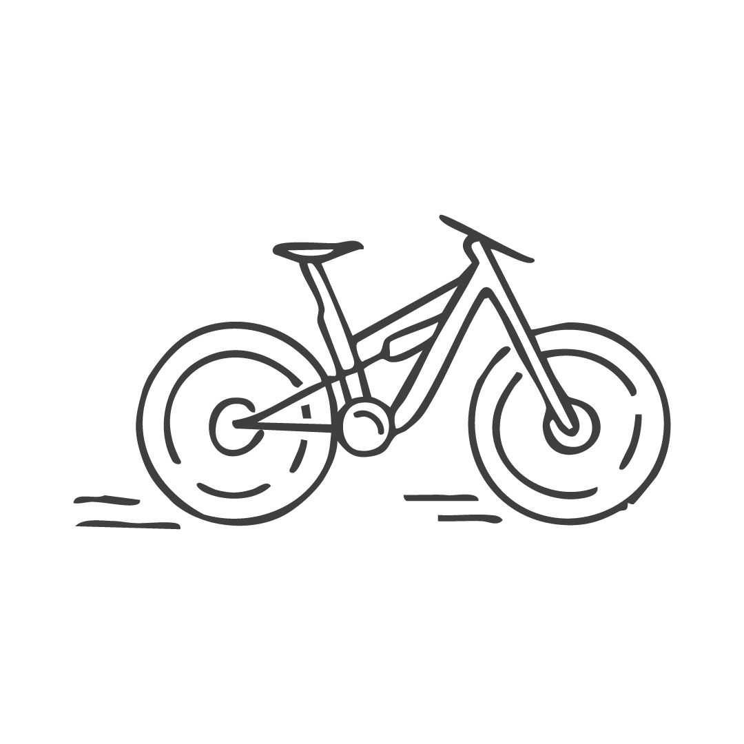
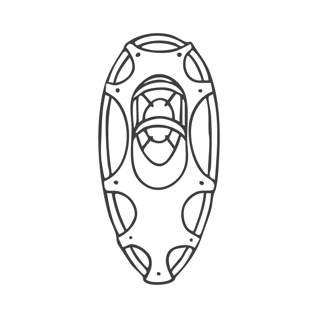
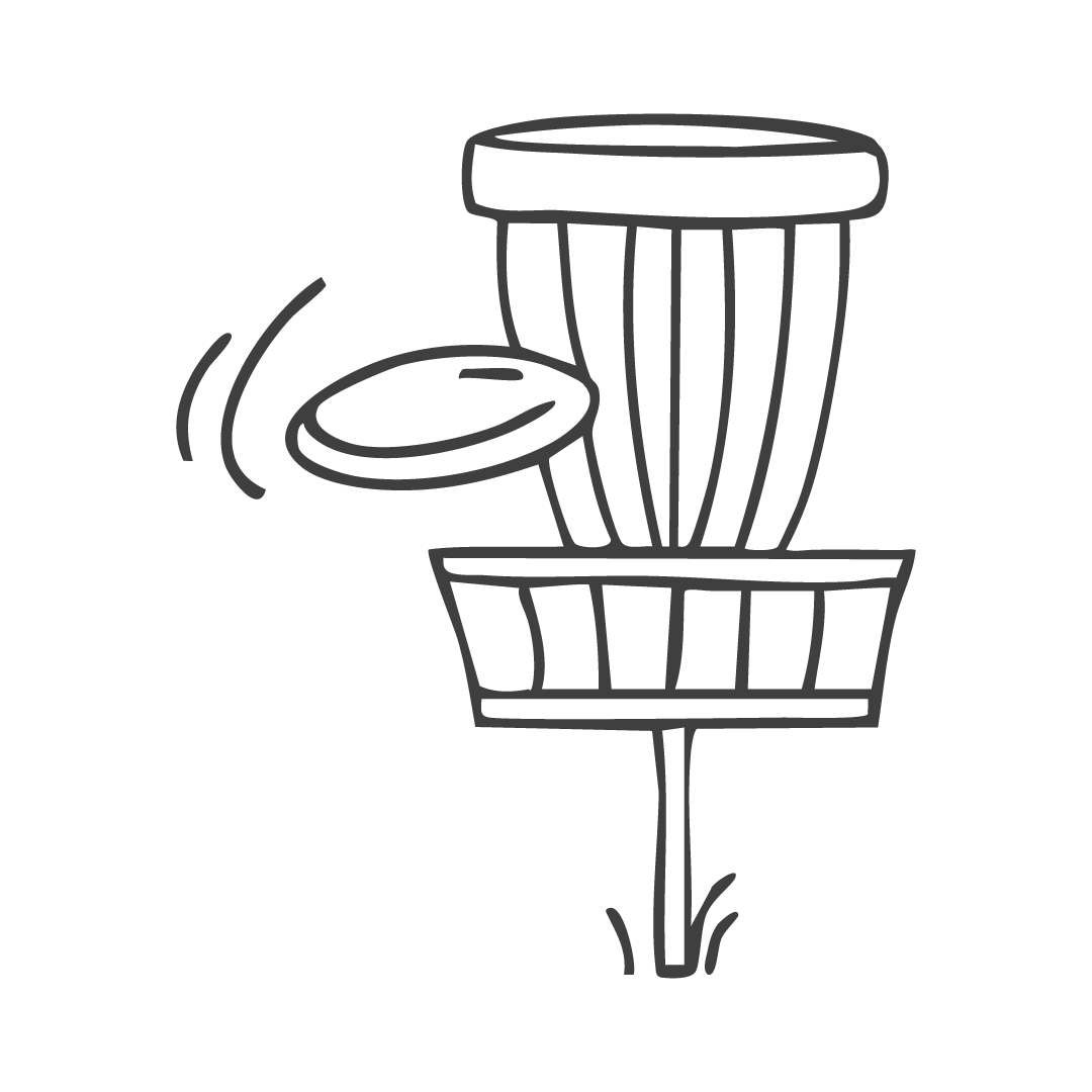
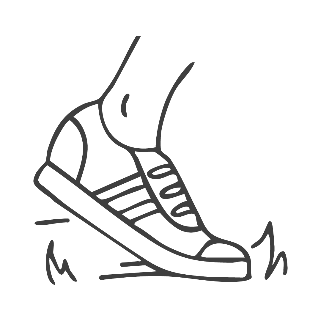
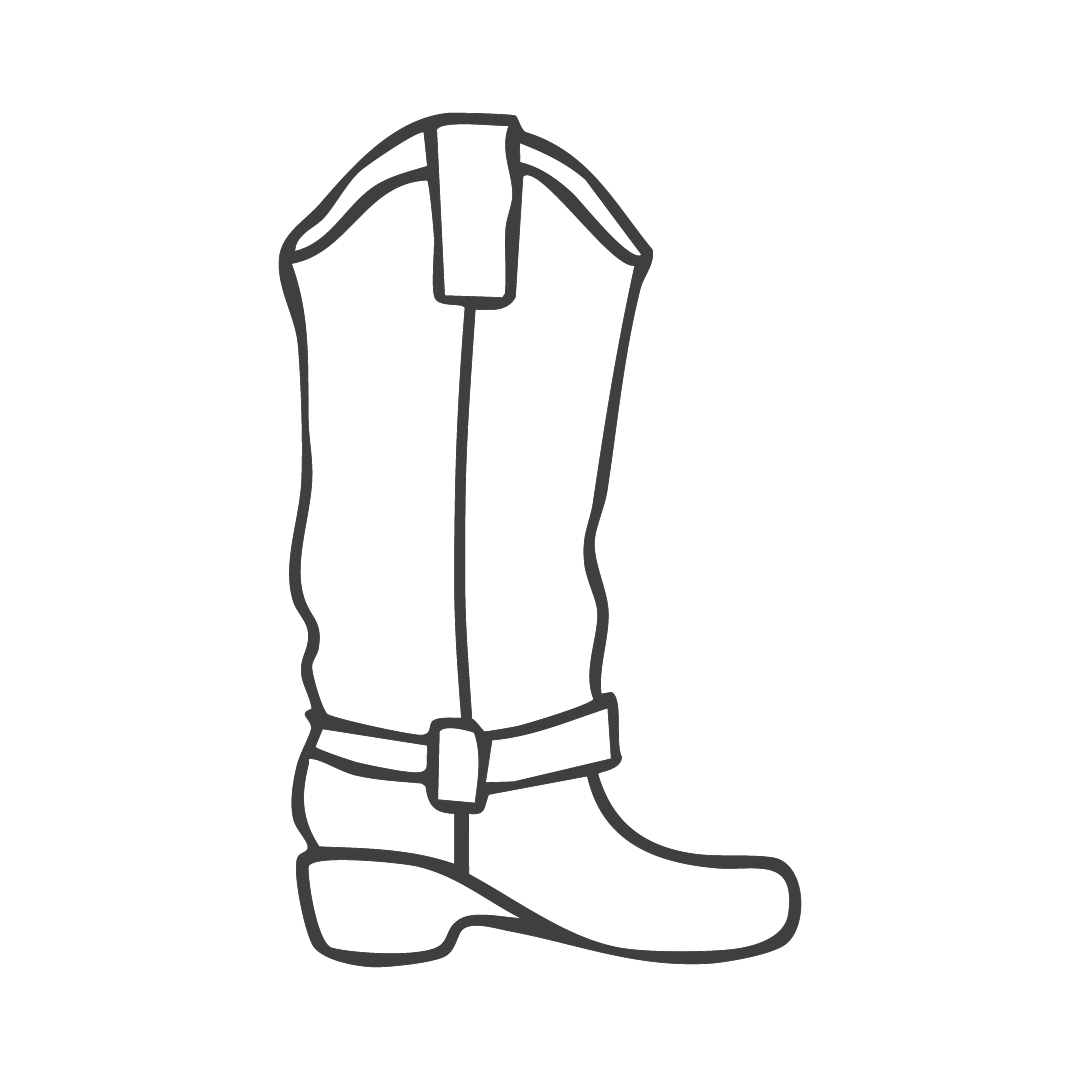
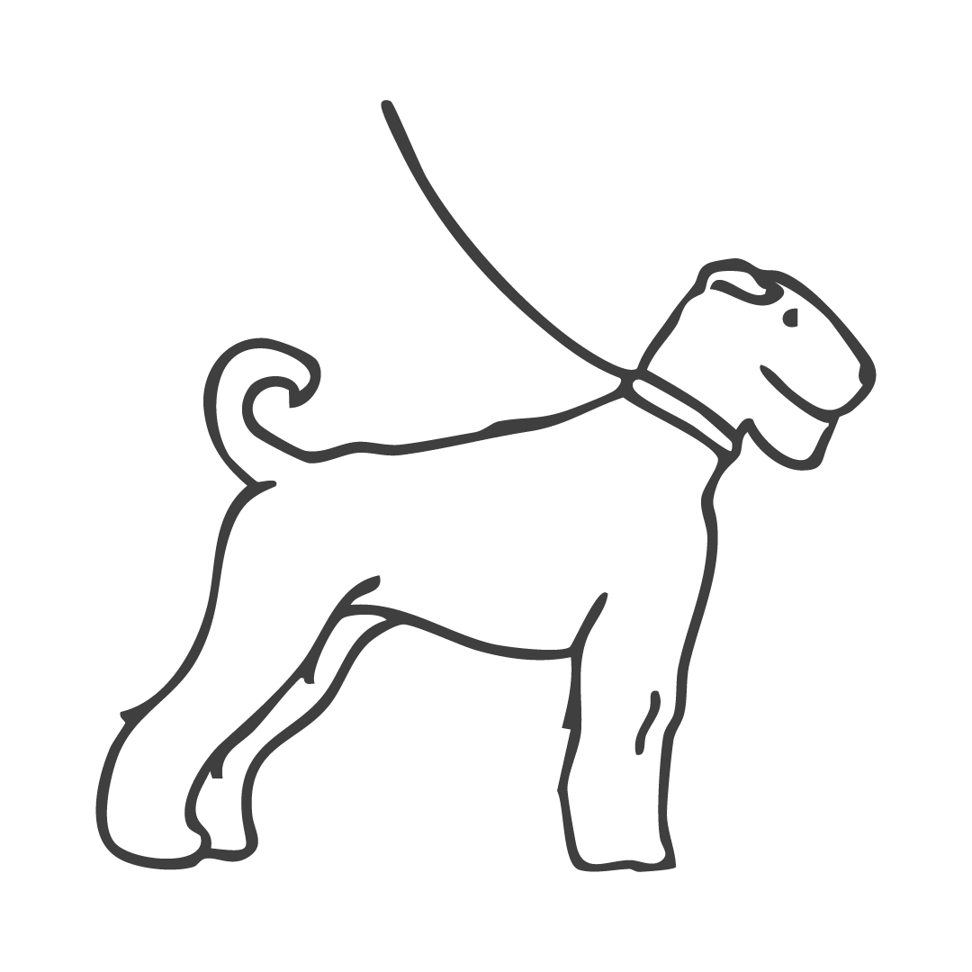
For the supporting icon system, I hired and art-directed a freelance illustrator who developed a hand-drawn visual language across activities and amenity categories.
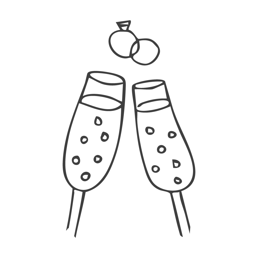

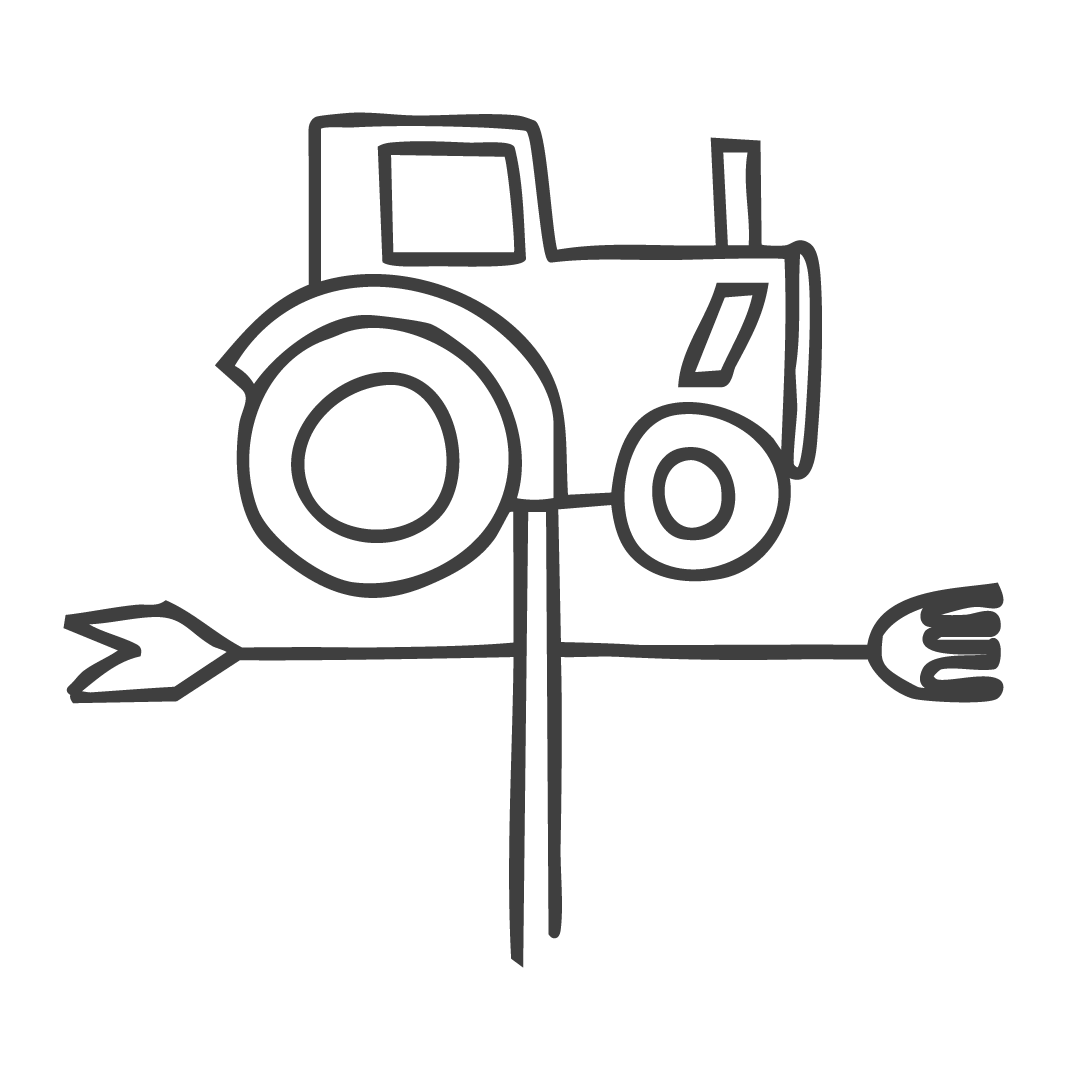
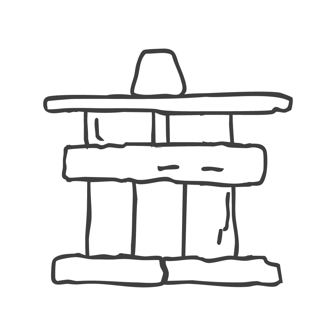

The Whole Enchilada
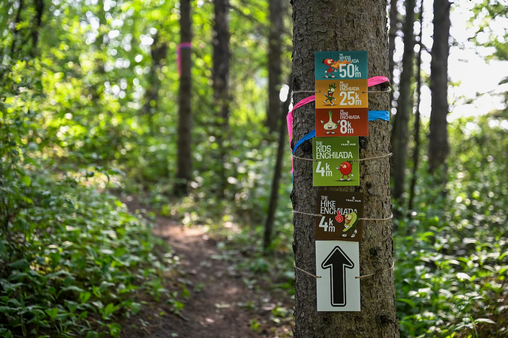
When Trail Hub decided to launch a trail-running race, I was brought in to develop the event brand. My pitch was to give each distance its own character.
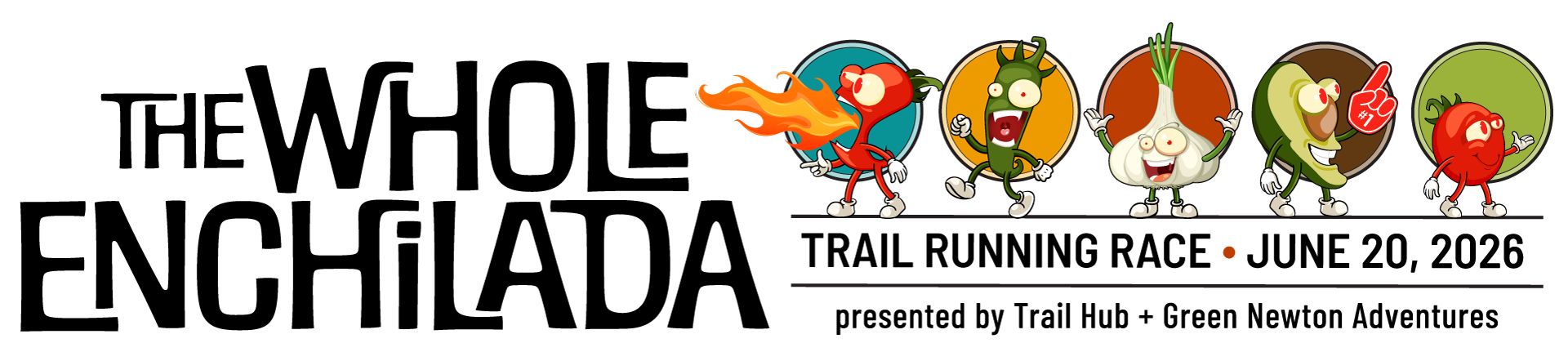
Five race distances became five food-inspired personalities: chili pepper, jalapeño, garlic, avocado and tomato. I created the original character set through a hybrid process — sourcing base illustrations and character elements from stock libraries, then assembling, drawing and refining the final artwork in Adobe Illustrator.

For the 2026 kids’ race, I used a different AI-assisted workflow. I directed and iterated on the character development through ChatGPT prompts, then converted the rendered image to vector artwork in Adobe Illustrator for production.
The identity extended across the complete race experience: race bibs, medals, trail signage, T-shirt artwork, and social graphics.

Bike Fest @ Trail Hub
Bike Fest is Trail Hub's annual mountain-biking event, bringing together the opening round of the Ontario Enduro Series, a Gravel Fondo and a festival village.
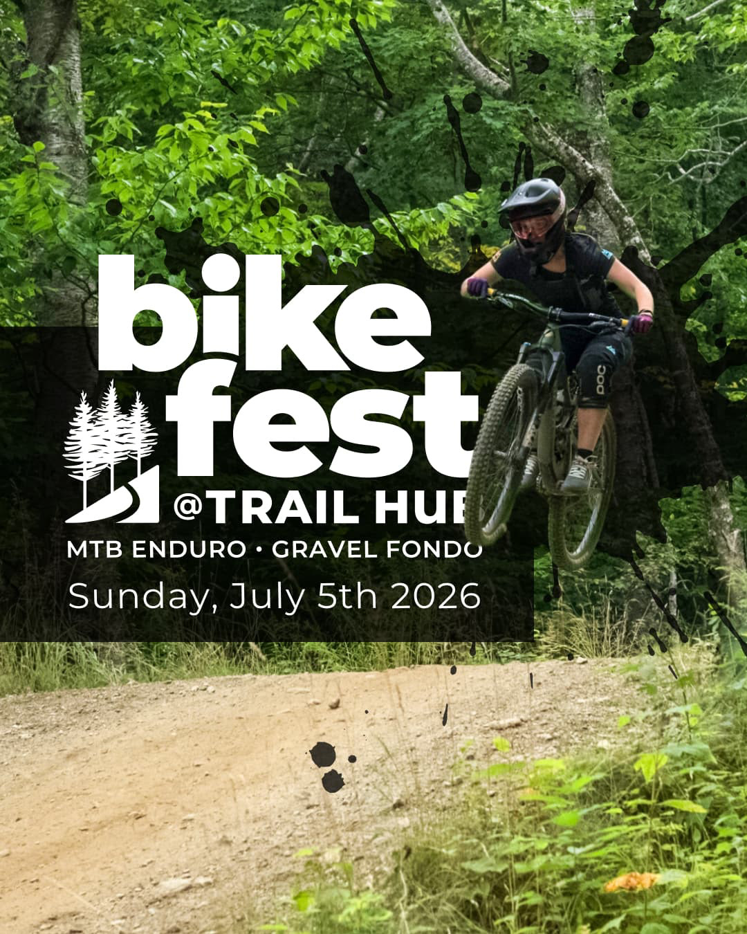
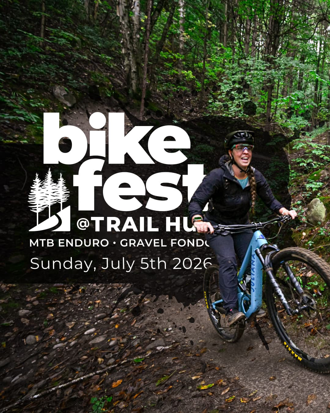
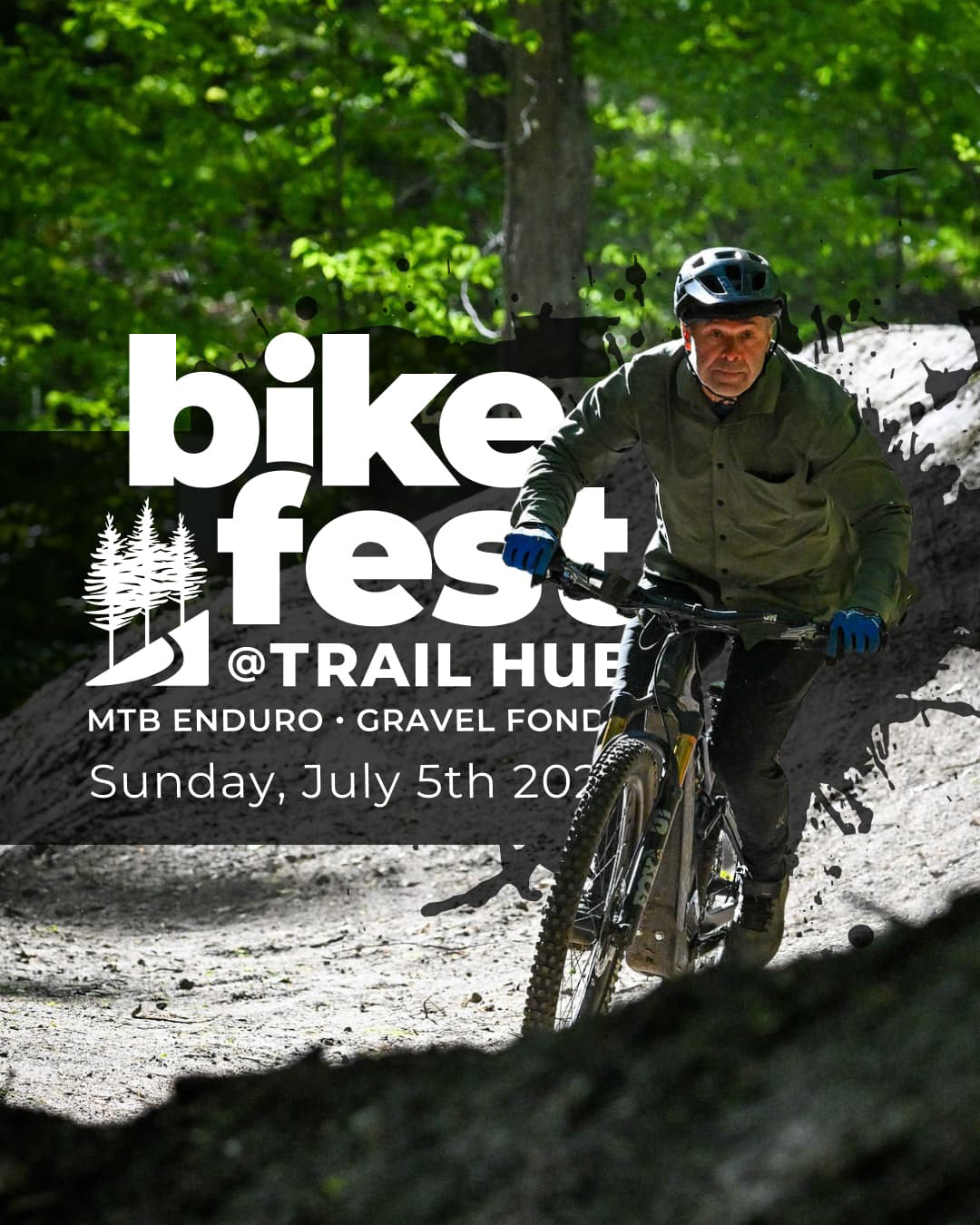
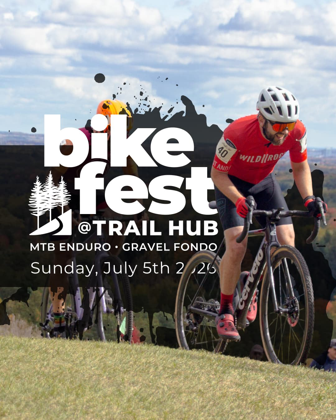
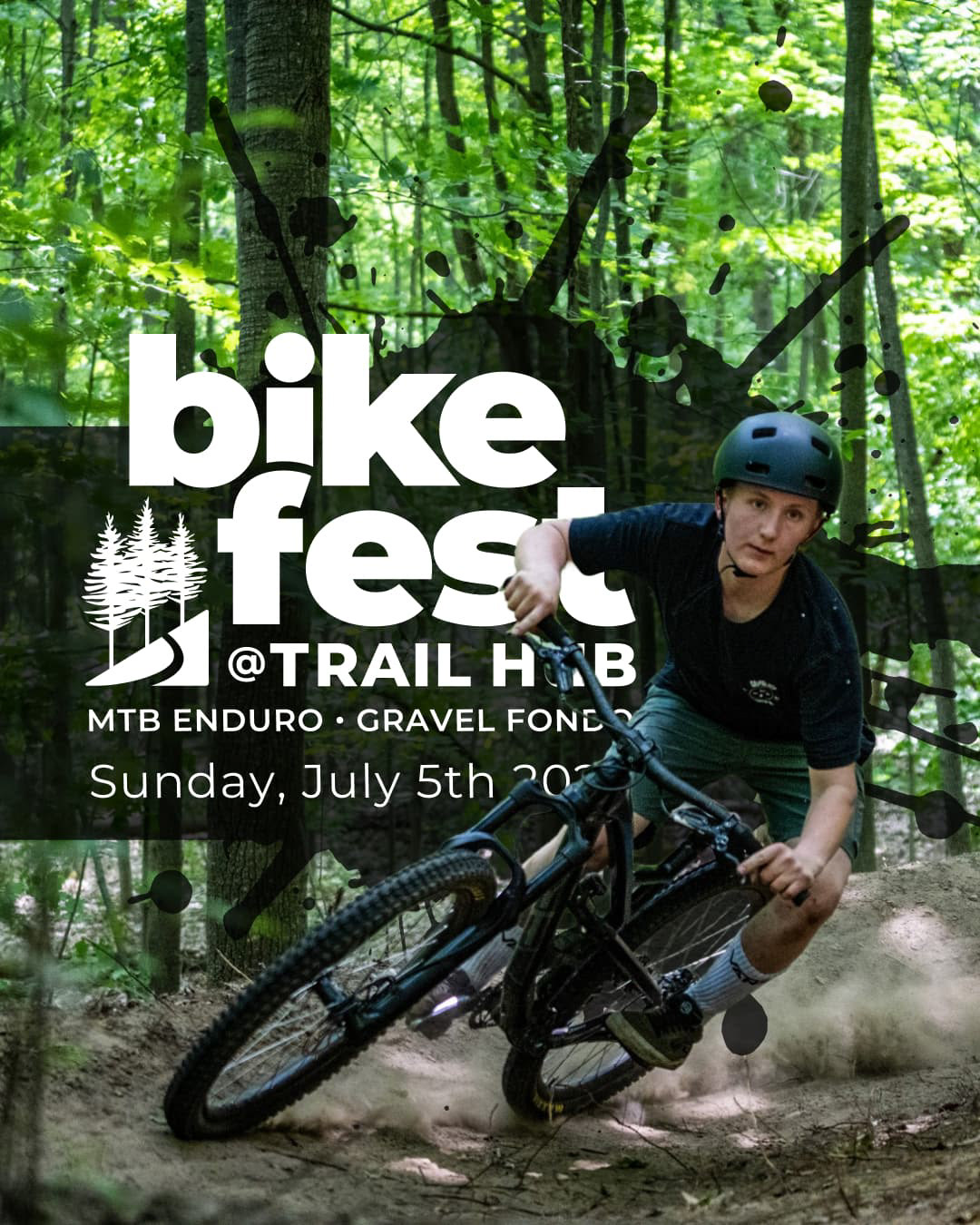
I developed the identity using an ink-splatter treatment, the Trail Hub glyph reversed in white and chunky — a bold visual language suited to the event and deliberately contrasting with the precision of the parent brand.

One brand, room to grow
Across the relationship, the work has evolved from individual creative assignments into a connected brand system. New divisions and events can develop their own personalities while remaining recognizably part of Trail Hub.

OTHER WORK
Invasives Canada | Granum | Trail Hub | Nest Restaurant | Rayment & Collins
